Creating a website requires the coordinated work of a team of specialists. Let's figure out in what sequence and by whom websites are developed; what role UX/UI design plays in this process.
I want to emphasize that in this lesson everything is written in the simplest language possible to make it easier to understand the essence of the process. Once this is understood, I will move on to specialized terms in the next lesson.
But today, we won't get around new words.
A website can be called a web application if it has not only a static set of pages but also includes close interaction with the user and reacts to their actions to solve additional tasks (besides providing information).
Example site: personal blog. Example Web application: a logo generator based on your preferences that works using neural networks.
The more complex the project, the more specialists need to be involved and the more stages must be completed. Below are all the stages of web site development, in which a UX/UI designer participates, marked with a check mark
Please note that each company has its own processes, so the stages, their components, and even the sequence may vary slightly. In large corporations, the steps may be more complex, while in small studios, there will be fewer stages.
- Step 1. Analytics, Information Gathering, Writing Technical Specification
- Step 2. Reference Search, Creating Mood Boards
- Step 3. UX Design
- Step 4. UI Design
- Step 5. Project Presentation
- Step 6. Resource Export
- Step 7. Markup (HTML/CSS/JS)
- Step 8. Programming
- Step 9. Testing
- Step 10. Deployment
- Homework
- Conclusions
Before starting the development of a risky project, for example, a startup, it makes sense to conduct market research: try to analyze competitors, forecast profitability. This is done by both business analysts and consulting companies. Often, the analysis and collection of information about the project is handled by a UX designer.
The stage is encountered in high-budget projects. Sometimes business analysts are kept on staff permanently to conduct new research.
Based on the collected information and conducted analysis, a technical specification – a detailed description of the requirements and necessary functions that the website must have upon completion of development, is written. The project manager and product owner (read as product owner) are also involved in writing the technical documentation.
After the concept is approved, the technical task is handed over to the UX/UI designer for finding UX solutions and visual style. That is, we look among already existing websites and try to "guess" what the client will like. For this, sites like Behance and Dribbble are often used. All successful examples found are collected into a collection called moodboard (pronounced as moodboard).
Next, the mood boards are shown to the client and they indicate what they liked and what they didn't. This stage allows saving time and skipping many unsuccessful attempts to find the right visual style.
At this stage, the UX–designer begins to design the user experience. That is, they come up with how the user will interact with the system. Depending on the level of detail and the processing of the technical assignment, it may be necessary:
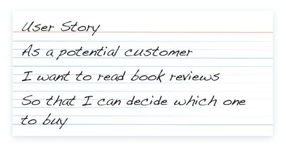
- Identify typical users and their tasks — allows you to understand who and how will use the website, detailing each function as a sequence of actions:
![User story User story]()
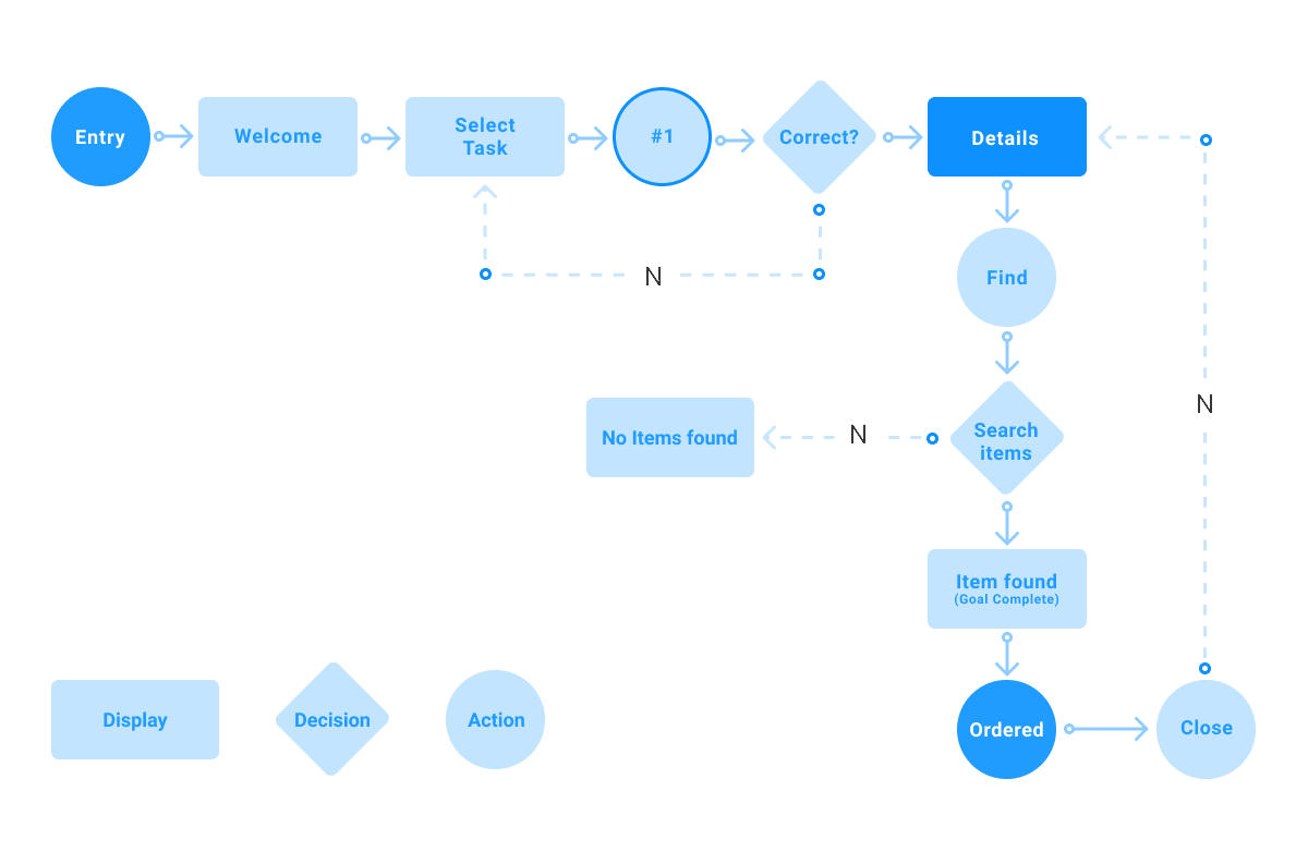
- Break the website into screens and display them as a diagram. The logic of transitions between screens is defined at this stage:
![User flow User flow]()
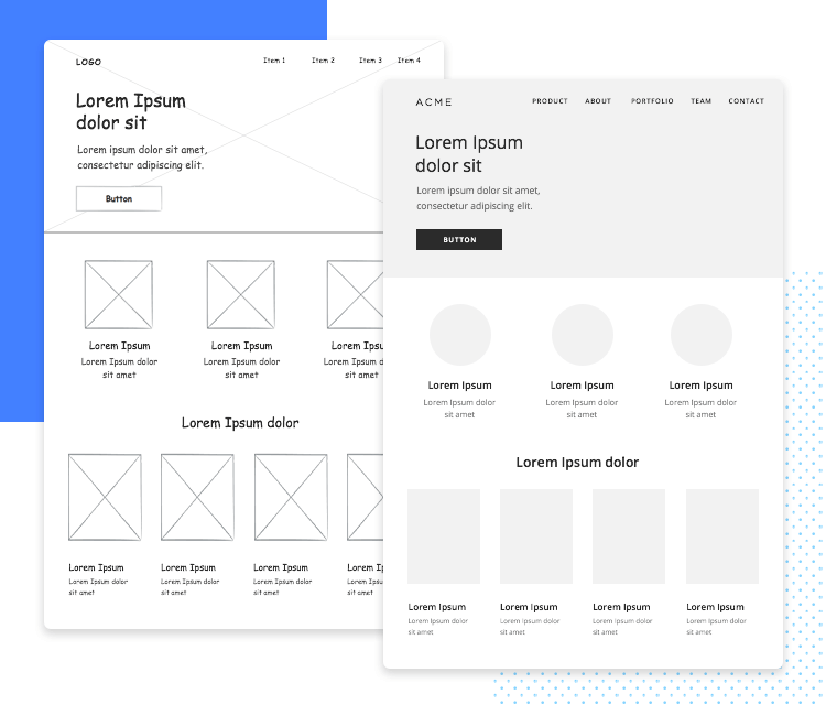
- Sketch the screens — based on the previous stages, the UX designer determines the layout and size of interface elements. At this stage, colors and visual style are ignored, usually everything is drawn in black and white or gray colors. Below is an image of the same screen sketch done in different styles, which does not affect the underlying content:
![Screen sketches Screen sketches]()
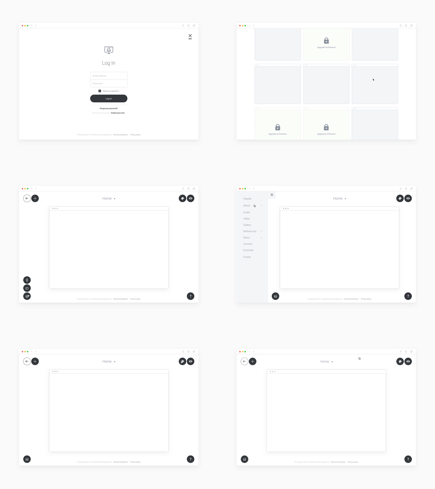
- Create interactive screens – based on the previous sketches, the UX designer creates an interface that users can interact with (it becomes interactive). That is, you can click on buttons and the website will respond (for example, transition between screens). At the same time, you save time as no programming is required. You can already test your solution on real users, as the interface works as if in a browser. Perhaps this is one of the most impressive and useful stages. You can conduct research and see how users perform certain tasks, what problems they encounter, and fix them right away.
![Prototype Prototype]()
For simple websites, such as landing pages, blogs, and online stores, it is sufficient to only sketch the screen designs (this stage is often overlooked in studios). This is logical, as these types of sites can be developed in such detail that the UX design is already obvious.
But this stage should not be underestimated for complex and unique web applications. For example, you need to create an interface for tracking calories and nutrients based on your diet. This task can be solved in many ways, but it is impossible to determine the best one based solely on static sketches. However, by testing the interface with users and gathering their feedback, conclusions can be drawn.
When the sketches for all screens were finalized, the UI designer works on finding the visual style: selecting the color palette, fonts, icons, building the grid, and drawing the key sketches from the previous stage.
When the visual style is approved by the client, the rest of the screens are designed. It is important to understand that at this stage, it is determined how the site should look after the development is completed (unlike the previous stage, where the structure of each screen was defined).

After all the screens have been designed, the UX/UI designer prepares the project presentation.
Usually, a static presentation is enough, but later we will get acquainted with interactive prototypes. See the example below and pay attention to the animation of the elements' appearance and what happens when the user clicks on the movie card.
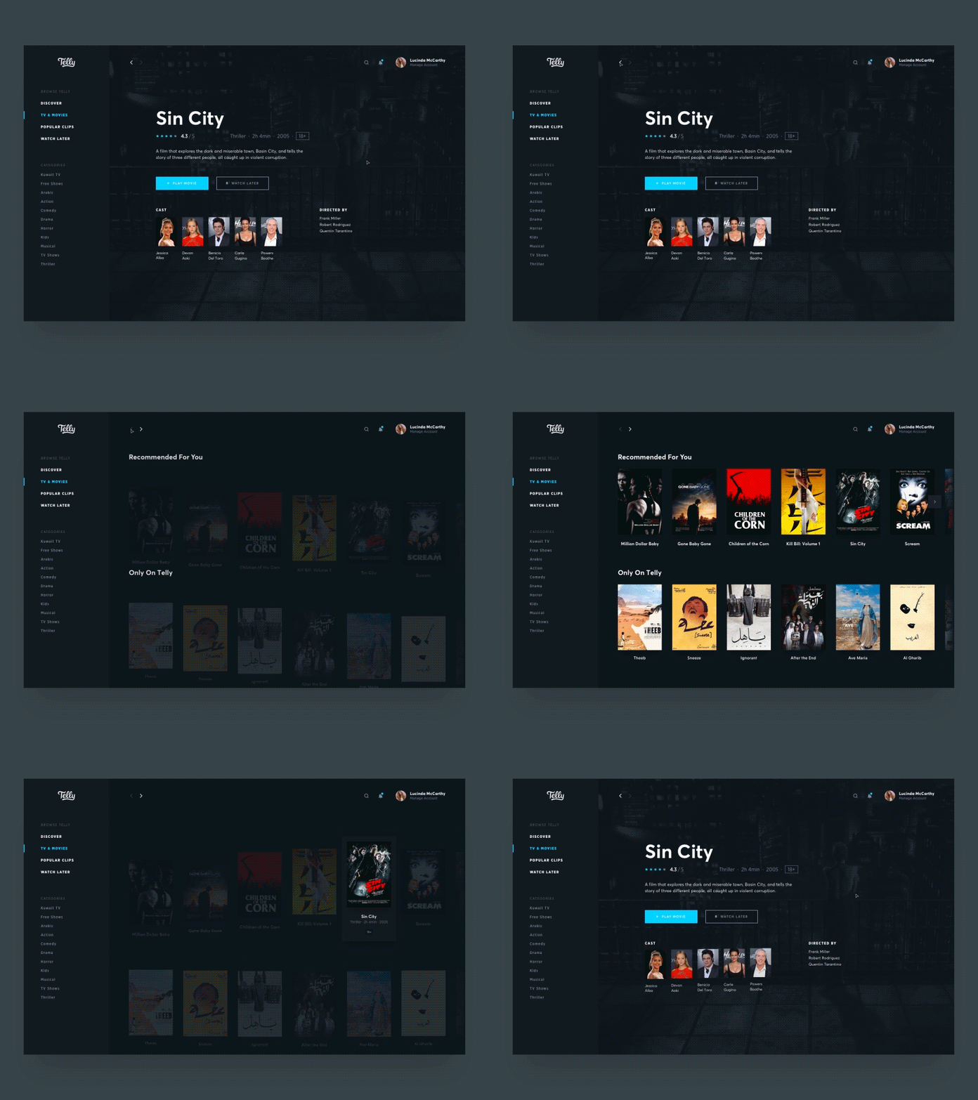
After a successful presentation and approval, the project moves into the layout and programming stage. They can be executed in parallel. To start laying out, Frontend developers need all icons, images, and illustrations in separate files, which are called resources.
The preparation and export of resources is done by the UX/UI designer. What layout is, is explained in the next paragraph.
Layout – is the writing of code that allows for the creation of static pages without transitions between screens. Such pages contain all interface elements, visually everything looks like a finished product. These pages open in the browser, but as soon as you click a button or want to follow a link (attempt to interact) — nothing happens.
Drawing an analogy with a microwave oven, at this stage, developers create only the front panel with knobs, doors, and housing — this is frontend (pronounced as frontend). Other components (magnetron, control board, roller) that provide the functionality of the device are absent.
This work is performed by layout designers and frontend developers using the following technologies:
- HTML (HyperText Markup Language) — a markup language for creating web pages and their content;
- CSS (Cascading Style Sheets) — stylesheets that define the appearance of elements created with HTML;
- JS (JavaScript) — a programming language used to "animate" certain interface elements: add micro-animations, make sliders work, and so on.
Often used are frontend–frameworks — a set of tools and ready-to-use components that work based on HTML, CSS, and JS. This significantly reduces development time.
Bootstrap — the most popular frontend framework, which includes design templates for web forms, buttons, labels, typography, navigation blocks, and other components.
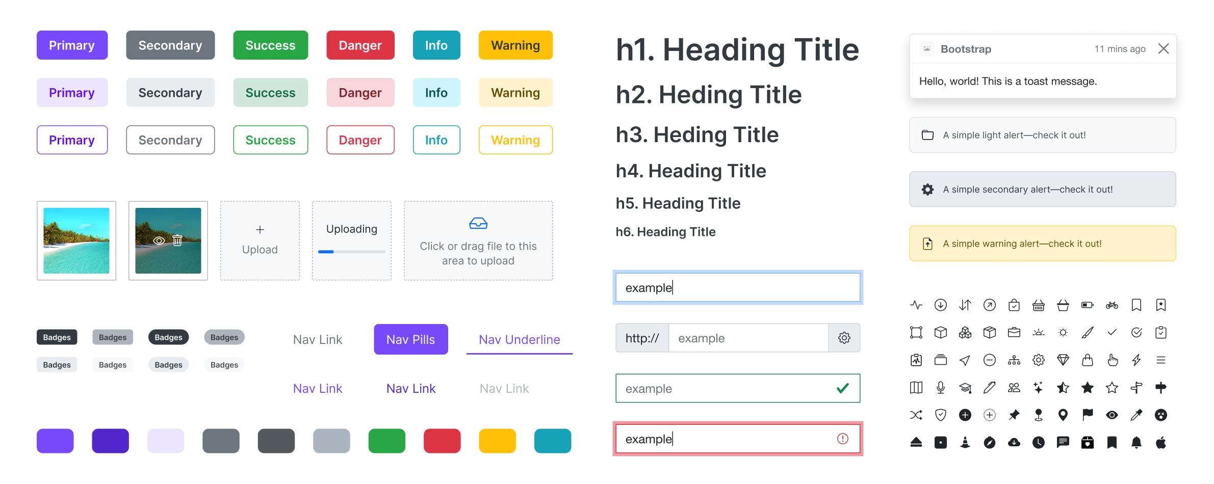
Programmers or backend developers (pronounced as backend) are involved in creating the functional part of the website, everything that makes the elements of the microwave oven's control panel (frontend) work. This entire system is invisible and hidden inside, but it is what allows the website to respond to user actions. In a microwave oven, this would be the magnetron, control board, and roller — backend.
Backend developers use a wide range of programming languages and technologies. I will mention just a few of them:
- HTML, CSS & JS — all that is used by developers;
- PHP (PHP: Hypertext Preprocessor) — a programming language widely used for web application development. To give you an idea, PHP allows for dynamic generation of HTML code in response to various conditions and user actions;
- MySQL — a database management system. It allows websites to store and process information. For example, user accounts and their messages on a social network are stored in databases.
There is no need to be afraid of programming, just like in design, everything is thought out so that its tools provide maximum flexibility and efficiency in solving tasks.
Moreover, in many graphic editors, the built-in programming language is similar to JavaScript (the same one used by layout designers and frontend developers). This allows for the automation of routine tasks.
I will provide a real example from the field of graphic design. You need to draw 10,000 (ten thousand) tickets with a unique barcode, seat assignment, and save each of them in a separate file. Doing this manually would take you weeks of work. Moreover, the more tickets you have, the higher the chance of making a mistake. By writing a script in Adobe Illustrator in JavaScript programming language and executing it, you will get all the necessary materials within 10 minutes.
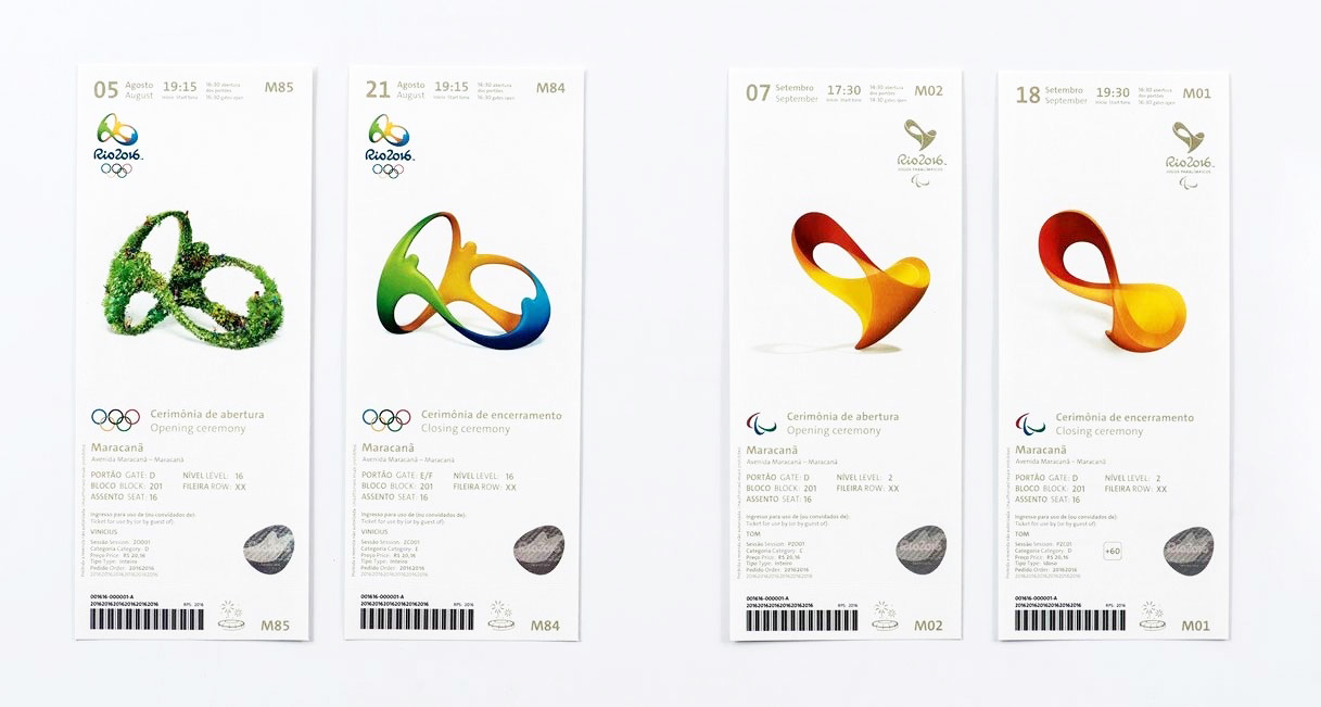
During the development process, each new feature is thoroughly tested by testers and QA specialists (QA is pronounced kew-ay – Quality Assurance in translation quality check):
- Manual — the tester launches the site and goes through all user scenarios, trying to detect errors in the operation;
- Automated — the QA specialist writes a script that launches a real browser and performs all actions instead of a person.
Sometimes regular users are involved for testing, but they are warned that the site is not yet ready and may contain errors. This is called open beta testing.
Deploy (pronounced as деплой) or website deployment — is the process of transferring and launching a site on a server in the Internet network. The thing is that website development is done locally. That is, the site being developed is not available on the Internet at all.
System administrators and devops engineers (pronounced as devops) ensure the smooth operation of the website. By the way, this work is performed in a terminal that uses a character graphical interface.
From now on, this course is designed for self-directed learning and completing homework assignments. I understand that some tasks may be challenging for you.
For additional support, use the chat in Telegram. Here you can ask questions related to the lessons or review examples of correct completions from other students.
The chat is not available for citizens of Russia.
Task. Read the article IT Sector Professions: Overview of Positions. It includes additional specialties that are not mentioned in this lesson. Think carefully and specify these new specialties, as well as the stage at which they are involved. Try to explain your reasoning. If you did not find a new specialty for some stage, we will skip it.
Now we know what steps are involved in the process of creating a new website and which specialists are involved in it. In the next part, we will focus on the typical tasks of a UX/UI designer and discuss which programs are used for this.
Доброго дня, лекцію пройшла, тест виконала вірно, але дз не розумію як робити. Я тільки-тільки почала цікавитися ве дизайном .Чи можна перейти до уроку 3?
Коментар frusia.pro:
Привіт! Так, звісно, ви можете перейти до третього уроку. Можливо ви можете вказати що конкретно вам незрозуміло? Я спробую пояснити. Ви також можете подивитись приклади вже виконаних домашніх завдань.