Lesson 7. Registration. Interface. First steps

Module 2. Figma basics.
Free UX / UI design course for a newcomer

To start learning, take tests and track progress, you need to enroll in the course. It's free.

Let's move on to the practical part. As you might have guessed, we will be using Figma. First, we will look at the advantages and disadvantages of this graphic editor, and then we will start learning how to create designs with it.

We begin with the basics. Today we will learn how to draw a rectangle, a line, an arrow, and a text block. This will be enough to create task flows of all kinds and simple pages.

At the end of the lesson, as always, you will have many practical tasks to reinforce the material.

Why choose Figma?

This editor is excellent in all aspects, and we choose it not because of its simplicity or free access. Currently, it is a powerful tool that is perfectly tailored for creating websites, applications, or other graphical interfaces. Let's consider the advantages of Figma:

  • Free – most of the features needed by a designer are available for free. While you are learning, Figma does not require any financial investment. Purchasing a subscription becomes relevant if you want to work in developer mode or create more than two team projects with other designers;
  • Easy to learn – Figma's developers spent several years making most features intuitive. Compared to learning in other editors, like Photoshop, Figma seems easy and straightforward;
  • Uncomplicated for computers – this graphic editor will run on any laptop, even the weakest. The main thing is to have a browser up and running. It also doesn't matter what operating system you are using (Windows, MacOS, or Linux);
  • Works in the browser – to get started, you don't even need to install anything. Just register and start working. Convenient for showing clients. The desktop version is slightly faster on large projects, supports local fonts, but overall you can start with the browser version, which is what we will do;
  • Includes all necessary features and even more – provides the broadest capabilities from vector editing to creating an interactive prototype that can be instantly tested on a smartphone (looks like a real app). All of this we will need to learn in the future.

How to get started?

To begin, you need to register on the Figma website using a computer or laptop by launching a browser. A smartphone is not suitable because it can only view previously created designs. You need a working email inbox. It is used as a login.

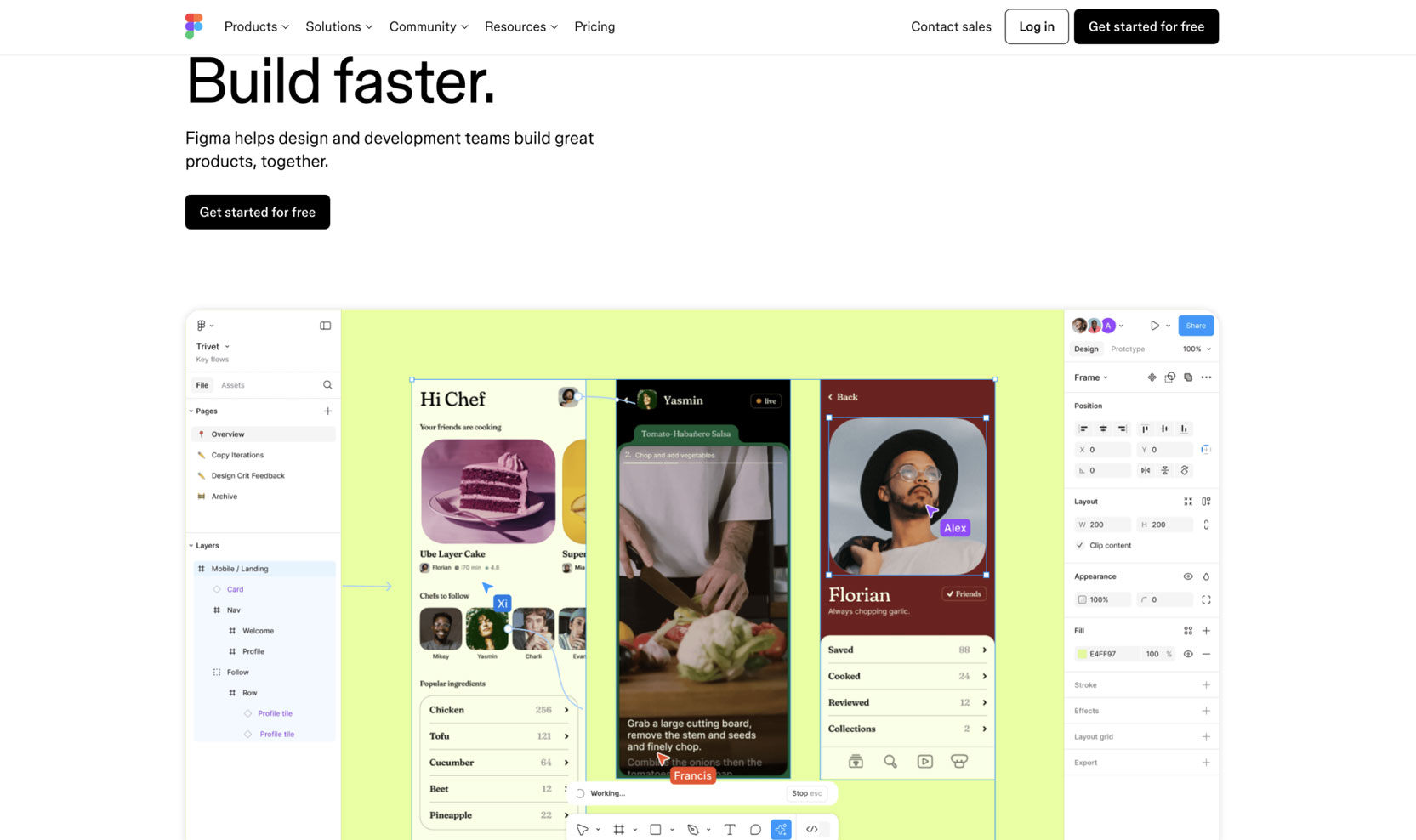
  1. We go to the Figma website — we go to this link and immediately bookmark it in the browser. After registration and logging in, we will use this bookmark to launch Figma like a regular application. We are greeted by an animation that showcases one of Figma's key advantages - the ability to collaboratively and simultaneously edit a file (you may have encountered a similar feature in Google Docs). Therefore, you can see colorful cursors with names:

    Main page of the Figma website

  2. We go to the registration form — for this, we look for and click the Get started for free button on the main page in the upper right corner:

    Registration button on the Figma website

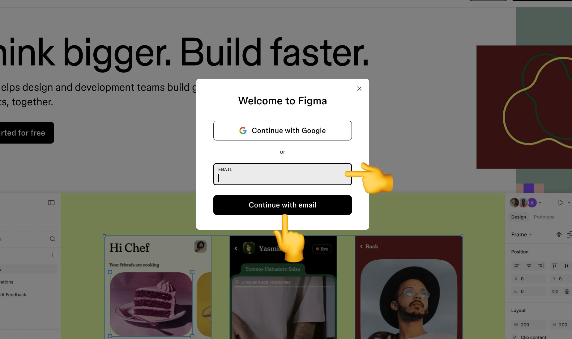
  3. We fill out the first step of the registration form — we enter your email address in the Email field. We click the Continue with email button and proceed to the next step. There are also other ways to register (for example, using a Google account), but they are not as universal;

    Registration form on the Figma website. Step 1

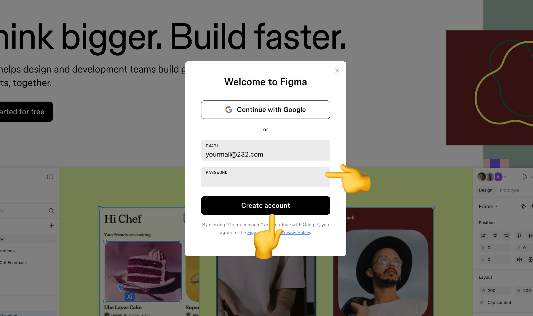
  4. We fill out the second step of the registration form — create a password and enter it in the Password field. You can change your email and password later if necessary.

    Registration form on the Figma website. Step 2

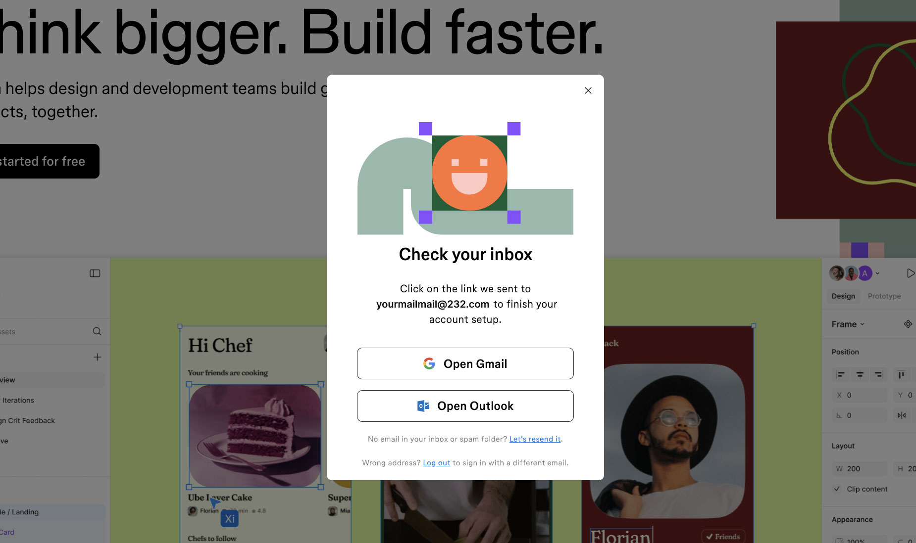
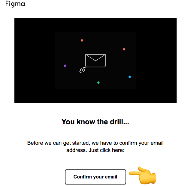
  5. Email confirmation — you know that most services require you to confirm your email address in case you, for example, forget your password. Remember that sometimes requests can end up in spam. If the letter got there, mark it as not spam. In Gmail, for example, there is a special button Report not spam when we open the letter that ended up in spam. This is a very important point, as later, when the client leaves comments on your Figma design, you will receive a notification email about it. And you should respond to the client's remarks as quickly as possible. So, we open the letter and click the Confirm your email button.

    Account confirmation via email

    Confirming email in Figma

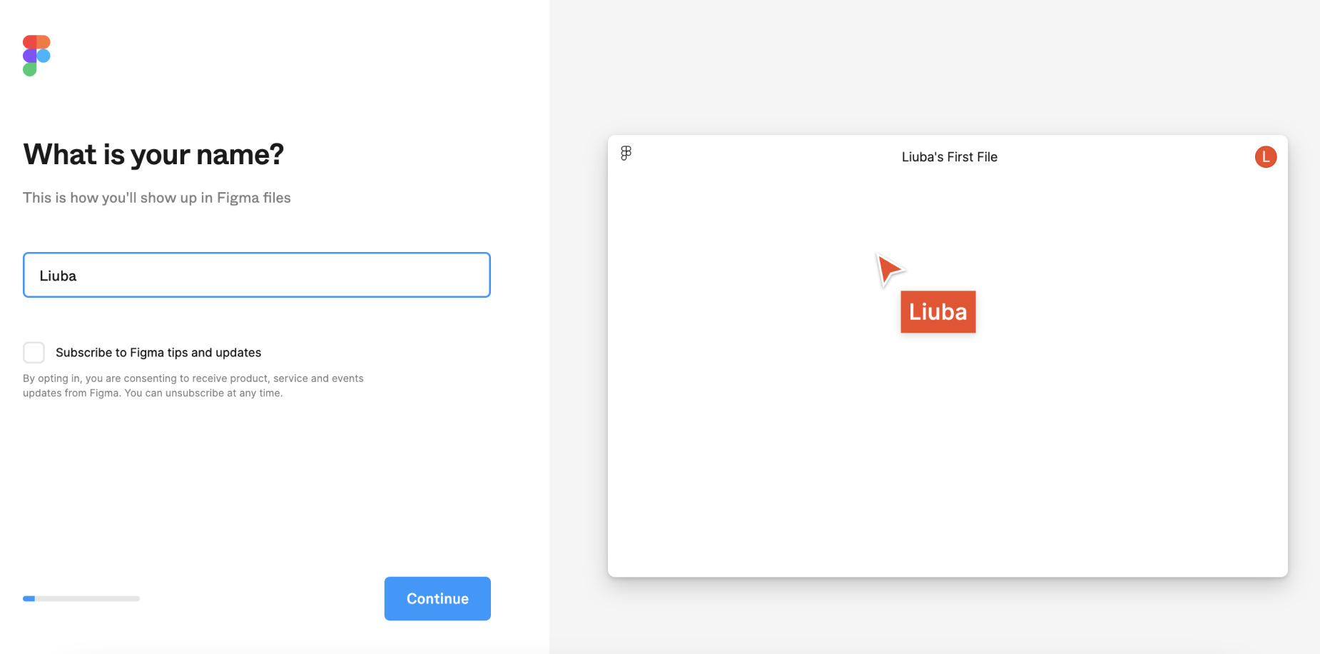
  6. Specify your name — it will be seen by other project participants, for example, your client. It will always be displayed in the upper right corner of the launched application (more precisely, the first letter). By the way, if you do not specify a name, it will be automatically generated from your email address. If you want to receive news about Figma via email, check the box next to Subscribe to Figma tips and updates. But you can always read the latest updates in the blog.

    Specify a name for your Figma account

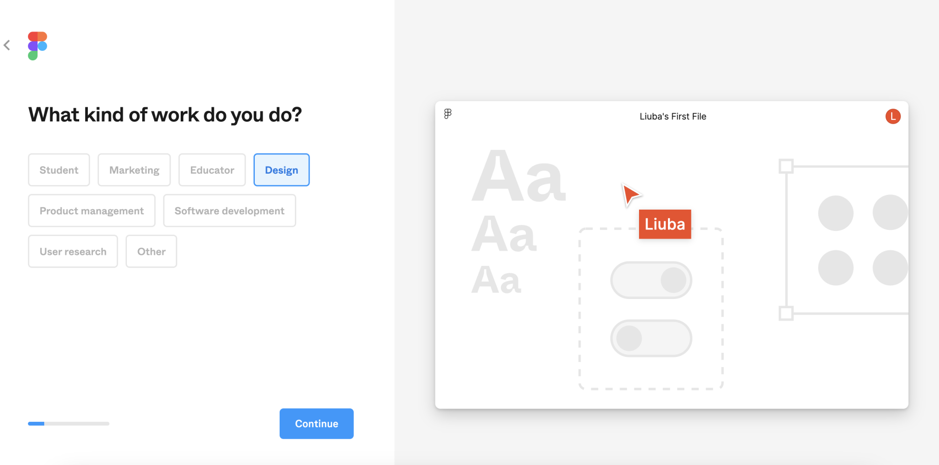
  7. Provide details about yourself — this is done in the form of a questionnaire. In the first question, we are asked to choose the field in which we will work. In our case, it is relevant to choose Design (Design).

    Choosing a direction when working with Figma

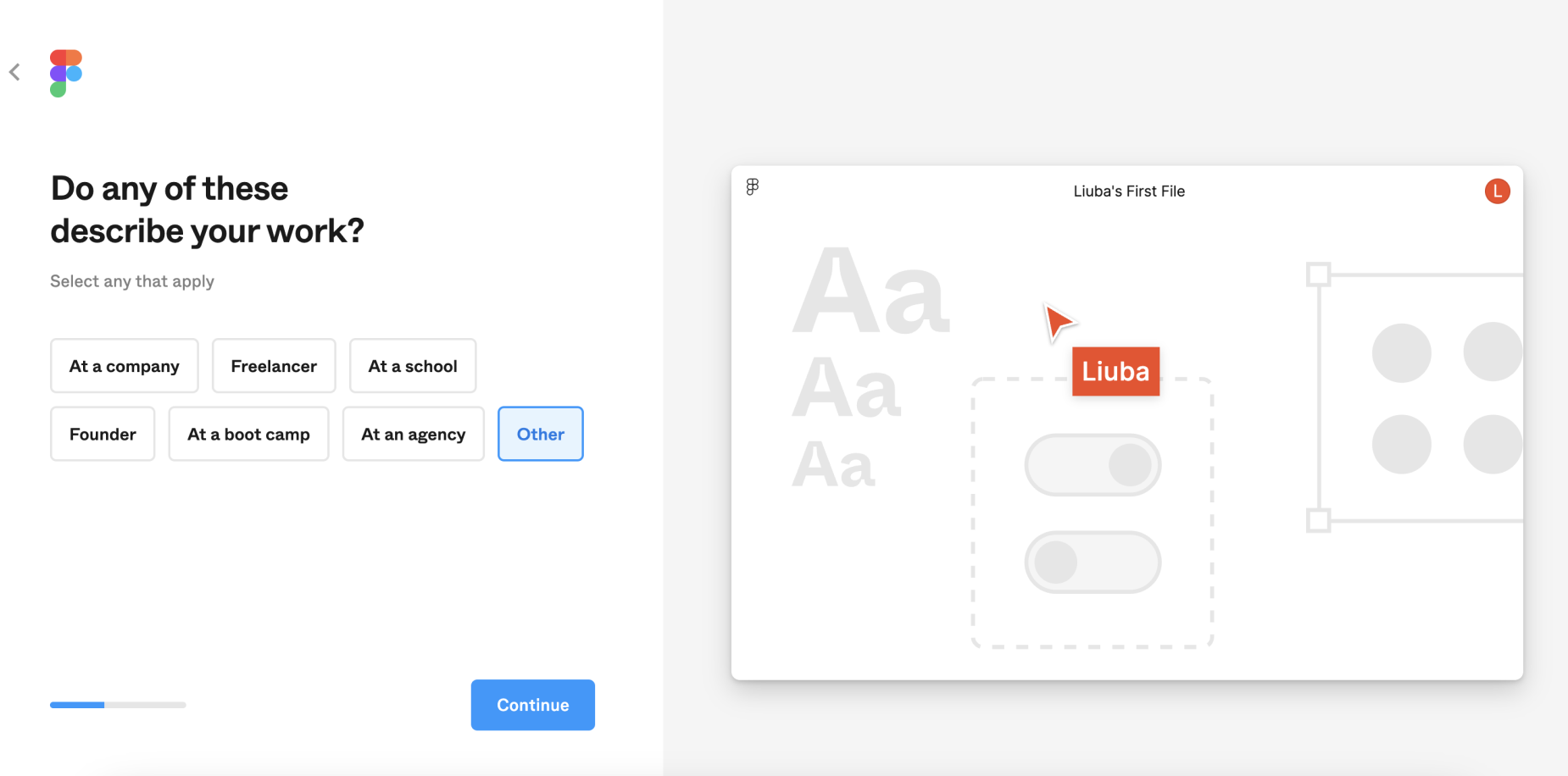
    In the next question, you will be asked to choose an option that best describes your work. You work in an agency, freelance, or study at a university. If you are unsure about what to choose, there is also an option Other (Other).

    Choosing status when working with Figma

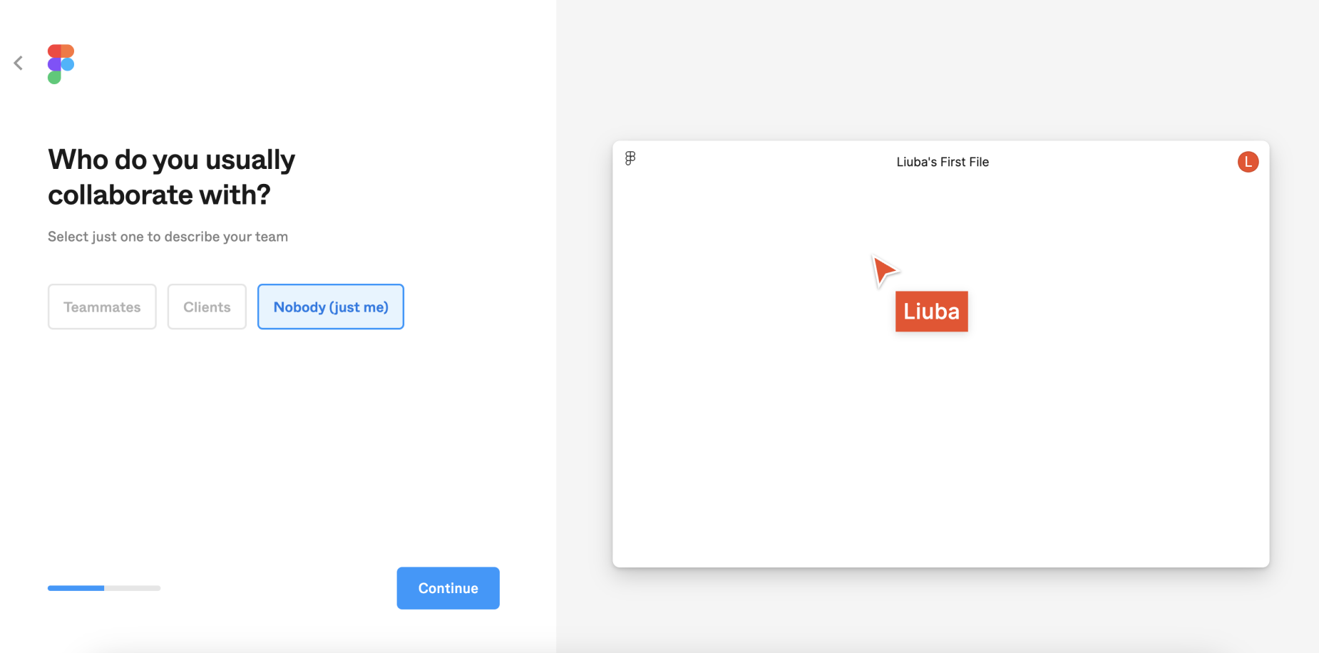
    Another question – will you collaborate with clients or a team? Since we are just starting to learn the program, I recommend choosing Just me (Just me).

    Collaborative use of Figma

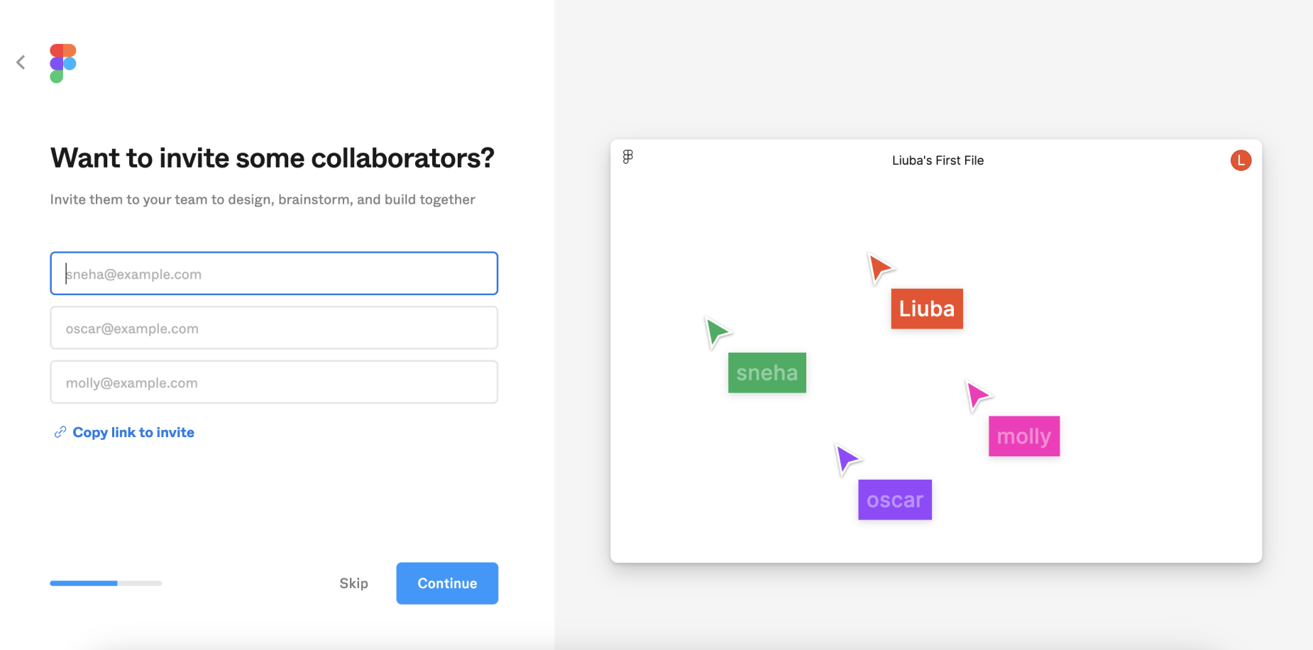
    Inviting other participants. Figma immediately offers us to invite others and create our own team. I recommend skipping this step for now – click Skip.

    Inviting other participants during registration in Figma

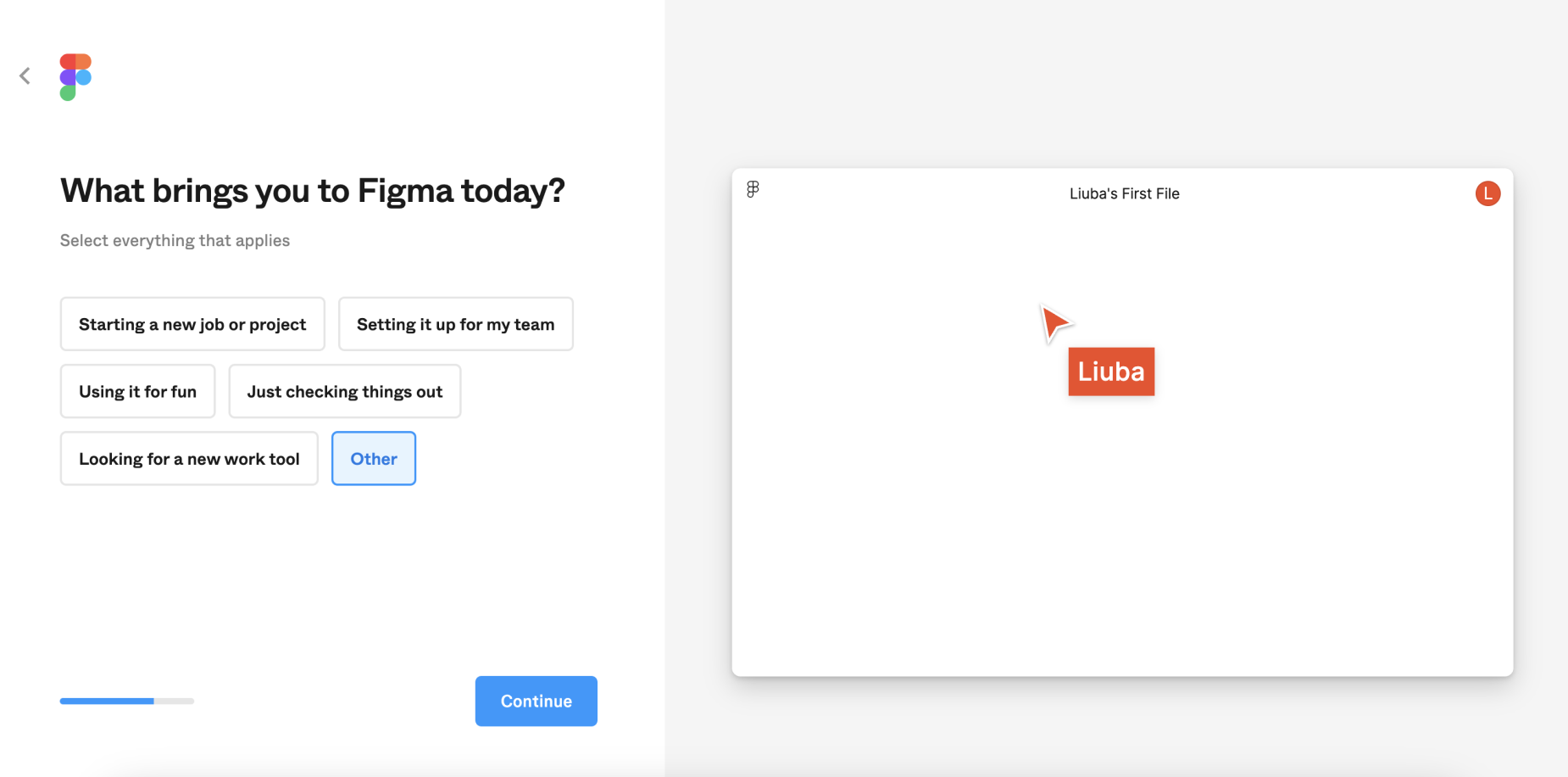
    What do you need Figma for right now? This is the next question. Since you do not currently aim to create commercial projects, and most likely each of you has your own goal: to test your skills as a designer, to learn the program, or anything else, the easiest option would be to choose Other (Other).

    Survey from Figma

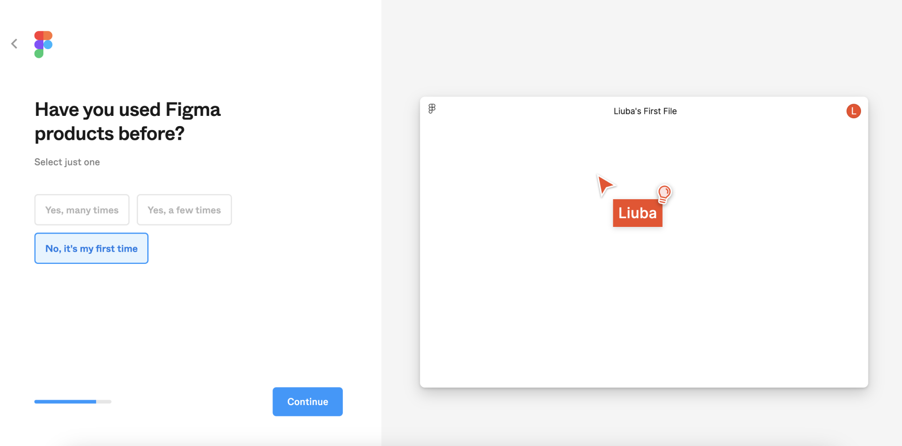
    The next question: have you used Figma before? Your answer will determine whether the program offers to go through a quick introduction to the functionality (tutorial). Since we will study all the main functions of the program together, you can click either the first or second answer option: Yes, many times (Yes, many times) / Yes, few times (Yes, few times).

    Have you used Figma

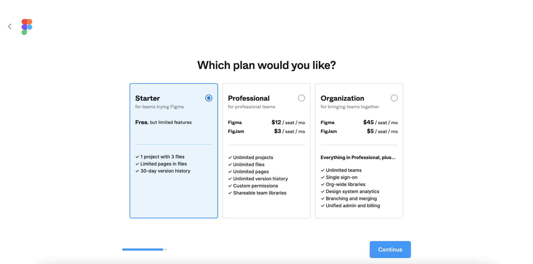
  8. Choose a pricing plan. In our case, this will be the free (free) Starter plan. It has no significant limitations as long as you work on your projects independently, learn the program's functionality, and create designs for your own needs. Figma also allows you to create one full project with three files. You can invite other participants to it and manage access rights to this project. You will be able to grant and revoke editing rights, limit viewing, and protect your work from copying.

    Choosing a Figma pricing plan

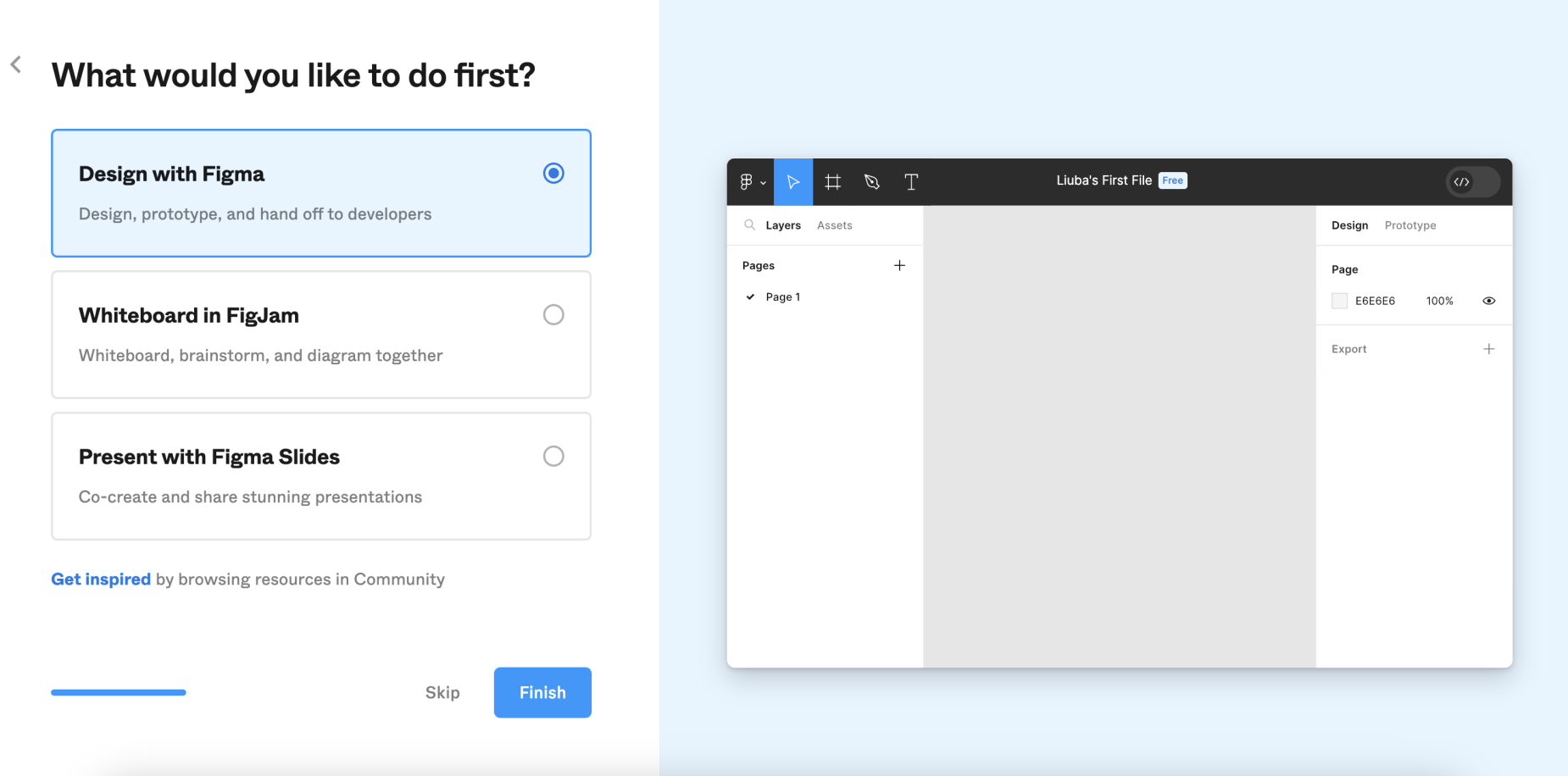
    Next, Figma offers you to immediately choose one of three interaction options: creating design in a file (what we will be doing 95% of the time), creating a board in FigJam (an additional Figma product that is convenient for organizing research results and conducting joint "brainstorming" sessions), or open Figma Slides (functionality for creating presentations). I recommend that you skip this step to avoid confusion.

    Figma functionality

  9. All set! — Figma is ready to work. Maximize your browser to get the most useful space. There are a few nuances before we start;

    Figma is ready to work

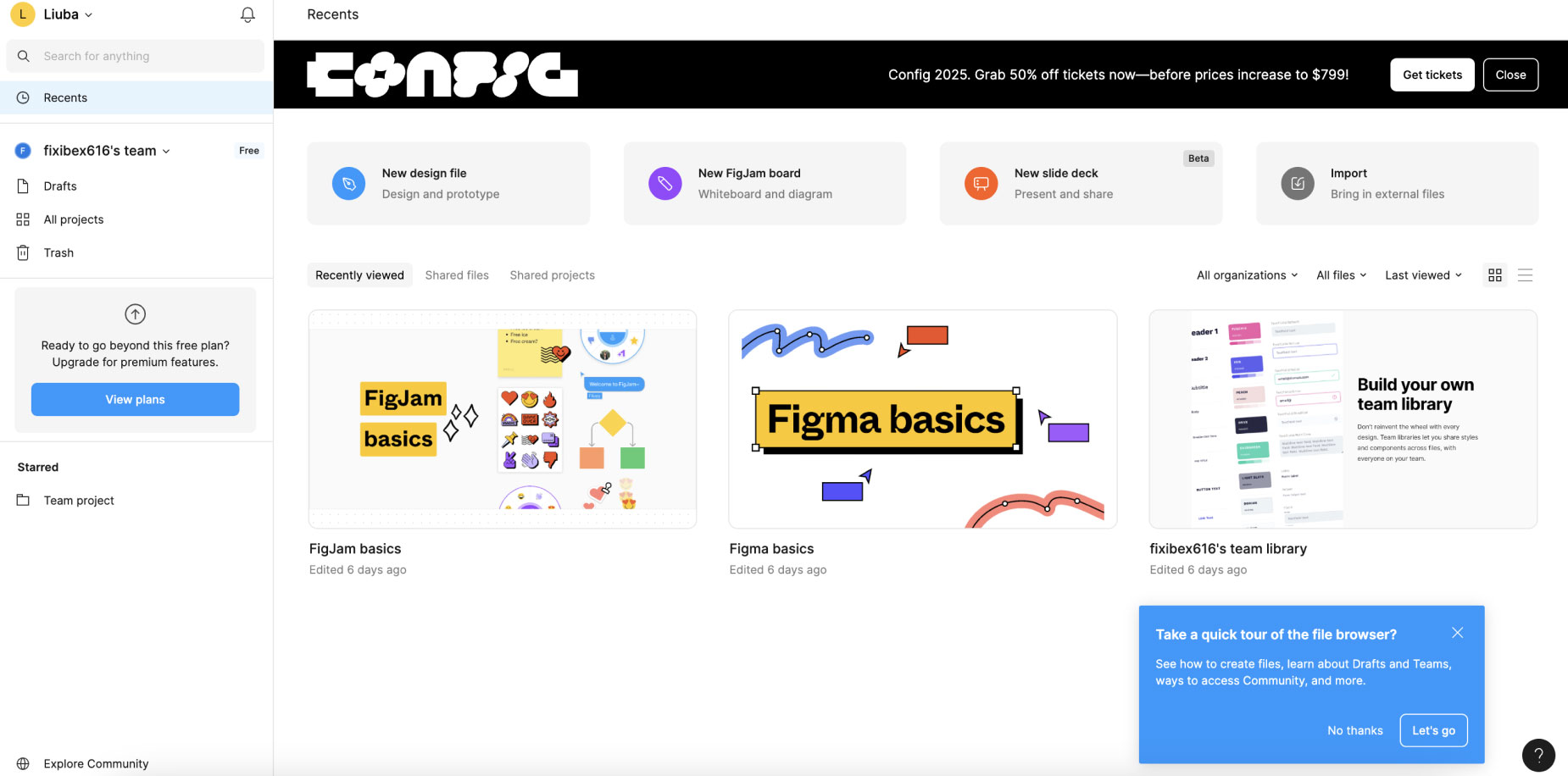
  10. As you can see, we have been redirected to the Figma page with recently edited projects (files). Figma saves all your projects on a remote server (also known as "in the cloud"). This means you do not need to save anything on your computer; everything is done automatically. On the right, you can see images of your projects. Look, Figma has added a few for you to explore.

    Page with recently edited projects in Figma

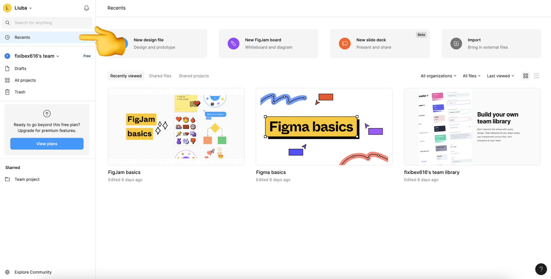
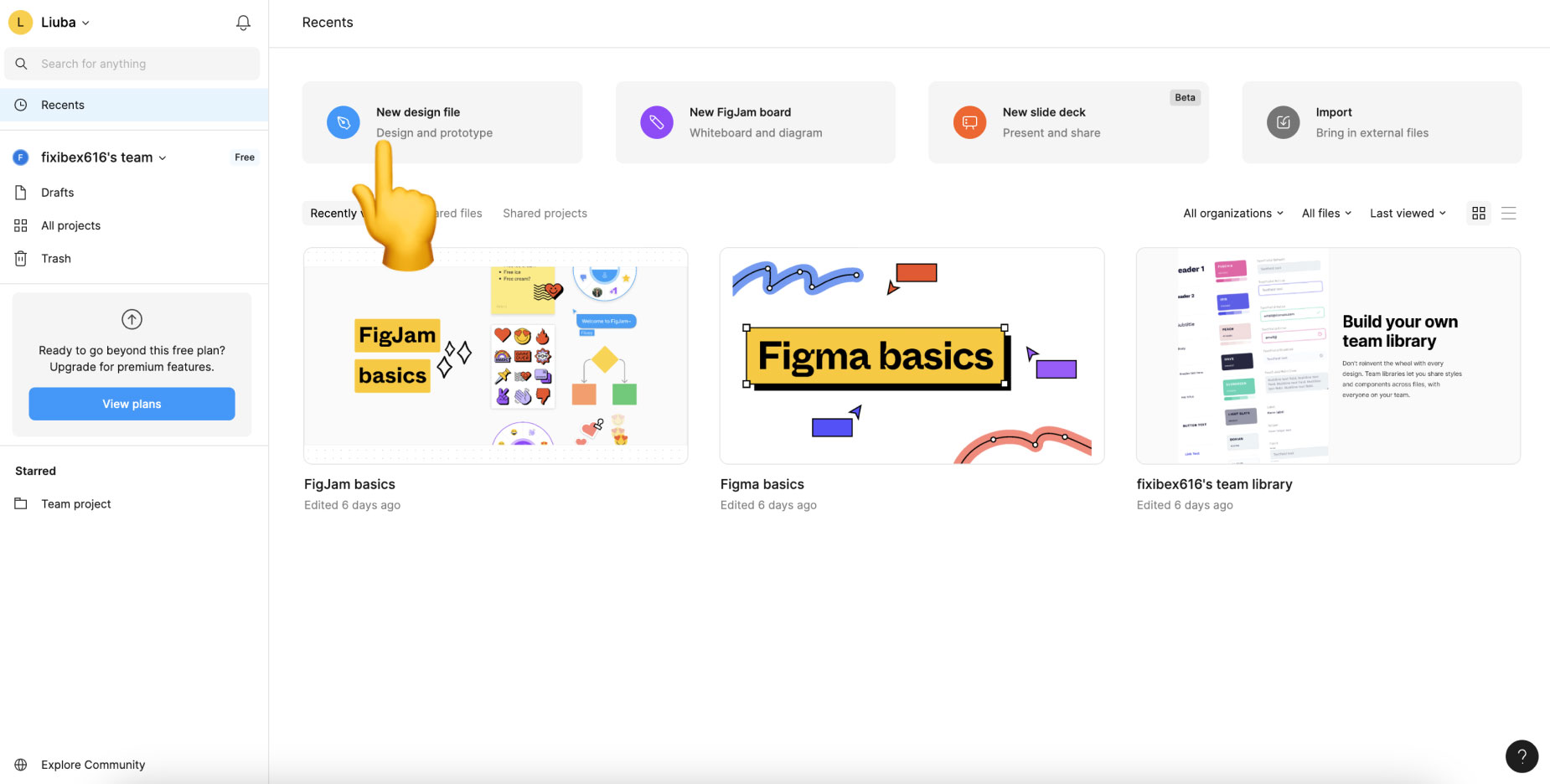
    To create your first project, you need to click the "New Design File" button. Now we can move on to exploring the Figma interface.

    Creating the first design file

Main Page of Figma and Creating a New File

You have already had the opportunity to familiarize yourself with Figma's pricing plans and have seen that we have chosen the simplest and free plan for now. It allows you to create an unlimited number of projects for personal use. The Figma developers called them drafts (Drafts).

On the main screen to the left, you will see a list of sections:

  • Your Name – the first item at the top. Here you can set up your profile: change your name, email address, and password. Other settings are not important at this time;
  • Search – search for projects by name. If you have many files, this section can be useful;
  • Recent – Recently opened files. Everything is organized in chronological order. At the top are the recently used files;
  • Drafts – drafts (with full functionality) for personal use, learning, etc.
  • All Projects – these are essentially folders that allow you to conveniently separate your personal and commercial work. They are designed for easy sorting of files. In the free version, we have access to only one project, into which we can move files from our drafts and get the opportunity to test the functionality available with a subscription for free.
  • Trash – archive of deleted projects. You can perform two actions with them: restore or delete permanently.
  • Community – community contributions: templates, plugins, and other useful resources. We will talk about them in the next lessons, it's still too early;
  • Note that you can perform various actions with files (create a copy, delete, rename, share, etc.) by clicking on their thumbnail on the main page. See the video below.


Overview of the Figma Interface

The interface of any graphic editor can be conditionally divided into several key elements. Each of them performs a specific function and is actively used during work. Let's consider each part:
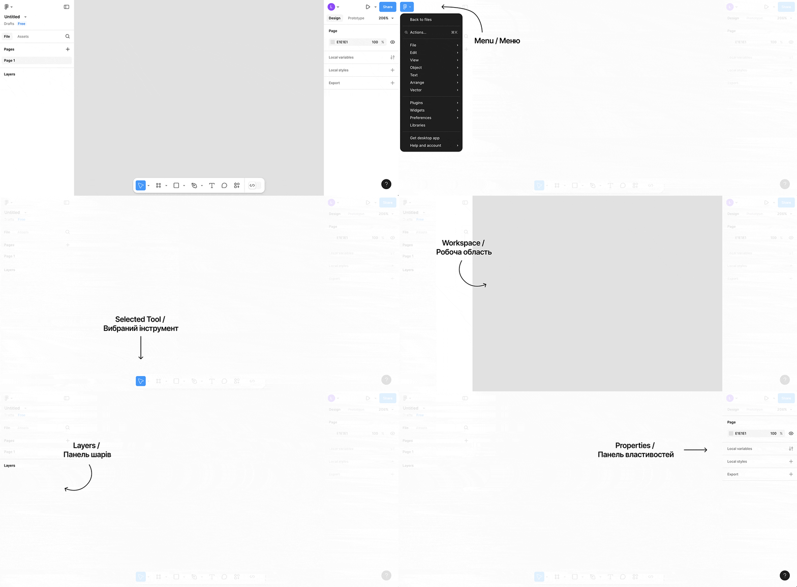
Overview of the Figma Interface

  1. Main Menu — consists of a list of commands, both global (not related to the project we are currently working on) and contextual, which apply, for example, to the selected object. Let's consider a few examples. Global command: go to the list of projects (files). Local command: Delete the selected object. We will discuss all commands separately in detail. For now, you just need to know that when you click this button, a huge menu with commands that are executed when clicked appears;
  2. Toolbar — each icon on the toolbar is a separate tool. To select it, we click on the icon, and it gets highlighted in blue, indicating that everything is ready to work. After selecting a tool, it is used in the workspace (next point). For example, there is a rectangle drawing tool. Today we will get acquainted with several useful instances;
  3. Workspace (Canvas) – all the magic happens here. Here we draw shapes using the tools. We select primitives to change their properties (for example, color) in the properties panel (next point);
  4. Properties Panel — each type of object has a unique set of properties. For example, a rectangle has size, position, and color. Text, in addition to the properties of the rectangle, also has line spacing and alignment (left, right, center). Depending on the selected object, the panel can change beyond recognition;
  5. Layers Panel — stores a list of all created objects. Additionally, here we determine the order in which to display them (more on this later). In the layers panel, objects can be selected just like in the workspace. It is just another way to select an object for editing or changing its properties.

I know it sounds complicated, but essentially we have the following sequence of actions when we create a design:

  1. Selecting the tool — on the toolbar;
  2. Using the tool — in the workspace. For example, adding a rectangle or text;
  3. Selecting an existing object — using the workspace or the layers panel;
  4. Modifying the selected — using the properties panel (changing position, size, color) or using the context command from the main menu (making a copy);
  5. Changing the display order of objects — using the layers panel;
Each of these points you repeat hundreds of times in different sequences to achieve the desired result. Now let's move on to practice and everything will become clearer.

Drawing a Rectangle

Rectangle – a commonly used primitive. It can be used to draw not only rectangles and squares but also circles. To draw, follow this sequence:

  1. Select the Rectangle tool — click on the rectangle icon in the toolbar. Or press the R key on the keyboard. The button should be highlighted in blue;
  2. Set the starting point — for this click and hold the left mouse button anywhere in the workspace to set the "start" of the rectangle. Do not release the left mouse button;
  3. Set the dimensions — move the mouse in any direction while holding the left button – voilà – the rectangle starts to be drawn;
  4. Set the endpoint — now release the left mouse button to finalize the dimensions of the shape. Done!

This is what it looks like in action (to expand the video to full screen, use the second button at the bottom right of the player):


Let's analyze what happened. During and after the rectangle is displayed, you will notice that it has a blue border – this means that the object is selected. This is called a bounding box, which means limiting frame. Below it, the size of the object is indicated in pixels – we talked about them in the previous lesson.

Properties Panel on the right is instantly adjusted to the selected rectangle. The following parameters have appeared:

  • X – object position on the X-axis (horizontally). The origin point is at the top left (we will move the rectangle now and you will understand everything);
  • Y – object position on the Y-axis (vertically);
  • W – width (pronounced wiz) or the width of the object;
  • H – height (pronounced hight) or the height of the object.

All these properties are specified in pixels. To change one of them, simply click on it and enter a new number from the keyboard, then press Enter. The object will react instantly.

In the layers panel on the left, a row "Rectangle 1" with a rectangle icon has appeared. When a primitive is created, a new layer is automatically created. It informs the graphic editor in which order to draw the shapes. For now, this doesn't make sense, but when there are many objects, I will show the usefulness of layers with an example.

Draw two more rectangles. Note that each time you need to select the rectangle tool again, as it resets after use. Also, after each new shape, a new row appears in the layers panel.

Selecting, Moving, and Resizing Objects

First, make sure you have selected the Move tool (pronounced moov), which means to move. The icon looks like a cursor and is the first one on the toolbar. For a quick call, press V. Next:

  • To select an object, simply click on it in the workspace. You can also click on the layer name in the left panel. Each time you select, the properties panel and layers panel are updated. To deselect, click on an empty space in the workspace or layers panel;
  • At the corners of the selected object are white squares, which can be used to resize. To do this, hover the cursor over the square, hold down the left mouse button, and move it. Release the left mouse button to apply the new size;
  • To move an object, you need to hover the cursor over it, hold down the left mouse button, and drag the mouse. At this moment, the object will be selected and will follow the mouse until you release the left button.

Let's practice with rectangles:


During movement and resizing, the corresponding parameters on the properties panel change. But these are just the simplest ways to interact with shapes. There are a few less obvious techniques, but working with them is much more efficient:

  • If you hold down the Shift key before starting to move, the object will shift exactly vertically or horizontally depending on where you move the cursor after holding down the left mouse button;
  • You can resize the object by dragging one of its edges, not the corner, to change only the height or width;
  • To maintain proportions while resizing the object, you need to hold down the Shift key. In this case, the aspect ratio will be preserved and, for example, a square will remain a square;
  • You can precisely adjust the position of the shape using the arrow keys on the keyboard. One press will move the selected object by one pixel in the corresponding direction. To increase the step to 10 pixels, you need to hold down the Shift key while pressing the arrow. You can also hold down the arrows for continuous movement.

There are other techniques, but this will be enough for comfortable work for now. Try out new ways to control objects:


Navigation

The space you see in the workspace is just a small part of it. Imagine a video camera is focused on a huge canvas. You can only observe what the lens is focused on. Of course, you can choose a comfortable position and even zoom in to see the details. Or zoom out to assess the design as a whole. Let's explore new techniques for convenient navigation through the project:

  • To move the camera hold the spacebar while simultaneously holding the left mouse button and move the cursor in the desired direction. Objects in the workspace will start to move according to the new camera position. As you can see, there is a lot of empty space around. During this manipulation, the cursor will take on a hand icon, indicating that it is in a different mode. Instead of the camera analogy, you can also imagine that we are moving the canvas on which the figures are drawn;
  • In the upper right corner, the current camera zoom level is displayed. For example, 100% means that we all see 1 to 1, i.e., the actual size. 200% means everything is zoomed in twice. 25% means everything is reduced to a quarter. To zoom in, press the + (plus) button. To zoom out, press - (minus). It is even more convenient to use the mouse scroll wheel. If you are on Windows, just scroll it to zoom in/out the camera. On MacOs, you also need to hold down the Command button;
  • To quickly reset the zoom to 100%, press Shift + 0. If you select a layer on the left panel by clicking on it, the specified combination will move the camera so that the content is centered in the workspace. This is convenient when you have lost sight of the object you need and want to focus on it;
  • If you need to see everything on the page – press the combination Shift + 1;

These three techniques allow you to navigate the space very quickly:
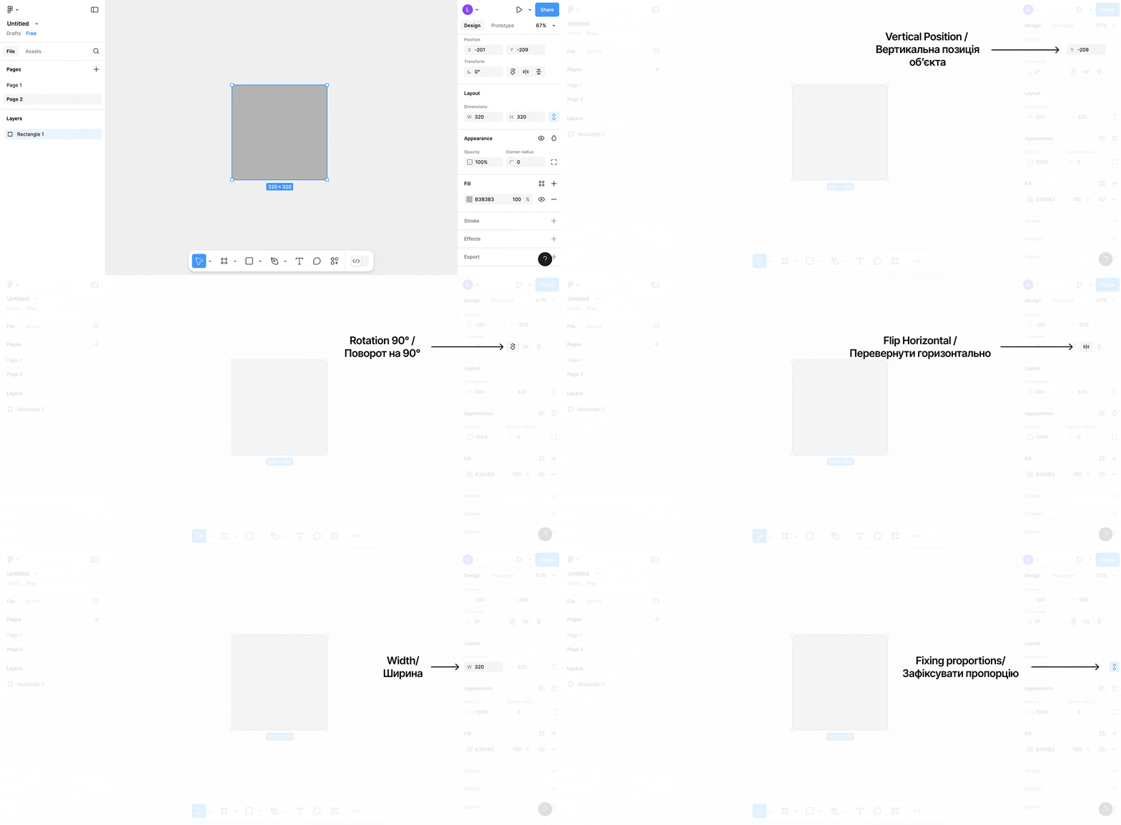


Object Properties Settings

Now for the most interesting part. Select the rectangle and pay attention to the properties panel. Most of these parameters are available for all types of objects. Let's take a closer look at what and how can be configured.

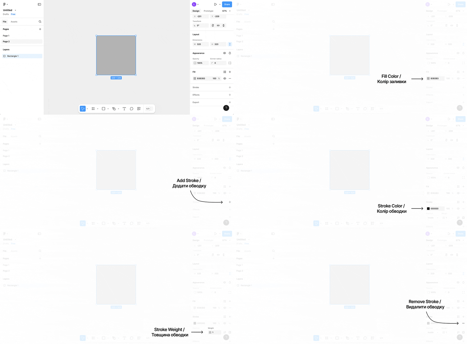
Rectangle Properties

  • Position and Size — after clicking on the field, you can increase/decrease the value in increments of one using the up/down arrow buttons. To increase the increment to 10, hold down Shift. It is also worth noting that basic arithmetic operations work in these fields. For example, you can add a number to the current value by typing +8 and pressing Enter. Subtraction, multiplication, and division operations are also supported. To quickly move to the next property, press Tab. To go to the previous one, press Shift + Tab;
  • Lock Proportions — allows you to maintain proportions when changing the width or height through the property fields;
  • Rotation Angle — allows you to rotate the object by any angle;
  • Corner Rounding — sets the radius for rounding all corners;
Rectangle Properties

  • Fill Color — sets the color of the rectangle. Clicking will open a window, after which you need to select the appropriate color and its saturation. Then click on the cross in the upper right corner of the window or anywhere outside the window to save the changes;
  • Add Stroke — adds a stroke effect along the outline of the shape. After activation, new settings will appear;
  • Stroke Color – a similar window will appear upon clicking, just like for the fill color;
  • Stroke Thickness — specify the thickness of the line;
  • Remove Strokes — if you do not need it.

You will have more than enough of these properties. In the following lessons, we will get to know them in more detail. And now let's see how this can be used. In particular, the most interesting aspect for us is the ability to set the color and round the corners of the shape:


Color Picker Window

Let's take a closer look at the color picker window. It allows you to flexibly adjust its hue, saturation, and even transparency. Additionally, each color has its precise value that can be copied and pasted into the fill or stroke color of another object.

To do this, you need to click on the field with the color value, highlight it, right-click, and select Copy. Next, we select the object to which we want to apply the copied color, click on its fill color or stroke color field, highlight all the values, right-click, select Paste, and click. It is much faster to use the combinations Command + C, Command + V for MacOs and Ctrl + C, Ctrl + V for Windows.


There are even faster techniques for copying and pasting colors, but we'll cover that in the next lessons. For now, let's master the methods shown.

Adding Text

This is the simplest part. First, select the Text tool on the toolbar. Its icon looks like a large letter T. Or use the hotkey T. Next, follow this sequence of actions:

  • Set the boundaries of the text block — this is done just like creating a rectangle. These boundaries indicate where the text will automatically wrap to a new line if the width is insufficient. Additionally, they set the frames against which the text will align;
  • Enter the text — after creating the boundaries of the text block, a blinking cursor will indicate that it is time to enter the text. To save our text, press Escape;
  • Change the appearance of the text — now we can set the font, color, size, vertical and horizontal alignment. Alignment allows you to specify which edge to place the text (left, right, or center). All these parameters are located on the properties panel. Make sure the text block is selected.

The entire process is shown in the video below. There will be separate lessons dedicated to working with text, as this is a very extensive topic.


Drawing a Line and an Arrow

And the last pair of primitives for today. The process of creation is also very similar to the rectangle, and we have already covered all the important properties. To select the Line or Arrow tool, you first need to click on the arrow next to the rectangle icon, and then choose the desired tool from the menu. There are also hotkeys for quick activation: Line - L, Arrow - Shift + L. Let's watch the video and try it ourselves:


There is one useful tip. If you hold down Shift while creating a line or arrow, the shape will be drawn at an angle that is a multiple of 45 degrees.

Why are layers needed?

I will draw an analogy with the real world to clarify the concept. Imagine that you have several A4 format files. Those transparent files in which office paper is inserted. So, in each of these files, we insert one cut-out figure made of colored cardboard (circle, rectangle, etc.). We now have several figures in the transparent files. Now we insert them into a folder and turn all the files to one side. Now we can see that some figures overlap others. In this analogy, the folder is the layers panel, the file is the layer, and the cardboard figure is a primitive within that layer. Let's see why layers are needed in Figma:

  • Organize and group objects — in the following lessons, we will learn to create groups and frames that allow collapsing several layers with primitives into one. Layers can be renamed, allowing them to be grouped by content (for example, buttons, lists, windows, screens, etc.). Additionally, groups and frames can be nested within each other, creating entire hierarchies. All these capabilities allow for quick and convenient handling of very large projects. Continuing the analogy with the real world, imagine that a transparent file can contain several cardboard figures;

  • To enable selection and focus on an object – additionally, the layers panel has a search by name;

  • Determine the order of appearance – layers in the same panel are arranged one after another in a list from top to bottom. The highest layer will always be drawn first, and the lowest last. The situation is the same with files; figures in upper files overlap those below.

    Take a look at the visual example below. To change the drawing order, simply drag the layer in the left panel up or down. Imagine that we are rearranging files in the folder above or below to achieve the same effect.


And now let's try to formulate the definition of a layer in Figma. Layer (layer) is an abstract object with a name that represents the primitive (shape) placed within it according to the drawing depth. Layers can be combined into frames (that is, grouped by meaning), but we'll discuss that in the next lesson.

Useful Commands

  • Undo Last Actions — sometimes you can accidentally do something and need to go back in time a few actions. To do this, press Command + Z on MacOs or Ctrl + Z on Windows. You can perform this multiple times until you revert to the desired state;
  • Create a Duplicate of an Object — select the desired object and press Command + D on MacOs or Ctrl + D on Windows. A copy will appear in the same location as the original and will be selected. You can immediately start working with it, for example, moving it with the arrow keys, which is very convenient;
  • Delete an Object — select the desired object and press Delete. It will immediately disappear from the workspace and the layers panel;
  • Select Multiple Objects at Once — hold down the left mouse button and drag the cursor in any direction so that several objects fall within the appearing box. Then release the left mouse button and you will have several selected objects. What can you do with them now? You can move them all together as one object or resize them. If the objects are of the same type, you can change the properties for all of them at once.

Homework

From now on, this course is designed for independent study and completion of homework assignments. I understand that some tasks may be challenging for you.

For additional support, use the chat in Telegram. Here you can ask questions related to the lessons or view examples of correct execution from other students.

The chat is not available for citizens of Russia.

Task 1. Choose one website and try to closely recreate its main page (the first screen is sufficient), using the tools from this lesson. Try to match similar colors, sizes, proportions of blocks, and fonts. Send links to the images of the recreated screens. You can take a photo with your smartphone if you don't know how to take a screenshot. Also, don't forget to specify the address of the website you are recreating. Share the difficulties you encountered;

Task 2. Draw one icon from each row listed below, using the tools learned. You should have a good understanding of the properties of shapes to complete this task. There is no need to try to replicate the icons exactly; they can be slightly different;
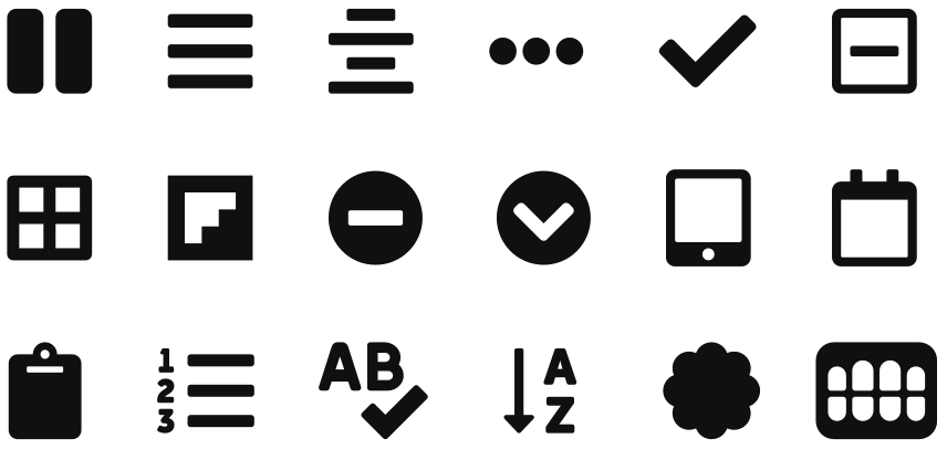
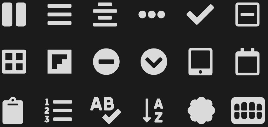
Homework on drawing iconsHomework on drawing icons

Task 3. Redraw one wireframe from the fourth lesson of your choice.

Task 4 (increased difficulty, optional to complete, if desired). Redraw another website. Draw the remaining icons.

If you cannot complete a task, read the lesson again and try again. If you still can't do it, write in the comments or in direct messages. Remember, there is a large volume of work concentrated here, do not expect to do everything in one evening.

Conclusions

The first practical lesson is coming to an end. You have learned the minimum information that we will gradually build upon. Next, we have a few more parts about the basics of Figma, and only then will we return to design theory.

Make sure to complete all the homework. Creating and manipulating primitives, as well as navigation, should be done by you at the level of reflexes (without thinking). This will come with time and practice.

There is a lot of information, so reread the lesson again in a few days to not forget anything.

Take quiz

To pass the lesson and check your knowledge, you need to correctly answer 80% of the questions from the quiz. To do so, you need to login and enroll to the course or signup, if you haven't done so yet.

Take quiz

Leave a comment

Place the handle into the purple zone

Comments

Marho12 August 2025 23:12  
I had a lot of fun with the first task, it was very interesting to replicate the design
https://www.figma.com/design/cz3rxF7GTiVo1Cy6EDPHLv/Untitled?node-id=0-1&p=f&t=sNeGBHH06VL7Xgua-0

Comment from frusia.pro:

Hello, Marho! Here are my comments on each task:

Task 1. Redesign the website. The fact that you enjoyed the process is a very good sign. Maybe design is your profession :) It turned out very well.

Task 2. Redraw all the icons. I see that you have redrawn all the icons, great job!

Task 3. Redraw the wireframe from the previous lesson. I see one wireframe, but it is from the lesson itself, that is, for the food ordering app, not your planner. But this task is accepted since you did everything in Figma in the previous lesson, not in a notebook. So everything is good :)

Task 4. Redraw all the icons and two more websites (optional). You have redrawn all the icons, well done!

Great job, move on to the sixth lesson!

Ruslana18 March 2025 16:28  
I completed tasks 1-3, and about half of 4
https://www.figma.com/design/NpFute24BtuEukTxLnJeYH/%D0%A3%D1%80%D0%BE%D0%BA-7?node-id=0-1&t=qkPBYXg1pqrAzDDU-1

Comment from frusia.pro:

Hello! You did a great job, well done! I have a few comments to make this homework even better.

Task 1. Everything is perfect, I see the main page of Pinterest has been redrawn. You did a wonderful job with the icons, fonts, and overall sizes.

Task 2. Everything is very good, the icons turned out to be similar and detailed.

Task 3. A great start, the screen has been redrawn very well. But I see only one screen, not a whole wireflow. That is, the rest of the screens for the scenario are missing. This is a big task, no one said it would be easy :)

Task 4. You have redrawn all the icons, great job!

Only the rest of the screens for the third task are missing. I am waiting for the additions. I want to note the very high level of the completed work, it is clear that you are well acquainted with Figma.

skazhena cherepakhaUkraine flag підтримує ЗСУ 24 November 2023 14:01  
ok, I practically fixed everything except for the first one -- close the layout and add a background. I'm talking about the hanging elements. For some reason, I can't hide them (

Comment frusia.pro:

I see you've found a solution, move on to the next lessons.

skazhena cherepakhaUkraine flag підтримує ЗСУ 22 November 2023 14:28  
Thank you so much for the course! I fell in love with working in Figma, I'm as happy as a little child )).
Here’s what I came up with. I’m eagerly waiting for feedback.
https://www.figma.com/file/nvSYfkq63m2kn0QDaZHriK/%D0%9D%D0%B0%D0%B2%D1%87%D0%B0%D0%BD%D0%BD%D1%8F-%D1%83-Frusia.Pro?type=design&node-id=34-2&mode=design&t=wVQMrLResBoDtqYc-0

Comment from frusia.pro:

Please! I'm happy for you :) I left comments on three of the tasks you completed in the Figma file. I will be waiting for the corrections.

Antanas Romualdas Kolyta10 December 2022 05:42  
A very good presentation for those mastering Figma
I believe I have found the optimal option.
Everything is presented deeply and clearly. No fluff. If I read all of this carefully and practice, I will gain complete clarity about Figma.
Zakhar8 November 2022 13:27  
https://www.figma.com/file/5dFKsw7QGNdyrW2sh8rK9c/Untitled?node-id=0%3A1

Due to the high influx of those wishing to take the course, I am making the homework checks paid. $30 (at the current exchange rate), I will donate 10% to the Armed Forces of Ukraine. For one donation, I will check the homework for all lessons.

For details, write to my Instagram direct @frusia.pro

VarvaraUkraine flag підтримує ЗСУ 31 October 2022 20:13  
https://www.figma.com/file/QIwTSpFf9pMvfRDCs0z1Rp/UX%2FUI-Frusia?node-id=128%3A2

Comment from frusia.pro:

Task 1. You did a great job, well done!

Task 2. I didn't find any mistakes in the icons, everything is very detailed. I commend you for deciding to draw all of them.

Task 3. I see your drawn flows, awesome!

Task 4. You also managed to recreate two other websites. I especially want to praise you for using the Diia font and capturing the style very accurately!

Yuliya LepenkoUkraine flag підтримує ЗСУ 7 September 2022 14:32  
Good day! Thank you for the feedback. I tried to correct the mistakes.

https://www.figma.com/file/xSk0BHiIjCZakBmALVRkmP/icons?node-id=9%3A3

Comment from frusia.pro:

Now everything is much better, well done! Move on to the next lesson.

Yuliya LepenkoUkraine flag підтримує ЗСУ 3 September 2022 15:14  
https://www.figma.com/file/xSk0BHiIjCZakBmALVRkmP/icons

Comment from frusia.pro:

Task 1. Redrawing the website. I know this is your first attempt, so I don't count this as a mistake, but in the future, try to design websites with a width of 1920 or 1440 px. These are standard monitor or laptop screen sizes used by designers in their layouts. Also, make sure that the size of your texts is never smaller than 12. For example, these texts are too small and are positioned too far from the photo https://monosnap.com/file/K1q83Vq4M2hacOKTlkUEyzsENAEGvA. Regarding the reproduction of the site – there were almost no questions, it was drawn very similarly.

Task 2. Icons. Some icons have inaccuracies in the drawing. I'm sending a screenshot https://monosnap.com/file/YGf23H3BTArJ3eT3dhJmpoYti0jpVe:

– 1 and 2 – the line width should be greater;

– 3 – the checkmark is squished in width, try to reproduce it with rectangles over the original image;

– 4 and 5 – these icons should be taller;

– 6 – pay attention to the rectangles next to the numbers, they should not have such rounded corners.

Task 3. Wireframe. Everything is great!

Task 4. Redrawing another website. The same comments apply here as in task 1, regarding font sizes and layout width.

MahrharytaUkraine flag підтримує ЗСУ 19 August 2022 16:34  
Good day! The homework was very interesting. At first, it seemed that it would be difficult and I would never finish it. But the further I went, the easier it became to navigate. The task of drawing the main page develops creativity.

https://www.figma.com/file/CgNaoc2ojvJcUnA4AAehuD/%D0%A3%D1%80%D0%BE%D0%BA-4.-%D0%97%D0%B0%D0%B2%D0%B4%D0%B0%D0%BD%D0%BD%D1%8F-1%2C-2%2C-4.?node-id=0%3A1\

I didn't quite understand how to do the 3rd task, what exactly needs to be done?

Comment from frusia.pro:

Good day! Yes, it is always very difficult at first, but then everything falls into place

Task 1. Redraw the website. Very high-quality work, I want to commend you for the size of the main frame being 1440 pixels and overall for the detail, structure, and accuracy of the drawn layout (all icons and logos are perfectly reproduced). I have a few comments to further improve the layout:

  • Use a font size of no less than 12 pixels;
  • do not use small fractions in font sizes. For example, I saw you had 11.5,
  • round the sizes of elements to whole numbers. For example, if you look at the size of the user pics of the video authors (avatars), it will be 35.72 by 36.66 pixels, but it should be 36 by 36 pixels;
  • for texts in multiple lines, use one text block. Your headings in the video are made through two text blocks. To adjust the spacing between lines in the text element, use the Line Height property, which is located right under the dropdown menu for font weight (in your case, it says ExtraBold).

Task 2. Redraw the icons. You have redrawn all the icons, great job. I also see that you already know how to use some boolean operations, well done!

Task 3. Redraw the wireframe from the previous lesson. As far as I remember, you did this task right in Figma (you had the Makeup site). But if you had drawn the wireframes in a notebook, you would have needed to redraw them. Therefore, this task is automatically credited

Task 4. Redraw two more websites. I see Youtube Music and TheStartupBros. Everything here is very good, the fonts and icons, as well as the other elements turned out to be very similar.

You are doing very well, I am waiting for corrections to the first task

Viktoriia HryshchenkoUkraine flag підтримує ЗСУ 9 July 2022 16:09  
Good day! Thank you for the response! I have corrected it)

https://www.figma.com/file/fPVAREH9cjVynZqap7NNck/%D0%A3%D1%80%D0%BE%D0%BA-4.-%D0%92%D0%B8%D0%BF%D1%80%D0%B0%D0%B2%D0%BB%D0%B5%D0%BD%D0%BE?node-id=0%3A1

Comment from frusia.pro:

Hello! Yes, everything is good now, please proceed to the next lesson

Viktoriia HryshchenkoUkraine flag підтримує ЗСУ 7 July 2022 15:20  
Good day!
I really enjoyed completing the tasks, I couldn't tear myself away from the computer!) But when I first read the tasks, they all seemed very difficult to me, but then I gradually started to complete them, figure out Figma, and finished everything)

https://www.figma.com/file/eO9DJ0Vn8gnkJmcM73fflM/%D0%A3%D1%80%D0%BE%D0%BA-4?node-id=0%3A1

Comment from frusia.pro:

Good evening! I'm glad you liked it

Tasks 1 and 4. Redraw the websites. You have redrawn all three websites, great job. I see only one problem: the main frame is too wide. Try to redraw at least one website so that its frame width is 1440 pixels. This corresponds to the screen width of most laptops (please stick to this size in the future). Accordingly, the sizes of all elements inside will change based on the new width.

Tasks 2 and 4. Redraw the icons. You have drawn all the icons, good practice, everything is fine.

Task 3. Redraw the wireframe from the previous lesson. I see the wireframe for the new function scenario from the previous lesson for the book selection test. Everything is correct.

I am waiting for corrections to the first task. It is enough to redraw just one website in the new size

Yana UsachovaUkraine flag підтримує ЗСУ 1 July 2022 17:08  
Good evening, very interesting task, thank you, I hope mine is at least a little similar
https://www.figma.com/file/2Px8chcuhtqdFvWFU3eUgx/Untitled?node-id=0%3A1

Comment from frusia.pro:

Good evening! Please

Task 1. Redraw the website. It turned out quite well, good job!

Tasks 2 and 4. Redraw the icons. You drew all the icons, everything is great. In terms of sizes, they differ a bit overall, but it's not significant.

Task 3. Redraw the wireframe from the previous lesson. I see the screen with the list of letters, everything is good, it counts.

Move on to the next lesson

Mariia SUkraine flag підтримує ЗСУ 29 June 2022 23:59  
https://www.figma.com/file/dWGWKQPPPZULkadAnpuvMX/Frusia?node-id=0%3A1

Comment from frusia.pro:

Hello!

Task 1. Redesign the website. You did very well: high detail, the icons turned out similar, great job!

Tasks 2 and 4. Redesign the icons. You redrew all the icons. Everything is very good, I only have a note about the chevron icon (second row, fourth from the left): it turned out like a mirrored checkmark, although this shape should be symmetrical.

Task 3. Redraw the wireframe. You already had everything in Figma, so it counts. Plus, you redrew the main page. You worked well.

You are doing well, move on to the next lesson

AnnaUkraine flag підтримує ЗСУ 27 June 2022 12:40  
I revised my mistakes, specifically: I detailed all the blocks.
https://www.figma.com/file/FGYebaPYrSfAFmQRpzZCjn/Untitled?node-id=0%3A1

Comment from frusia.pro:

Hello! Yes, it has become much better, well done! Please note that the contrast can be made a bit higher, because, for example, the text on the button "Order" is somewhat hard to distinguish. But overall, very good, the task is accepted. Move on to the next lesson

Iulia K.Ukraine flag підтримує ЗСУ 25 June 2022 20:09  
Good evening, here is the homework for lesson 4 :)
https://www.figma.com/file/lgmsAkkSUVzybS6R47Sh6f/%D0%B4%D0%B7%2C-%D1%83%D1%80%D0%BE%D0%BA-4?node-id=0%3A1

Comment from frusia.pro:

Good evening!

Task 1. Redraw the website. I see two screens from Youtube Music, everything looks very good. Even the frame size matches the width of a typical laptop. I also see that you have already figured out the gradients, well done!

Tasks 2 and 4. Redraw the icons. You have redrawn all the icons. It turned out to be very similar, everything is done correctly. I can only give one piece of advice: for numbers and letters, it's better to use the Text tool (text block), specifying a large font size.

Task 3. Draw the wireframe from the previous lesson. Everything is very good, I especially liked the last screen with the map. There’s nothing wrong with the site changing its name while you were doing the homework I have a small piece of advice: do not use fonts smaller than 12. I found size 11 on the element indicating the number of stops.

Great job, move on to lesson 5

AnnaUkraine flag підтримує ЗСУ 20 June 2022 23:54  
https://www.figma.com/file/FGYebaPYrSfAFmQRpzZCjn/Untitled?node-id=0%3A1
This was really difficult for a first attempt. Many questions, but I think I will master it over time.
Your material is very valuable, thank you for your work.

Comment from frusia.pro:

Good day, I'm glad you liked it! Feel free to ask questions, I will try to answer or at least point you in the right direction.

Task 1. Redraw the website. Everything is good, I really liked how you recreated some icons, especially the wishlist.

Task 2 and 4. Redraw the icons. You redrew all the icons, well done! Some have extra shadows, but that's a minor detail.

Task 3. Redraw the wireframe. The first screen is good, but there are some comments for the rest. Images are marked with a crossed rectangle. On your second screen, the input field for the address is marked this way (it should be marked with a rectangle) and the text block (it should be marked with several horizontal lines). The same goes for the other screens; buttons should be shown and labeled with what they do. In other words, my expectations include a level of detail no less than what you drew in the previous lesson on paper.

Good start, but the third task needs a bit more work, I’m waiting for the additions

Iryna S.Ukraine flag підтримує ЗСУ 18 June 2022 20:52  
Good day! I am sending the homework for lesson 4.
https://www.figma.com/file/DQpfkbv7kMTPnI9or7ECcP/Homework-4?node-id=0%3A1

Comment from frusia.pro:

Good evening!

Task 1. Redraw the website. Everything is very good, drawn 1 to 1.

Tasks 2 and 4. Redraw the icons. You worked well, I see all the icons are drawn very similarly. I can nitpick about the discrepancies in sizes, for example, the icon in the bottom right corner. But these are minor details.

Task 3. Redraw the wireframe from the previous lesson. Everything is good. At this level of detail, you can already insert real text and thumbnails (images) for the video.

Task 4. Redraw two more websites. I see another website that is drawn very well. You just need to remove the rounding of the tabs in the middle (search engine, employer). I was initially very surprised at how accurately you reproduced the flag on the left, and then I realized that you got the svg file from the website itself. It seems you are very good at using the browser inspector, well done!

You are doing very well, move on to lesson 5

Anna SmirnovaUkraine flag підтримує ЗСУ 6 June 2022 14:49  
Good day!
This is a very cool course!
The information is presented very clearly and easily, and the assignments are structured in a way that allows for real improvement.
Thank you!
I am sending a link to the completed assignment:
https://www.figma.com/file/XLJ8Id8aNBwcOC9ss2O5ut/UI%2FUX-home-work-lesson-4?node-id=0%3A1

Comment from frusia.pro:

Good evening, thank you for your feedback!

Task 1. Redraw the website. Everything is good: you chose the fonts well and redrew the icons.

Task 2 and 5. Redraw the icons. Well done, you redrew all the icons. It turned out very similar.

Task 3. Redraw the wireframe from the previous lesson. You chose the wireframe for the new feature, it turned out very well. I see that new details have appeared, for example, there is now an arrow to return to the contact group selection if the user made a mistake or changed their mind.

Task 4. Redraw two more websites. Everything is very similar, you practiced well. I noticed only one strange detail. On the last website, for some reason, three text blocks at the bottom are combined through a boolean addition operation (Union). The same applies to the icons. To combine layers, use regular groups or frames.

Everything is going very well, keep up the learning

InnaUkraine flag підтримує ЗСУ 29 May 2022 14:46  
Good day,
Thank you very much for such a wonderful course!
Here is the link to my completed homework https://www.figma.com/file/I5saUtUkJM2PGC8WXt6gel/

Have a great day)

Comment from frusia.pro:

Good evening! Please

Task 1 and 4. Redraw the websites. I see three wonderfully redrawn websites. Some icons you inserted as raster images, but that’s totally fine, don’t worry about it (besides, you redrew all the icons in the next task).

Task 2 and 4. Redraw the icons. Very carefully done work. The proportions and sizes are very similar, well done!

Task 3. Redraw the wireframe. Everything is good, just your play button icon on the last screen is facing the wrong way.

Everything is good, keep moving to the next lesson

BohdanaUkraine flag підтримує ЗСУ 23 May 2022 20:25  
Hello!
Thank you for the wonderful and interesting lesson ;)

Task #1
https://www.figma.com/file/R2GcgT9WcgRm1jolF5lBA9/%D0%B4%D0%B7?node-id=16%3A2
Task #2, 4
https://www.figma.com/file/R2GcgT9WcgRm1jolF5lBA9/%D0%B4%D0%B7?node-id=16%3A76
Task #3
https://www.figma.com/file/R2GcgT9WcgRm1jolF5lBA9/%D0%B4%D0%B7?node-id=16%3A188

Comment from frusia.pro:

Good evening, please!

Task 1. Redraw the website. This is not mentioned in the lesson, but remember for the future that you should always use a font size of 12 or more. Otherwise, it will be hard to read the text. Everything else is very good.

Task 2. Redraw the icons. Also good, but try to fit all the icons into an imaginary rectangle of the same size, then they will be more or less balanced in width and height. Right now, some of your icons are significantly wider or taller than others.

Task 3. Redraw the wireframe from the previous lesson. Everything is good, but there is the same problem as in the first task. I see text objects with a size of 8. This will be hard to read.

Except for minor details, everything is good; after corrections, you can move on to the next lesson

KaterynaUkraine flag підтримує ЗСУ 21 May 2022 17:31  
https://www.figma.com/file/cB67NaAf0Oe0AerZ09DesC/Untitled?node-id=0%3A1

Good evening!
The link to the first assignment is in the title of the first frame.
I am attaching my work.

Comment from frusia.pro:

Good evening!

Task 1. Redraw the website. Excellent work, all blocks have been redrawn, not just the first one, it looks very similar.

Tasks 2, 4. Redraw the icons. Everything is good. I can only suggest trying to fit all icons into an imaginary rectangle of the same size. Your bottom right icon is significantly larger than the others. The same applies to the bottom left icon.

Task 3. Redraw the wireframe from the previous lesson. Everything is great, you even paid attention to having equal margins.

You are doing very well. The comments I left are quite minor. Move on to the next lesson

DariaUkraine flag підтримує ЗСУ 16 May 2022 18:21  
Good day!
Completed task:
https://www.figma.com/file/DVdNRePXoAtzrcXrQB3nkF/Untitled?node-id=4%3A2669

Comment from frusia.pro:

Good day!

Task 1. Redraw the website. I see a list of contacts from a messaging app for smartphones. Good, it will be accepted.

Tasks 2, 4. Redraw the icons. Good start! There are a few comments:

  • The icons differ quite a lot in size; try to fit them into an equal-sized imaginary square (container);
  • Some elements are drawn in gray; they need to be repainted in white;
  • The last two icons (bottom right) don’t look very similar; they need to be refined.

Task 3. Redraw the wireframe. I see the scenario for viewing movie details. Correct.

After making corrections, proceed to the next lesson

AlinaUkraine flag підтримує ЗСУ 15 May 2022 19:09  
Good day)
All completed tasks: https://www.figma.com/file/w19GuIUXCpw7fgHjCcuJcO/%D0%A3%D1%80%D0%BE%D0%BA-4?node-id=0%3A1

Comment from frusia.pro:

Good day!

This looks very much like a perfectly completed task: three websites and all icons have been redrawn. Well done! There is just one point I don't understand regarding the wireflow. The screen for continuing purchases doesn't need to be duplicated; you can indicate it with an arrow to the first screen or even remove it altogether. This can be done with the user flow, but that's not crucial. Keep up the learning

Olha11 May 2022 13:02  
Good day :)
Tasks 1,2 https://www.figma.com/file/ZDQoI6gO14FLCkUXWLTAg5/1%2C2-task?node-id=0%3A1
Task 3 https://www.figma.com/file/pqXRg5Ey30yjJ4PJYcWsBs/3-task?node-id=0%3A1
Thank you!

Comment from frusia.pro:

Good day!

Task 1. Redraw the website. The work is done very well.

Tasks 2, 4. Redraw the icons. I want to praise you, you drew all the icons and grouped them.

Task 3. Draw the wireframe. As I understand it, this is the flow for viewing the product. Everything is good.

Proceed to the next lesson

Alina8 May 2022 20:52  
1. Good day. Task one. https://www.figma.com/file/PHclzIyJi8yHW4T7Kyu4Vq/Untitled?node-id=1%3A2

I didn't understand how to create shadows (in this case, at the top and bottom of the site)
so I just made a square, multiply, linear.

With the top shadow, such an adventure succeeded) but with the bottom one, no.

Task 2. https://www.figma.com/file/k7wzRfG3SWTs2wFncz0P18/Untitled?node-id=0%3A1

I drew the icons selectively

Comment from frusia.pro:

Good day!

Task 1. Redraw the site. You did well. The idea with the shadow is correct. It’s enough to set the blending mode to Normal and change the gradient color for both key colors much closer to dark, and everything will be fine. For the bottom part, make a duplicate of the rectangle with the shadow and flip it 180 degrees. It will turn out just what you need.

Task 2. Redraw the icons. Overall, everything is good, a few minor comments:

  • All icons should be approximately the same size;
  • There should be larger spacing between the icons, because right now everything is a bit cluttered;
  • It would be nice to arrange them in a row.

What about the third task?

Viktoriia7 May 2022 11:58  
Good day! I am sending the practical :) I look forward to your response. Thank you!
https://www.figma.com/file/e3NS1Qrhsa725mXhGBij9s/Untitled?node-id=0%3A1

Comment from frusia.pro:

Task 1. Redraw the website. It's interesting that you didn't go far and redrew a part of my website. A few important points: for the screen, it would still be necessary to set a white background. Also, pay attention to the arrow next to the language selection. It has the shape of a triangle on my website. The lines of the rectangle in the illustration should connect at the corners at the top.

Task 2. Icons. Everything is good here.

Task 3. Wireflow. Everything is great here too. The only thing is, for better readability of the text, it’s better to choose lighter gray colors for the background.

Tetiana6 May 2022 21:34  
Good evening! Thank you for such a wonderful and detailed explanation. I completed the homework, though perhaps not very neatly! When I was working on the main page, I struggled for a long time to draw the arrow neatly (in the end, it didn't turn out very neatly). Thank you in advance if you have the opportunity to take a look.

https://www.figma.com/file/uNcUg2U2lbbxIRR6RocGgt/Урок-4-ДЗ-2

Comment from frusia.pro:

Task 2. You did great: you chose a visually pleasing concept and redrew it well. We will have lessons on how to work with curves later, and you will be able to fix your arrow. Also, pay attention to the margins; I don't have the original image to compare the result, but I think the text alignment should be on the same vertical line as the website logo.

It would be nice if you also completed the task of redrawing the icons. Practice never hurts.

Veronika5 May 2022 15:57  
Good day! I completed only one task, I didn't want to bother you unnecessarily, I just had to work on the icons, so I decided to only do the task with the website! Thank you in advance if you can take a look))

https://www.figma.com/file/9T6qHtek3VfNe7xZqC5Y6b/JYSK?node-id=0%3A1

Comment from frusia.pro:

Good evening, feel free to bother us, it's no problem

The task with the website is done well and quite thoroughly, great job! If we want to nitpick, I can only point out the icons in the header. When resized, the proportions got a bit distorted and some icons look squished. But this is really a minor detail at this stage of learning. Just enable Constrain proportions in the properties of the icon container.

Move on to the next lesson. You can also draw icons for this lesson

Alona Hur3 May 2022 11:26  
Good day, Liuba!
I want to thank you for such a detailed and clear lesson and, in general, the course for "beginners". Everything is so well and clearly laid out that doing the homework is a pleasure!)
1. https://www.figma.com/file/FtdbyCaoC2XNm6cPG3pPfF/Урок-4,-ДЗ-1?node-id=0%3A1
2. https://www.figma.com/file/Ulf0S0o6ax8CqmYI830vUZ/Урок-4,-ДЗ-2
3. https://www.figma.com/file/z8WWeRhQBJFLVhvIfLbedB/Урок-4,-ДЗ-3

Comment from frusia.pro:

Good day, thank you for the feedback, it’s very pleasant

Task 1. Redraw the website. Very well done, you even redrew the icons in the header.

Task 2. Icons. You worked through all the icons in detail, this is good practice, well done. In the future, you will see how much everything can be simplified using new tools and techniques.

Task 3. Wireflow. I remember you did this task right in Figma, and now you have refined the last screen of the new feature. Now you can switch between rooms, great.

You are doing well, keep up the learning!

Elvira19 February 2022 00:04  
Good day. Liuba, thank you very much for the lesson!
I am sending the assignments!
https://www.figma.com/file/WqTSJ9KBdrYL5WeuQCM7xA/Untitled
https://www.figma.com/file/2U1yGOnlBmErCYVLRugpkk/Untitled
https://www.figma.com/file/BoPuqtvIMuHnFYcuhxdOrj/Untitled

Comment from frusia.pro:

Assignment 1

Overall, the first screen looks good. But try to pay attention to the details: align the small text and the button above the photo to the center. The same goes for aligning the text on the white background (both small and large).

Assignment 2

There are a few comments regarding the icons:

  • The first four icons are drawn well, but the last five seem smaller compared to the first ones.
  • The checkmark icon turned out crooked, try redrawing it from scratch once more.
  • The first icon (pause): the rectangles should be the same size, but right now they are of different thicknesses.
  • The window-shaped icon (the first in the bottom row) – the distances from the crossbars to the outline are uneven inside.

Assignment 3

You did an excellent job on the wireframe, well done.

Renat (NиNo)18 February 2022 13:51  
Liubov, good afternoon!
It's really cool, especially the practical part.
Task 1: https://www.figma.com/file/T33LsFT18DDc6S3fOJs80M/%D0%A3%D1%87%D1%91%D0%B1%D0%B0?node-id=0%3A1
Task 2: https://www.figma.com/file/lgvQesW2OcvAseUDINfrff/Untitled?node-id=0%3A1
Task 3: https://www.figma.com/file/hVbp7pUN6kSxz6nnBgvjrB/Untitled?node-id=0%3A1

Comment from frusia.pro: Good evening

Task 1

The main question I had while reviewing this task: why didn't you draw a background? Without a background, the elements look quite strange, as if they are floating in the air. The elements themselves are redrawn well. Only minor details need attention. Pay attention to the display of the exchange rates; it would be good to represent it accurately.

After all, we are copying designs not only to master the tools of Figma. It's a good experience to learn how designers format details. For example, the header of the website, where a large number of elements need to be displayed clearly and compactly.

Task 2

The top icon (pause) has slightly sharper corners than in the original. It needs more rounding. The others are good.

Task 3

Unfortunately, the link leads to an empty Figma file.

Margarita9 February 2022 11:34  
1st task https://www.figma.com/file/H81hJipyaLuWZgFf3AY61h/Main-page?node-id=0%3A1
2nd task https://www.figma.com/file/4PcKsxfEWuoMVosHMt2j8Y/Icons?node-id=0%3A1
Thank you very much for your help in development!)

Comment from frusia.pro:

The first task is excellent, well done! The second one – the last icon in the shape of a flower turned out a bit crooked, the others are good! I hope you will continue to complete all the tasks from the lesson.

Klkiv20 November 2021 06:34  
Thank you, your site is very useful!
Valeriia6 November 2021 13:11  
Good afternoon, I sent the assignment to you on Instagram. The difficulties I faced: I couldn't manage to draw the Russian flag in tricolor for the store's website, I don't know how to divide the circle. There were difficulties with the icons where the teeth are; I couldn't make one side round for a long time. Sometimes I accidentally pressed some button and something could disappear, it's more about inexperience)

Comment from frusia.pro:

You can implement the assignment with the flag using a mask or frame; we haven't covered this yet at this stage of learning. The information is in the sixth lesson.

modOity31 October 2021 14:19  
Thank you for the information.
PandOi26 October 2021 12:35  
Thank you.
Viktoriia13 October 2021 18:51  
Hello! Please check the assignments)
Assignment 1: https://www.figma.com/file/iGBzivbxRygUXEWwhO1yoP/Premier
Assignment 2: https://www.figma.com/file/larVyUQU3p2GeCXUFl6oK9/%D0%98%D0%BA%D0%BE%D0%BD%D0%BA%D0%B8
Assignment 3: https://www.figma.com/file/NiotUocgzImcizKFDO48F8/Coursera

Comment from frusia.pro: Good evening

Assignment 1

Good choice of pages, well drawn! Well done. There is a note regarding the work with layers: please pay attention that all your content is not centered within the frame with the background, but just scattered. It would be better to place it inside the frame. When you move your page, all the content will be one whole.

Assignment 2

You have drawn all the icons, keep it up. You did a good job, but there is a small note about the flower icon (the fifth one in the very bottom row). Try to make sure that the circles (as a component of the icon) are symmetrical and identical.

Assignment 3

The assignment is done well. The only thing I am not entirely clear about is: did you complete the previous assignment? And did you draw the flow as a continuation of the third lesson? Because I unfortunately did not find the comment signed "Viktoriia" in the third lesson.

Liubov Furseieva2 September 2021 13:19  
Julius Shevchenko, please!
Julius Shevchenko2 September 2021 13:00  
Thank you for the lesson)

Polina29 August 2021 14:36  
Good afternoon!

I kindly ask you to check my homework.
1. https://www.figma.com/file/R10535bzgjRI2axH7ved67/DODO?node-id=0%3A1
2. https://www.figma.com/file/JnnclXg9Ci3SusDOow5KOF/Untitled?node-id=0%3A1
3. https://www.figma.com/file/cE0Ygh0Q6XKw9IuzMiFeKL/Вакансії-Я?node-id=0%3A1
4. https://www.figma.com/file/3ZmZoeiSZWmWBuzH0PtGOq/Я?node-id=0%3A1

Thank you in advance and I look forward to your feedback! Thank you for your work.

Comment from frusia.pro: Good evening

Task 1

Dodo pizza is a good example, well done. You drew everything very detailed and correctly. I commend you for using components.

Task 2

The icons are all excellent!

Task 3

I reviewed your flow from the previous task. Overall, your mockup conveyed only the general theme. We are creating a flow so that it will be easier to create the prototype in Figma later. All meaningful details should be worked out, and we should just display them graphically. In your flow from the previous lesson, there are many screens and interactions, unfortunately, you did not show them.

I would be happy if you could redo it and send it for review again.

Task 4

You are very clever. For the first time in all the homework assignments I have checked, I see that a person has completely drawn the full user journey across such a number of screens! Keep it up. I think this work was very useful for you.

Oleksandr29 April 2021 18:36  
Hello, please check the homework:
1. You can find it in presentation mode https://www.figma.com/file/Ue7bkDWqpWTzAr8YiZBtoS/SPACEX
2. https://www.figma.com/file/AYzDsZcVUNBtJQUSjEmJOm/ICONS
3. https://www.figma.com/file/4mTk3bTdNAVWEGndenQzFU/Untitled

Comment from frusia.pro: Good evening

Task 1

You chose a good example for learning, the site is not too complicated, but it allows you to pay attention to the sizes of the details. Great!

Task 2

Overall, the icons are drawn excellently. To make it perfect, you should pay attention to the checkmark icon in the first row (it is a bit elongated, as if distorted) and the AZ icon with the arrow (the arrow is too angular, it needs to be rounded like the other shapes).

Task 3

Well done, the wireframes are good, quite detailed and well made. Keep up the good work with the tasks!

Volodymyr21 April 2021 06:35  
https://www.figma.com/file/OwHmODPToeIpKKbDEs4sgx/2?node-id=0%3A1

Comment from frusia.pro: Good afternoon, you have drawn 9 icons and did an excellent job with the second task, no comments. I am waiting for the other tasks

Nastia26 March 2021 08:35  
Good day! Thank you very much for the assignments)

1. Icons https://www.figma.com/file/5J51nZpbLYLtI9sZeKeacN/Іконки?node-id=0%3A1

2. I decided to create the wireframe on one screen so that if I make a mistake, I don't propagate errors further)
https://www.figma.com/file/uLGXkg8UvrxS6kG6858jEs/Untitled-Copy?node-id=0%3A1

3. https://www.figma.com/file/lGEkztWtxdorgBYZyvHPan/Гл-стр-ivi?node-id=0%3A1

Comment from frusia.pro: Good evening

Assignment 2

Everything except the first icon is drawn excellently. The shape of the circles in the first icon is distorted, so it doesn't quite convey the essence.

Assignment 3

Overall, there are no errors in the flow, but it would be good if you attached a link to the previous assignment where you drew the flow by hand.

Assignment 4

You only drew one screen of the website, but everything looks good, very similar to the original site. Well done!

Serhio4 January 2021 17:51  
Correct link
https://www.figma.com/file/AKRUQrNAPzg4XyoRe9bqSi/Untitled?node-id=0%3A1
Icons
https://www.figma.com/file/0pr0HTLmNgEXKEt7Q6V4d6/Untitled?node-id=0%3A1

Comment from frusia.pro:

Task 1

Excellent. It would be good if you elaborated on the difficulties you encountered while completing this task. I could nitpick about the diagonal inscriptions "Black Friday" in colored rectangles, as these are raster images, not text blocks.

Task 2

You fixed all the points I noted, wonderful!

Well done, keep up the learning.

Serhio14 December 2020 23:31  
Good evening
https://www.figma.com/file/xhHeIutfErisEdjcp9yqqG/Untitled?node-id=0%3A1
https://www.figma.com/file/0pr0HTLmNgEXKEt7Q6V4d6/Untitled?node-id=0%3A1
https://www.figma.com/file/JQ8DuaLIGotuk45GATWfPI/Untitled?node-id=0%3A1

Comment from frusia.pro: Good evening

Task 1

The first link does not work, I receive a "File not found" message. Please send a working link.

Task 2

The icons are drawn well, you did an excellent job. There are a couple of minor comments:

  • The third icon on the top left. Please note that the height of all icons should be approximately the same, this icon is significantly taller than the others;
  • The third icon on the right in the middle row. You have a mirrored checkmark, although the idea was for it to be a downward arrow;
  • The far-right icon at the bottom. It appears that there are circles inside the white elements, although these are two rows of teeth.

Task 3

I see the wireframe for the course details viewing scenario, good job.

Overall good, I am waiting for the first task.

Anastasiia9 November 2020 16:38  
1st task: https://www.figma.com/file/E1zoCNyGwFm7r4l1UhnZrG/lesson-4-task-1?node-id=0%3A1
2nd task: https://www.figma.com/file/jkn4VxRMCBXUcEh3PInOXM/lesson-4-task-2?node-id=0%3A1
3rd task: https://www.figma.com/file/SFZBxzWJqS9Kbt4BA52l4D/lesson-4-task-3?node-id=0%3A1

Comment from frusia.pro:

Task 1

Great job, well done. I noticed that your design has the correct size for the container, fonts, and buttons.

Task 2

You also did well with the icons.

Task 3

You did a great job drawing all the flow screens in such detail. Good practice. There is a small note: when we draw the flow in a graphic editor, we need to maintain consistent sizes and margins (please take a look at the screenshot via the link) http://prntscr.com/vsghch.

Liubov Furseieva23 June 2020 23:45  
Maria, I'm trying, thank you!
Mariiа23 June 2020 13:21  
Everything is explained clearly and accessibly!
Liubov Furseieva11 June 2020 19:19  
Alexander, thank you! The next lesson is already ready. It will be published on June 13.
Alexander11 June 2020 14:29  
Great lessons! I can't wait for the next one!