Imagine that you are starting to work on a mobile application for food delivery. You already know what it should help users with: save time and make ordering as convenient as possible. In the previous lesson, we discussed in detail all the stages of the design process: from researching user needs to generating ideas. Now it's time to dive into the fourth stage — prototyping. It is at this stage that your ideas take shape, and potential solutions become visible and more tangible.
In practice, it often happens that designers skip the initial steps and immediately create wireframes or even final mockups. This can occur if the necessary information has already been gathered from previous projects or user research, or if the budget is so limited that there is simply no time for thorough research. Sometimes, a client comes with ready-made sketches, and then the designer is mostly required to focus on UI — visual style, color selection, typography, aesthetic appeal, etc. Here, wireframes, final mockups, and interactive prototypes will come in handy.
However, for more complex projects, such as corporate systems for tracking orders or mobile applications with many use cases, it is useful to first envision the user journey step by step and only after that proceed to wireframes and the final design of each screen.
This is similar to how we initially break down complex tasks into simple steps and then execute them one by one. User flows are used for this. This approach is also called decomposition because we seem to assemble a constructor from parts.
Ready to learn the nuances of all these methods? Then let's go!
Fidelity (pronounced fidility) – translates to accuracy and is used in design to denote the level of detail in a prototype.
We will move from more general prototyping methods to the most detailed. That is, from low-fidelity to high-fidelity. General methods require less effort, save time and money, and are used in the early stages of prototyping. These include user flow, low-fidelity wireframes, and paper prototypes. All these methods can be executed on regular paper without the use of any software.

When the initial sketches are refined and they have proven their right to exist, you can add details and polish the solutions using methods such as high-fidelity wireframes, interactive prototypes, and preparing final ui design. At this level, you cannot do without Figma, as the solutions will be very similar to the actual product.
User flow (read as user flow) — is a diagram of the user's interaction with the product (website, mobile application, etc.) to solve a specific task. It contains shapes of various forms to denote actions, decisions, beginnings, and endings.
Let's consider an example. Suppose a product manager approached you as a UX designer with a request to create a user flow for a user who wants to order food delivery using a mobile application. Here’s what you can propose:
Please pay attention to the following details:
- The user journey begins with the main screen, which they may have accessed by, for example, installing the app using a promo code to receive free delivery. This step is marked with a circle because, in the user flow, the beginning and end are indicated in this way. Depending on the task, the starting point may be a completely different screen. Its name is written in the circle;
- Actions taken by the user to achieve the set goal are marked in rectangles. As you can see, everything is quite straightforward and logical. There are no branches yet. Each rectangle does not necessarily indicate one interface screen. For example, a dish can be selected and added to the cart from both the main screen and the search results based on filters. This means we have a case where, in the initial stages, we have to simplify and generalize the details;
- Arrows indicate the sequence in which actions are performed and connect rectangles with actions. In other words, the arrows indicate the same user flow;
- Another circle concludes the scheme. In addition to the standard end or completion, you can specify what the user will do.
When building a user flow, always keep in mind the answers to the following questions:
- Who is the user? In our case, it is a user who is hungry and decided to order food;
- What is their goal? They want to have lunch quickly;
- What steps does the user need to take to achieve their goal? What exactly needs to be done to order food? Which buttons to press and through which screens to navigate?
Responding to the last question, we can assume that the user will start from the main screen, where they will type pizza in the search form or apply filters. After that, they will land on the search results page with photos and prices. By selecting a delicious dish, they will move to the next screen with more detailed information and a button add to cart. By clicking it, they will proceed to the cart and then to checkout. After confirmation, the buyer will see the message thank you for your order, your pizza is already being prepared.
This response is very simplified, but it should give you an idea of what information the user flow carries. Now let's add some details and get acquainted with new types of elements. Take a look at this updated diagram:
Due to the fact that I no longer have enough horizontal space, I have slightly changed the sequence and now it does not align perfectly, but essentially remains linear, without branches and places where the user can choose an alternative path. The sequence can also be vertically oriented, depending on your preferences; there are no rules here. Pay attention to the block where you need to enter delivery information. It has the shape of a parallelepiped, indicating that the user is entering data (specifying the delivery address) in this action. This can be not only text input from the keyboard but also a photo you just took or uploading a document stored in your smartphone's memory. This form is often overlooked and a rectangle is used, like for other actions. But it will be useful for you to know this detail.
So, you presented the enhanced user flow to the product manager, and after the discussion, a great idea emerged that it would be good to work on payment methods. Together you went through each step and made important comments that reveal useful opportunities to pay attention to when creating wireframes. Well, let's complement our scheme:
Rhombus shape symbolizes the point where the user needs to make a choice. In our case, depending on the payment method, additional information may be required, namely credit card information, to pay for the order. There can be many such branches. As you can see, the diagram has become significantly more complex, but it meets the product manager's requirement and provides impetus for continuing work. Notes and useful information that have been added will still come in handy.
Now you know which shapes can be used to build your own user flow. Isn't it much easier to navigate what the user is doing now? Also, pay attention to the cyclical nature of the process. After the first iteration (attempt), you had a fairly simple diagram that did not take into account some important details. But already at the last stage, after discussing with the team, you made the necessary additions.
User flow is just a subtype of so-called schemes or diagrams. In English, they are also called flowcharts. These are visual schemes that allow showing how a particular process proceeds depending on the situation. Programmers often use so-called flowcharts to understand how an algorithm should work step by step. The same set of elements is used, but there are also unique ones (for example, for loops) that designers do not use in their user flows.
The main idea that I want to convey to you is that visualization of processes and solutions helps to solve problems not only for designers but also for many other technical professions, including business analysts, engineers, and developers. And all of them come up with their own tools for this, but the essence and goal remain unchanged: to better understand the problem, as visual perception in humans is developed the best.
Task flow (pronounced task flow) — a sequence of actions within a particular task. This scheme is very similar to user flow, but focuses on smaller tasks. For example, in our food ordering app, these tasks might include:
- Searching for restaurants by location
- viewing the main screen with recommendations
- editing the cart (changing quantities/removing items)
- tracking the order status in real-time
- leaving feedback and rating the service after receiving the order.
In each of these tasks, there can be many subtleties that the task flow allows to work through. After all, if we were to do this within the user flow, our scheme could become monstrous in size, and understanding it would be very difficult. Therefore, we need to separate and work with small pieces of information. For this reason, in terms of thoroughness, I rate this method higher than the user flow and closer to wireframes.
Wireframe (read as wireframe) – is a static image of a specific screen of a product that defines the layout and size of UI elements. The visual part is always limited to a black-and-white palette and simple shapes.
Continuing our imaginary project of creating a food ordering app, after working on additional task flows, we were asked to design wireframes for key screens.
Depending on the task, it can be used in technical documentation for developers or serve as a basis for the UI designer. Often, regular notepads and pencils or markers are used for wireframes. However, flip charts, boards, or graphic editors like Figma can also be applied. There are even specialized programs for creating wireframes that imitate roughly hand-drawn shapes. For example, Balsamiq Wireframes.
All this is done to determine the best way to place interface elements so that users can conveniently perform specific tasks on the site.
Depending on the fidelity, wireframes can be conditionally divided into low-fidelity wireframes and high-fidelity wireframes.
Low-fidelity wireframes
Low-fidelity wireframes (pronounced low-fidelity wireframes) – very rough and quickly executed sketches of screens. They are often done on paper. Let’s continue to imagine ourselves in the role of a UX designer and take a look at what finished low-fi wireframes for the main screens of a food delivery mobile app might look like.
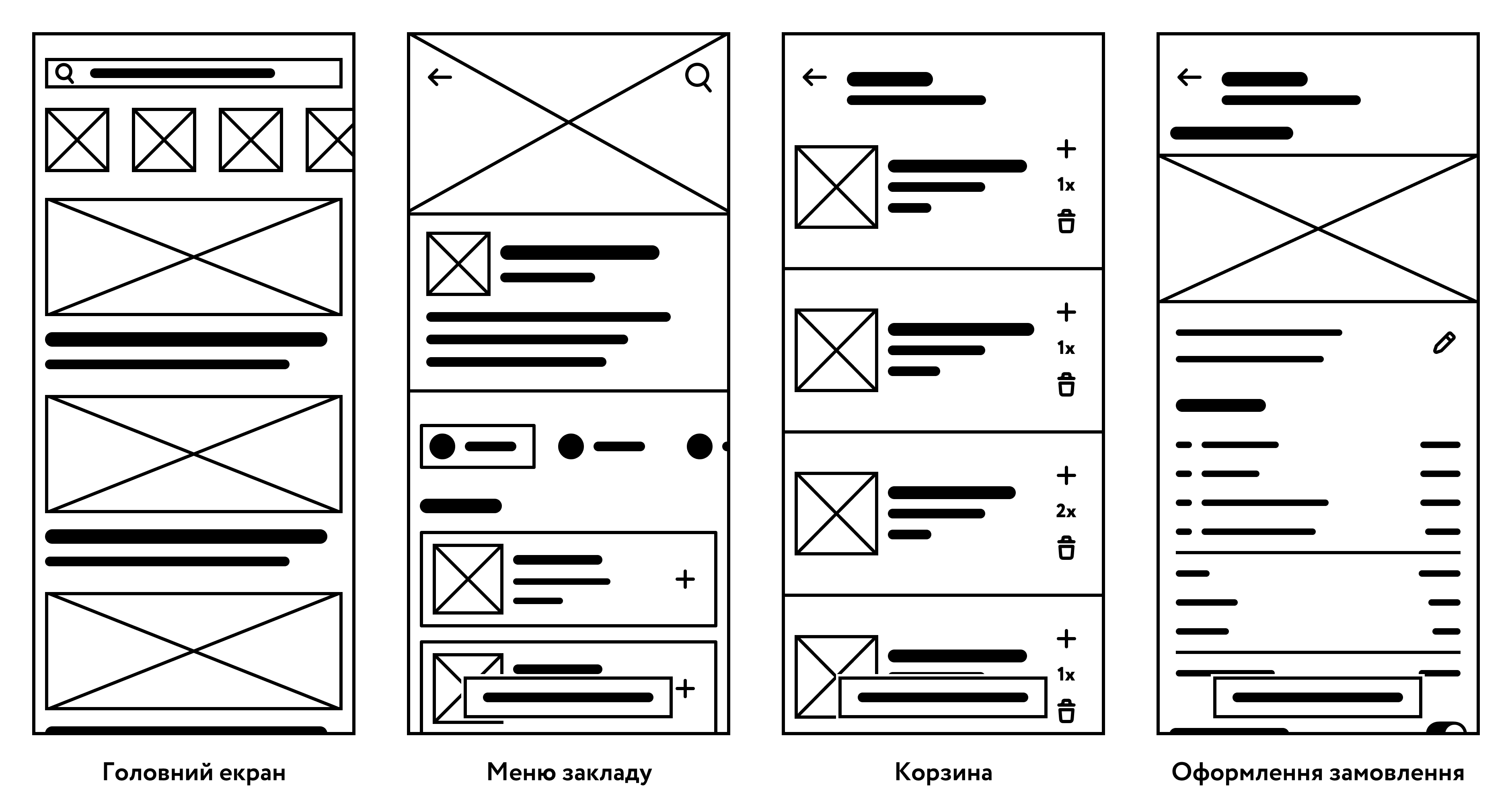
At first, it may seem that there is nothing to understand here and the sketch looks too simplified to imagine the final design, but in reality, each element means something and allows us to visualize the main screens. Pay attention to the following details:
- Crossed rectangle denotes an image. In our case, these are photographs of restaurants and fast food establishments along with their logos. For example, on the main screen, we can see a row of images that slightly extend beyond the edge of the screen. This indicates that these elements can be scrolled (swiped) by finger. Below, you see wide photographs that can showcase the main dishes of each establishment.
- Bold line denotes a title or text line. On the main screen, this is our search query within the search bar located at the top. Below, you can see the names of the establishments and their brief description (for example, wait time, distance to the establishment, and so on).
- Rectangle denotes a data input field or button. At the top of the main screen, there is a search field (on the left inside the rectangle, you can see the corresponding icon). On the establishment screen, in the cart, and during the order checkout, there is a button at the bottom. They serve the following functions: navigating to the cart, proceeding to checkout, and confirming the order.
- Circle denotes an icon or small image. In the establishment menu, you can see that we have a categorization for types of dishes, which is used for quick navigation to the corresponding category list.
- Icons. Sometimes, instead of a circle, it is more appropriate to draw a simple icon to show the main functionality. On the main screen, we have a magnifying glass icon to indicate that this is search. In the establishment menu, we have an arrow to return to the previous section and plus signs to add dishes to the cart. In the cart, we have an icon to change the quantity of each dish and remove it from the order. On the order checkout page, there is a pencil icon for editing the delivery address.
- Text. We can add small text blocks to clarify details. This can be text on an important button or, as in our case, the number of ordered dishes in the cart.
If the purpose of some elements remains a mystery, take a look at the next section and compare the wireframes – everything will become clear to you immediately.
High-fidelity wireframes
High-fidelity wireframes (pronounced high-fidelity wireframes) – accurately executed and detailed sketches of the future interface. They contain more fine details, text, and icons. The placement and sizes of each element are more precise and closer to the final design. They require significantly more time to create, but they also explain many more details. After discussing the initial wireframes with the team, you as a designer could create such high-fidelity wireframes:

Take a look at how much more detailed and refined the new wireframes appear. New actions have emerged, such as adding to favorites. Text blocks have become useful and provide a brief description of establishments and dishes. The map placeholder has transformed into a more realistic delivery route. Elements of the iOS operating system have been added to the template of each screen, showing the characteristic notch, system status icons, and time. This adds a bit more realism and hints at which platform the design is being created for, and of course, this is not a mandatory element of the wireframes, but is added at will.
As can be seen, low-fidelity wireframes are suitable for quick experiments and initial discussions, while high-fidelity wireframes are needed to approach the real user experience and obtain more accurate feedback on the design before development begins.
Well, the wireframes were liked by the team and the client. After some minor adjustments, you were tasked with creating the final UI design for the already familiar screens and were given one week to complete this task. Let's see what you have come up with:
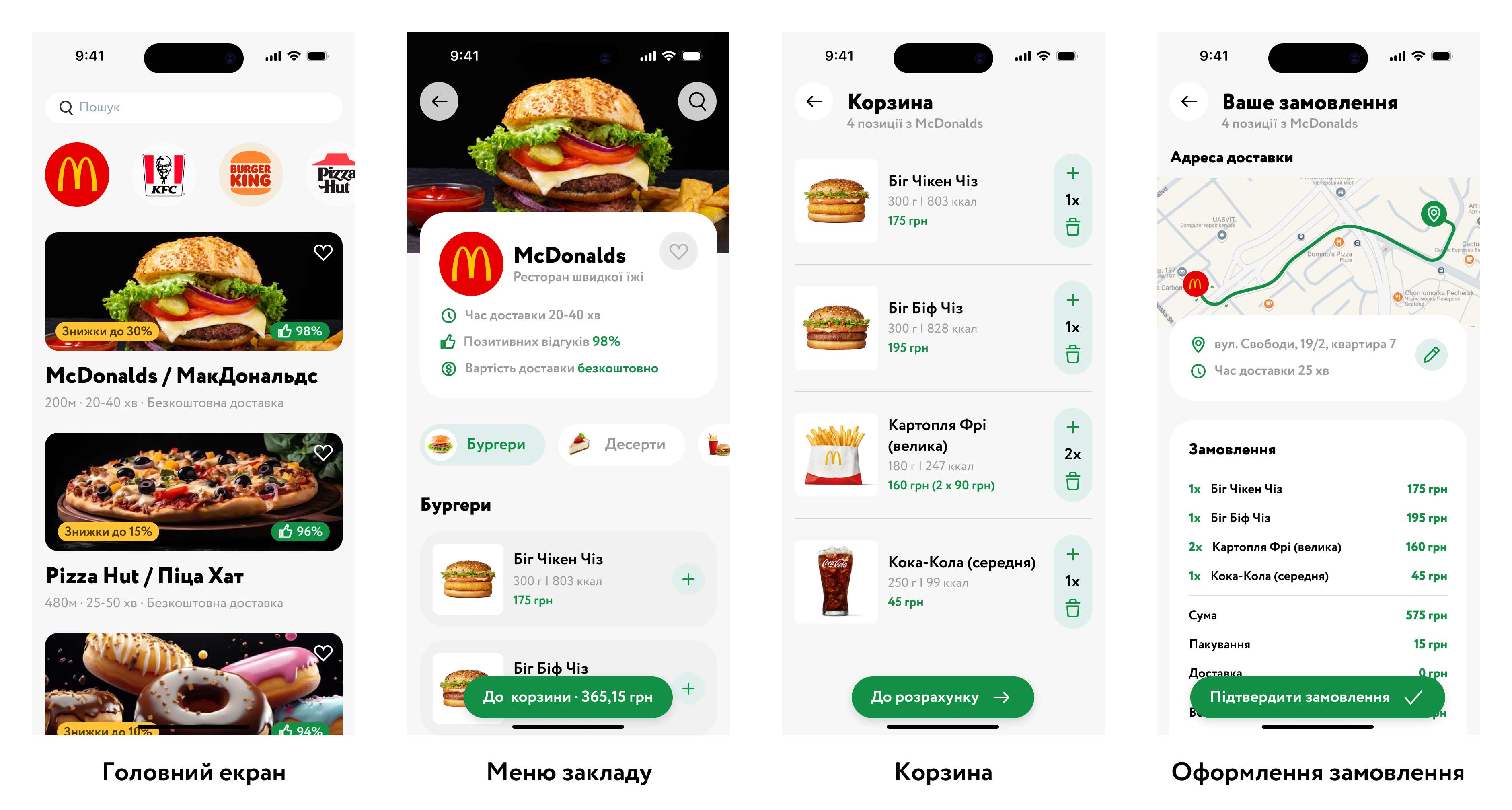
Here are the differences compared to the high-fidelity wireframes that can be noticed:
- Crossed-out rectangles replaced with photographs or logos
- Rectangles replaced with input fields and buttons
- Decorative elements and techniques added to enhance the aesthetic appearance: cards, rounding, shadows
- Color scheme applied to all elements
- Map with the route added
Creating the final UI layout requires the designer's deep attention to detail and work with various aspects of visual design. The UI designer works with typography, selecting appropriate fonts, their sizes, letter and line spacing to ensure good readability and stylistic consistency. Color in design plays an important role in creating atmosphere, highlighting important elements, and ensuring accessibility for all users.
Composition and spacing affect the perception of design: the right distances between elements make the interface clean and organized. Grids help maintain the structure and consistency of the layout across different screens, which is especially important for responsive design.
The UI designer also considers design principles such as contrast, balance, hierarchy, and usability to create an attractive and functional interface. Special attention is paid to working with icons – they should be clear, stylish, and match the overall visual language of the product.
The stage of creating UI design represents a separate profession, but as you already understood, they are often combined with UX responsibilities to form a UX/UI designer. Each iteration of the layout is checked, refined, and coordinated with stakeholders to achieve a unified, user-friendly, and aesthetically complete design. We will discuss the tasks of the UI designer in more detail in the next lesson.
Wireflow (pronounced together, read as wireflow) is a sequence of screen sketches (wireframes) that cover a specific user task. In other words, it is a more detailed version of a user flow or task flow using screen wireframes instead of action rectangles. That is, instead of a rectangle with the label "place an order," we will now have a cart screen with a highlighted element that the user needs to tap to proceed to the corresponding screen.
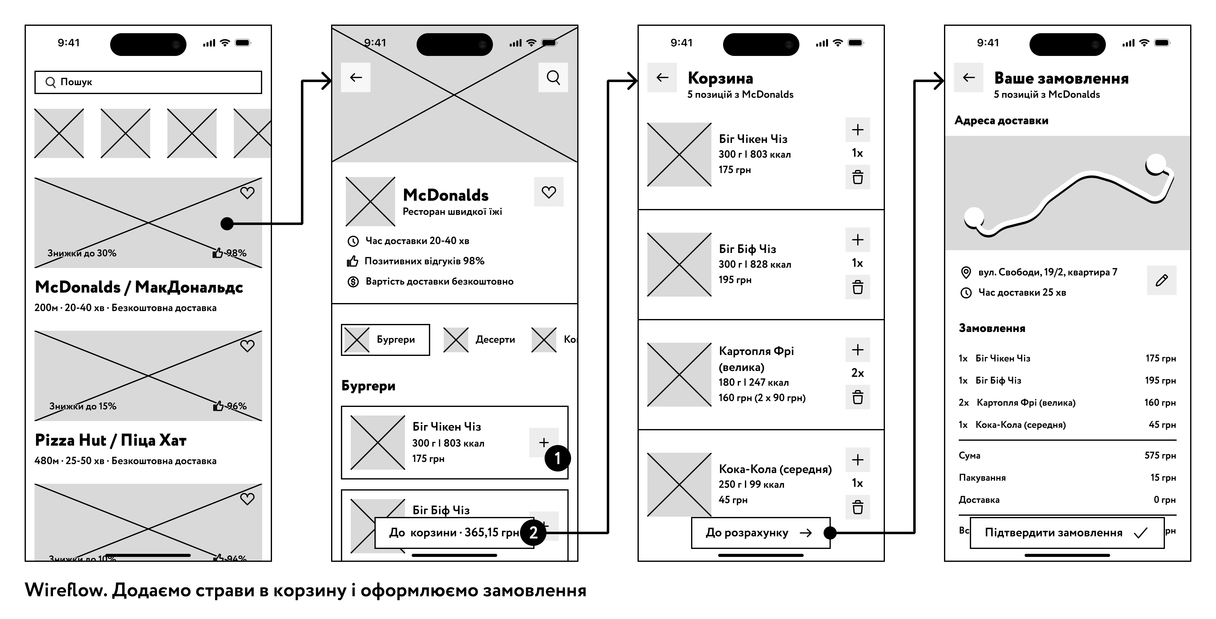
You can see several new elements when applying this method:
- Screens are connected to each other, as in the user flow, forming a sequence of actions or a user path.
- Sometimes it is necessary to show the sequence of actions within a single screen. As we have on the second screen on the left: the user first adds dishes to the cart using the button with the plus icon, and then taps the button at the bottom to go to the cart. To show the sequence, we use numbers, marking the first, second, and so on steps.
- If needed, at the bottom of the corresponding screen, you can outline what is happening. For example, 1 – add a dish to the cart, 2 – go to the cart.
- As in the user flow, there can be a branching in the wireflow where the user makes a choice. For this, you can use a diamond shape in the middle of the transition between screens, or there can be two arrows going to other screens from one screen. Add explanations as needed if some details are not obvious.
Screenflow (spelled together, pronounced screenflow) is a sequence of screens with a ready-made UI part. This type is used in the later stages of development. Here, the design of each screen is executed with maximum (final) detail. Essentially, it is the same as a wireframe but with greater detail. In other words, it is a user flow with UI design mockups instead of rectangles. In our case, it may look like this:
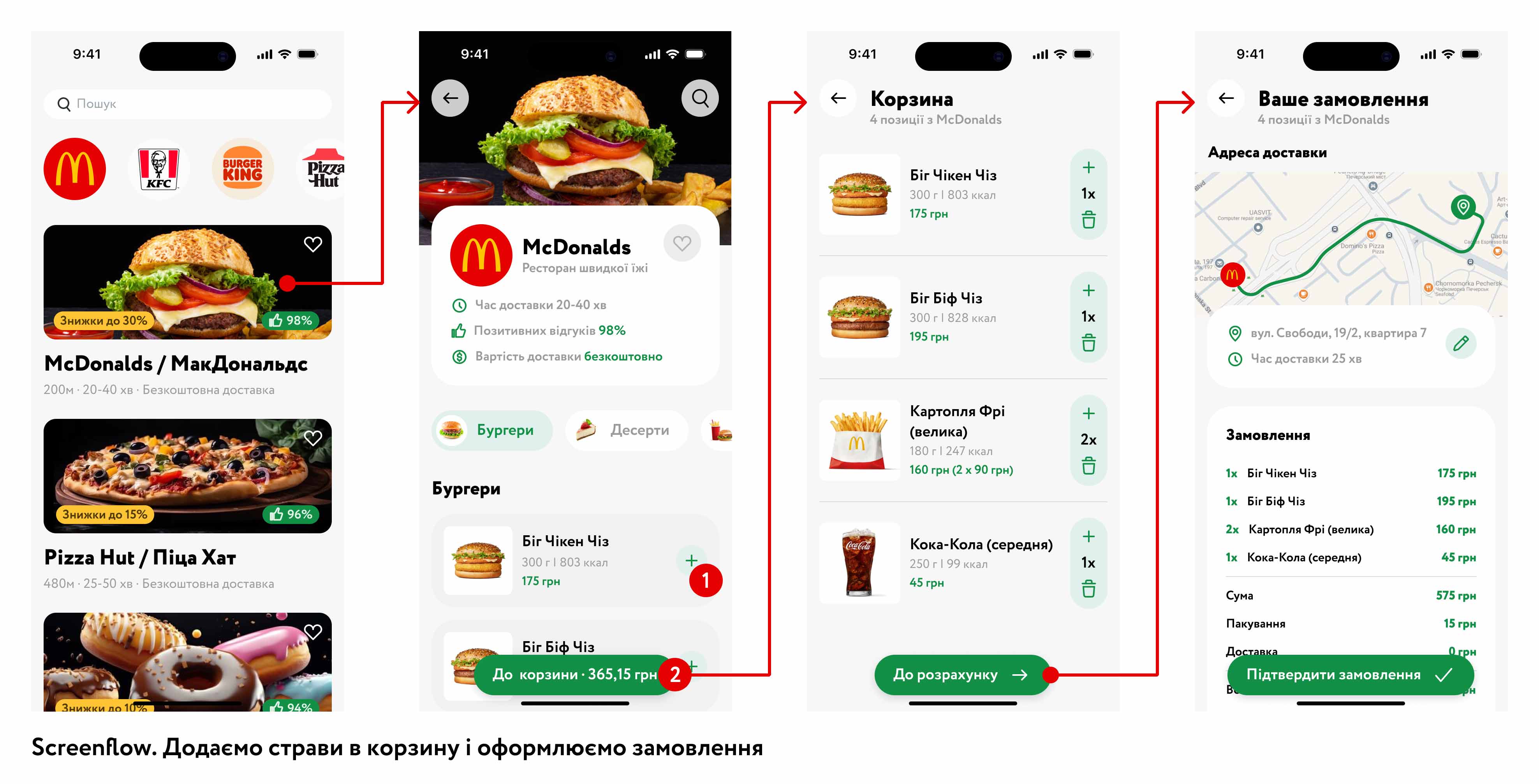
Screenflow is one of the most detailed artifacts that a UX/UI designer can create. But you can go even further and create an interactive prototype that looks and works like a real product. Next, we will review the different types of prototypes.
Paper prototypes are one of the fastest and most accessible ways to visualize and test interface ideas in the early stages of development. They consist of simple sketches on paper or cards, where interface elements (buttons, input fields, icons, etc.) are depicted in a simplified form. The main advantage of this approach is the ability to quickly capture ideas, cross out and correct mistakes without additional time and resource expenditures.
Due to their simplicity, paper prototypes allow for easy engagement of all project participants in the discussion process: designers, developers, business analysts, and even future users. Everyone can see what the interface will roughly look like and can quickly make suggestions or change the layout of elements. This encourages teamwork and fosters a better understanding of the product goals.
During testing, the user can point to an element they want to "click," for example, a button. The UX designer explains what should happen after this action and quickly provides the next sheet with a sketch corresponding to the expected result. In this way, we observe a sequence of actions that helps identify potential issues in navigation logic and usability of the interface.
Prototype (read as prototype) or interactive prototype – is a screen design that reacts to user actions. That is, it is not a static image, as in the case of wireframes or user flows. Prototypes allow understanding how the product will work before programming begins, identifying problematic and inconvenient screens. They are often used for testing with real users.
Interactive prototypes run in a browser on a computer or in special applications on a smartphone and can look like real finished products. But in reality, they are just imitations; no serious calculations or data processing can take place there. Usually, prototypes do not allow freedom of action, and the user can interact with a limited number of interface elements. All functionality is maximally restricted to speed up the creation of the prototype.
Our interactive prototype, based on previous methods, can be used for further testing. For one feature, several prototypes may sometimes be developed, and based on usability testing reports, a decision is made on which option to approve.
From now on, this course is designed for independent study and completing homework assignments. I understand that some tasks may not be easy for you.
For additional support, use the Telegram chat. Here you can ask questions related to the lessons or view examples of correct completion from other students.
The chat is not available for citizens of Russia.
Task 1. Choose a mobile app, web service, or website that you frequently use. Create a user flow in a notebook for typical usage scenarios of the selected product.
Task 2. Come up with a new feature for the product you use. It doesn't have to be for your favorite from the first task. Create a task flow for this new feature.
Task 3. Create a wireflow for the user flow from the first task. You can use a pencil or erasable pen to make corrections. Try to get as close to the original as possible.
Task 4. Create a wireflow for the scenario from the second task. This is an advanced difficulty task. That means you need to create a series of wireframes for the new feature you came up with. You need to be very observant here because you don't know all the interface elements that exist and how they are used. But you can look at other products and draw inspiration from them. Note how other designers have applied buttons, cards, text blocks, and how this can be utilized in your case.
Conclusions
Here we conclude our introduction to the prototyping stage of the design process. This stage of responsibility is usually perceived as the designer's work. After all, here the designer creates the interface that the user will interact with. In the future, we will delve even deeper into the nuances of this work. For now, complete your homework and after finishing it, move on to the next lesson, where you will learn more about the work of a UI designer and related specialties.
https://www.figma.com/design/EJsMRVz7Mg2OKXa4pPFwtv/Untitled?node-id=0-1&p=f&t=nk73zWl6TqqWFwMS-0
Коментар frusia.pro:
Привіт! Рада, що вам сподобалось. Бачу усі чотири завдання, але маю деякі зауваження.
Завдання 1. Тут замість ромба треба застосувати форму паралелепіпеда, адже користувач не робить вибір, а лише вводить якісь дані, в нашому випадку прописує свої плани.
Завдання 2. Така сама проблема, як і у першому завданні. Вибору немає, тому можем замінити ромб на прямокутник.
Завдання 3. Все правильно, з вайрфлоу мені зрозуміло, як саме користувач має вводити свої плани в обраний день календаря.
Завдання 4. Тут також все зрозуміло, молодець!
Хочу також окремо похвалити за те, що ви одразу все зробили у Фігмі! Отже, чекаю від вас виправлень, добре попрацювали, але треба внести зазначені зміни і тоді все буде ідеально.