Lesson 8. Groups. Layers. Pipette. Image import

Module 2. Figma basics.
Free UX / UI design course for a newcomer

To start learning, take tests and track progress, you need to enroll in the course. It's free.

We continue our introduction to the basics of Figma. Today we will learn about new techniques for working with layers, including how to select, move, group, lock, and hide them.

We will learn how to insert a raster image into a project and find out how to work with the eyedropper tool, which allows you to read the color code from images and shapes.

The last section with new commands concerns setting precise distances between objects, which is important later when working with grids.

This lesson expands our designer arsenal with new techniques that speed up and simplify the process. For example, it's hard to imagine working on a large project without grouping layers.

Groups

While completing the homework from the last lesson, you must have encountered the problem of managing layers. For example, any button consists of a rectangle (defining the boundaries) and text (which explains what this button does). To move the button, you will have to select each of its components first. And what if you want to move the top part of the site with the navigation menu, which consists of 5 text elements? That will take more time. You will constantly encounter such micro-tasks.

To solve this problem in Figma, there are several methods: using groups, frames, or auto-layouts. For now, we will consider the simplest option, which is grouping elements.

For example, a rectangle and text can be combined into one group by content and that will already be a button. This is very convenient and significantly speeds up the work.

Group is a special layer that contains other layers and is designed to combine and simplify further work with them. A group works with both a large number of layers and just one.

Creating and Deleting a Group

Suppose we need to combine several primitives that make up a button into a group. To do this:

  1. We will use the technique from the last lesson, holding down the left mouse button from the top left and dragging it to the bottom right corner, thus selecting all the primitives that make up the button. The selected layers are highlighted on the left panel;
  2. Right-click on any of the button components and select Group Selection from the menu. A keyboard shortcut for quick grouping is also available: Command + G on MacOS or Control + G on Windows;
  3. Note that in the layers panel, instead of two selected primitives, there is now one layer with a new icon and the name Group 1 – this is our button;
  4. Now you can work with the button like a regular layer: move, scale, duplicate, and so on without the need to select each layer individually;
  5. To break the button back into its components, you need to select the group and choose Ungroup from the context menu or press Shift+Command+G on MacOS or Shift+Control+ G on Windows;


Collapsing and Expanding a Group

As you noticed, after creating a group, the content is automatically hidden. This state is called a collapsed group. To show the content, you need to expand the group:

  1. Hover over the layers panel. A small triangular arrow pointing to the right will appear on the left opposite each group;
  2. Click on the arrow and the group content will become visible. The arrow will turn downwards, indicating the expanded state;
  3. To collapse the content again, click on the arrow once more.


Nested Groups

Groups can include other groups. To do this, simply select several layers with the group and make another group. A layer that is inside a group is called a child. A group layer that contains other layers is called a parent.

Why might this be necessary? For the same purpose: for convenient and quick work. Let's consider an example. Several buttons and a logo with a background can be combined into a so-called site header (in English – header, pronounced header) – a design element that repeats on all pages and usually contains quick navigation tools. In the eyes of Figma, this is simply a group with other nested groups.

So if we need to move the buttons inside the site header, we can expand the corresponding group and work with the group of each button.


Reorganization

Sometimes it may be necessary to move a layer from one group to another or to add new layers to a group.

To do this, simply drag the layer to the desired group in the layers panel and it will instantly be placed inside. You can also drag it to the desired position between layers within the expanded group. If you need to remove a layer from the group, you should drag it to the area above or below the group, as shown in the video:


Layer Selection

We already know how to select objects by clicking on them in the workspace or in the layers panel. Also, we know how to select multiple layers using a marquee by holding down the left mouse button in the workspace. Now we will get acquainted with new techniques and learn how to select nested layers without expanding the group.

Selecting the Nested Layer

Let's return to our example with the site header. To select the button, simply double-click on it, which will automatically expand the top group.

To go further down the nesting tree and select the text on the button, just double-click again. As you may have understood, double-clicking allows you to select objects one level of nesting below the current one.

Double-clicking speeds up selection when working with nested layers and is significantly faster than manually expanding groups. But what if there are more than one levels of nesting? Then you will have to make several double-clicks. To select an object at the lowest level of nesting, simply hold down Command on MacOs or Ctrl on Windows and click on the object – this is called deep selection.


Selecting Multiple Layers (New Method)

Press the Command button on MacOs or Ctrl on Windows and click on the layers one by one on the left panel. Hold down the Shift key and combine objects by clicking or dragging a frame in the workspace. Each new selection will be combined with the previous one. This method is very convenient for creating groups and in combination with deep selection.


Selecting Layer Range

If you hold down the Shift key and select two layers in the left panel, all layers that fall between them will be automatically selected.


Selecting a Covered Layer

Sometimes situations arise where a layer is completely covered by another and cannot be selected in the workspace. The only option left is to dig through the layers panel. In this case, simply right-click on the area where the invisible layer is located and from the dropdown menu select Select Layer, and then click on the name of the layer you need.

Another option: hold Ctrl and right-click on the layer's overlapping area. Instead of a context menu, a list of layers will appear immediately, which is significantly faster than the previous method.

These selection methods work for locked layers as well, but not for invisible ones!


Removing Selection

To remove a selection in the workspace, press Shift and click on the desired object or use the bounding box.

To deselect an object through the layers panel, click on the selected object while holding down the Command key on MacOs or Ctrl on Windows.


Working with Layers

We continue to get acquainted with new techniques for manipulating layers. Locking and hiding will help focus on the desired area of the page, while other commands will help perform repetitive operations faster.

Locking and Hiding Layers

Sometimes you need to work exclusively on one interface element, and accidentally selecting other layers can be distracting. In such cases, it is helpful to lock or hide some part of the design. To do this:

  1. Select the necessary layers;
  2. Hover the cursor over the selected objects in the workspace or layers panel;
  3. Invoke the context menu with the right mouse button;
  4. Select Lock/Unlock to lock or Show/Hide to hide the layer;
  5. If you hover the cursor over a layer in the panel, icons for actions will appear to the right of it: click on the lock to lock/unlock or on the eye to hide/show the layer;
  6. But it's better to use hotkeys: to lock – Shift+Command+L on MacOs or Shift+Control+L on Windows; to hide – Shift+Command+H on MacOs or Shift+Control+H on Windows;
  7. Unlocking and showing hidden layers are done similarly, but they should be selected in the layers panel.


Copying, Cutting, and Pasting a Layer

To copy an object, select it and press Command + C on MacOs or Ctrl + C on Windows.

To cut an object, select it and press Command + X on MacOs or Ctrl + X on Windows.

To paste, select an object or completely remove the selection and press Command + V on MacOs or Ctrl + V on Windows.

Copying, cutting, and pasting objects, commands that are familiar from other programs, can surprise some beginners in Figma. The thing is, the position where the object will be pasted depends on the currently selected object type (primitive or group) and the level of nesting it is at. Let's look at some examples:

  • If nothing is selected, the paste will occur in the same location where the copied object was;
  • If a group or primitive inside a group is selected, the paste will occur at the center of that group;

At first, this behavior may seem strange, but once you understand how it works, you'll get used to it over time. Watch the video, pay attention to which type of object is selected before pasting and how this affects the paste position.

Another important point: in the layers panel, the pasted object always appears above or below the selected object (which is also somewhat strange, because in other similar programs, pasting always occurs above the selected layer).


Inserting at the position of another object

The position of any Figma object is considered to be its top left corner. To make the insertion position more predictable, simply select the object after copying or cutting and press Shift+Command+V on MacOs or Shift+Ctrl+V on Windows. The new object will be inserted neatly in the top left corner of the selected layer.


Layer Names

Bringing order and making clear the chaos that occurs in the depths of any large project cannot be achieved with grouping alone. A thoughtful naming system will be required. This takes additional time, but will save nerves later when searching for the needed layer, and the frontend developer will say thank you.

Renaming Layers

To rename a layer, you need to:

  1. Select the desired object in the workspace or the layers panel and press Command + R on MacOs or Ctrl + R on Windows;
  2. Change the name of the layer;
  3. Press Enter to save the changes;
  4. You can also double-click on the layer name in the panel to enter editing mode.

To rename a group of layers, you need to:

  1. Select multiple layers;
  2. Press Command + R on MacOs or Ctrl + R on Windows;
  3. In the Rename to field, enter the new name and press Enter.


Give meaningful names

Names should be understandable not only to you but also to the developers who will work with your design. If you are working with a foreign company, the names must be exclusively in English. If you don't know how to translate something, use Google Translate.

It's better to set names without spaces, using a hyphen or underscore instead. The reason is that some layers will later be exported into resource files by developers. For them, it's more convenient to adhere to such rules in file names.

Here's a small list of typical layer names to give you an idea:

  • Header
  • Footer
  • button_cta
  • modal-export
  • Icon_Reload
  • img_banner

In no way do I forbid you to name layers as you wish; adapt to the needs of your project and team. This is just advice for beginners.

Image Import

Photographs and illustrations can be used not only as a component of the design but also as examples to refer to before starting work. Let's consider a few terms we have already encountered in the second lesson.

References and Mood Boards

Reference, references (from English reference – recommendation, benchmark, hint, link) – one or several examples of images provided by the client to show what they want to achieve as a result of your work. A reference may relate not to the entire site but only to some specific aspect. For example, there may be a request to make the colors like in the first reference, the header structure – like in the second, and the navigation menu of the mobile version – like in the third. References accompany the technical task and make it clearer. A reference can be not only an image but also a link to a website or even a photo/video.

Mood board (from English mood board – mood board) – is a collection of images compiled by the designer to show to the client and get a general impression at an early stage, even before starting work. Through such collections, we try to understand the client's taste and preferences. The best examples from the mood board can later be used as a starting point for the design process. As with references, images for the mood board can include designs from other websites, photographs (as examples of successful color combinations), illustrations, fonts, color sets, and so on.

There are special free services for creating mood boards: Milanote, Pinterest. But don't rush to register there; for now, the capabilities of Figma will be enough for us.
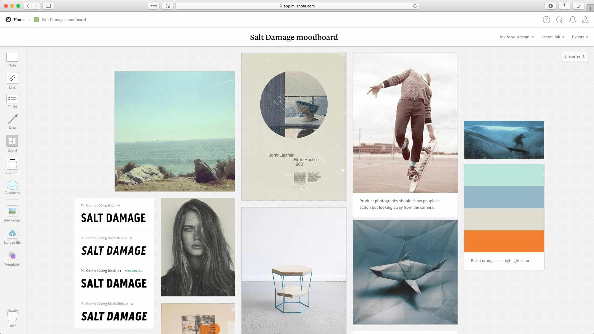
Moodboard

Import from Clipboard

To work with references and create mood boards, we need to somehow insert images directly into the workspace. Figma has several mechanisms for this. First, let's get acquainted with the simplest one. To insert an image, you need to:

  1. Find any image in your browser;
  2. Right-click on it to bring up the context menu;
  3. Select the Copy Image command, which will make the browser copy the image to the clipboard;
  4. Go back to Figma;
  5. Press Command + V on MacOs or Ctrl + V on Windows to paste the image from the clipboard;
  6. Note that if the image turns out to be large, when you paste it, it will cover the entire workspace. Don't be alarmed, just reduce the image;
  7. You can then work with the image like a rectangle: change its position, size, etc.

Figma has limitations on pasting large raster images: if the width or height of the image exceeds 4096 pixels, the inserted object will be automatically scaled to those dimensions.


Import from File

Sometimes graphic resources are sent in archives or the files are already on your computer. Just drag the image file into the Figma workspace, as shown in the video. The position of the inserted image will depend on where you release the left mouse button after dragging – the center of the picture will be under the cursor.


Eyedropper Tool

Eyedropper or Eyedropper Tool or Color Picker – allows you to read the color from any primitive and assign it to the selected object. Very useful for choosing a color palette based on images. We already know how to copy the color value from one object and paste it into another. But there is a faster way.

Quick Color Assignment

To quickly copy a color, simply:

  1. Select one or more objects that need to be recolored. If it has a fill or stroke, its color will be changed. If the object has both a fill and a stroke, only the fill color will be changed;
  2. Press the I key or Ctrl+C to activate the eyedropper;
  3. Hover the cursor over the point in the workspace from which you want to read the color. Note the magnifying circle with a pixel grid in the upper right corner that appears for your convenience;
  4. Just click the left mouse button to confirm;
  5. If the selected object contains both fill and stroke colors and you want to change the stroke color using the eyedropper, you need to click on the stroke color to invoke the color selection window, and only then invoke the eyedropper.


Pixel Color Assignment from an Image

To read colors from images, you just need to follow the same sequence of actions as in the previous section. See how quickly you can select a color palette this way.


Exact Positioning

Figma has a very convenient tool for exact positioning that shows the distance between objects. To use it:

  1. Select the object you want to align precisely;
  2. Hold down the Option key on MacOs or Alt on Windows;
  3. Hover the cursor over another object to see the distance in pixels;
  4. Simultaneously adjust the position of the selected object using the arrow keys.


How to share a project

Let's agree that from now on all homework assignments will be sent as a link. For this, Figma has a Share button in the upper right corner. Instructions:

  1. Click Share;
  2. Check that the setting in the Who has access section is set to Anyone. This means that anyone will be able to view your file if you send them the link. Usually, this setting is the default in drafts;
  3. Click Copy link to copy the link to the clipboard;
  4. Now send the link to the person you want to share your file with. Access will be view-only: anyone who clicks the link will not be able to make any changes.


Homework

From now on, this course is designed for independent study and completing homework assignments. I understand that some tasks may be challenging for you.

For additional support, use the chat in Telegram. Here you can ask questions related to the lessons or view examples of correct completions from other students.

The chat is not available for citizens of Russia.

Task 1. Go back to the file with the first and second tasks from the last lesson and organize it: group and rename the layers (come up with meaningful names) so that it is easy to navigate.

Task 2. Visit the website Behance (where designers share their work), scroll through the page until you find illustrations (not to be confused with photographs). Illustrations (see the example in the video from the previous section "How to Share a Project") are perfect for us because it's easier to extract the main colors from them. Copy five images that you like (to enable the Copy Image command, you need to click on the work first, it will enlarge). For each image, draw 4-8 circles of the same size and color them in the key colors of the illustration (use the eyedropper tool).

Task 3. Enter the search term "UI web app" in the Behance search bar. Try to find a simple website design and redraw it as detailed as you can (ignore what you cannot reproduce yet). Replace illustrations and photos with your own, look for them on the website Unsplash.

Task 4. Practice your amazement. Visit the website Awwwards and browse the sites listed there for at least 10 minutes a day – it features the best examples of web design. You can also use this site for the previous task.

Task 5 (advanced difficulty, to be done at your discretion). Draw one page from any two websites you find on Behance or Awwwards.

During the execution of these tasks, use groups and hotkeys. Try to practice as many techniques from this lesson as possible. Pay special attention to the amazement; do not skip this important exercise.

Conclusions

Today we continued to get acquainted with new techniques for effective work. And although now you know much more, this is not enough for full-fledged work.

Be patient, complete all homework assignments, and review old lessons from time to time. Keep practicing and gaining experience. Think about how much easier it would be to complete the homework from the previous lesson if you knew all the techniques that we learned today.

Take quiz

To pass the lesson and check your knowledge, you need to correctly answer 80% of the questions from the quiz. To do so, you need to login and enroll to the course or signup, if you haven't done so yet.

Take quiz

Leave a comment

Place the handle into the purple zone

Comments

Margo15 August 2025 13:07  
Task 1 -- https://www.figma.com/design/cz3rxF7GTiVo1Cy6EDPHLv/Untitled?node-id=0-1&t=nyvnsfIi3aVkg2YN-0
Task 2, 3 -- https://www.figma.com/design/rBAKV50B0k6gSRTYrBLtbM/Untitled?node-id=0-1&t=XzSfRfdGjjFgKVbB-0

For the third task, I didn't redraw the design but created my own - the basis was the reference design: https://www.behance.net/gallery/225959077/Website-Design-UIUX-Design?tracking_source=search_projects|+website+design&l=12

Comment from frusia.pro:

Hello, Margo! I checked your homework:

Task 1. Organize. I see that the layers, groups, and frames are organized and named concisely. Everything is good, but I recommend naming them in English. This is a very common practice even in Ukrainian teams. If you get used to it, it will be easier for you to work in the future. Sometimes you also have to communicate with English-speaking developers, and this will be helpful for them as well. By the way, you don't need to get too caught up in the names; general ones are sufficient: Header, Footer, Item, Img, List, Text, Icon. There’s no need to describe in detail what is depicted in the image or to insert all the text from the text block; this won't simplify navigation and won't bring any benefit, just waste your time.

Task 2. Choose colors. Everything is great!

Task 3. Redraw the website with image replacements. It turned out very well, good job! The sizes and spacing are quite good. To slightly improve these aspects, you can use an 8-pixel grid. That is, all sizes and spacings should be multiples of 8 pixels (for example, 8, 16, 24, 32, 40, 48 pixels, and so on). Spacings of 2 and 4 pixels are also acceptable.

Overall, you are doing very well. Keep my comment about layer names in mind and move on to the next lesson!

Anastasiia7 August 2025 12:36  
Good day. I have completed task 3 for lesson 7
https://www.figma.com/design/p10p6kyOmFXZjEH04ai3jJ/HOMEWORK?node-id=54-2&t=8iZI12u0CCOm2hJW-1

Comment from frusia.pro:

Good day! I see that in addition to the wireframe, you have also created the final design. It looks very good, considering that very few tools were explained in this lesson compared to those you are using (for example, curves, gradients). It is clear that you already know Figma well. Everything is done wonderfully for the task, I just have a few suggestions for the future:

  • Avoid using a font size smaller than 16px on mobile devices;
  • try to make all similar margins consistent. For example, your margin from the navigation button texts to the bottom edge is about 15px in some places and 18px in others;
  • make margins and sizes multiples of 4 or 8 pixels. That is, button sizes can be 40x40, 128x40, 64x40, and similar. Margins: 2, 4, 8, 12, 16, 20, 24, 28, 32, 40px, and so on. This is also called an 8-pixel grid.

Everything is great, keep up the learning!

Also, please send homework in the comments of the respective lessons. Thank you!

Anastasiia22 July 2025 12:22  
Good day. Homework for lessons 7 and 8
https://www.figma.com/design/p10p6kyOmFXZjEH04ai3jJ/HOMEWORK?node-id=21-53&t=yKgMTjxy9pNvYeGW-1
For lesson 8 the site
https://www.behance.net/gallery/222403269/COSMETIC-STORE-WEBDESIGN

Comment from frusia.pro:

Hello! I have an analysis for you:

Lesson 7.

Task 1. Redraw the site. Very good, the redrawn version is almost identical. The sizes are also perfect, well done!

Task 2. Redraw the icons. Everything is good here too, the icons turned out to be similar.

Task 3. Draw the wireframe from the third lesson. I don't see this task, it is mandatory.

Lesson 8.

Task 2. Choose the main colors. Everything is good, you have accurately selected colors for the illustrations you chose, well done!

Task 3. Redraw the site. Perfect! Very meticulous work. There are minor issues with the margins in the last block and footer, but considering the volume of work you have done, these are trifles.

So, Anastasiia, you are doing great, I am waiting for the third task of the seventh lesson from you. Don't neglect your studies :)

skazhena cherepakha19 February 2024 11:56  
Thank you, I have corrected it.
https://www.figma.com/file/nvSYfkq63m2kn0QDaZHriK/%D0%9D%D0%B0%D0%B2%D1%87%D0%B0%D0%BD%D0%BD%D1%8F-%D1%83-Frusia.Pro?type=design&node-id=34%3A2&mode=design&t=CTU6LFuBVSvEDDJa-1

Comment from frusia.pro:

Good evening. I left detailed comments in Figma. You did a great job making the corrections. We just need to figure out the last task)

skazhena cherepakhaUkraine flag підтримує ЗСУ 16 February 2024 19:06  
Good evening )
I couldn't copy the images from Behance, so I had to settle for screenshots.

https://www.figma.com/file/nvSYfkq63m2kn0QDaZHriK/%D0%9D%D0%B0%D0%B2%D1%87%D0%B0%D0%BD%D0%BD%D1%8F-%D1%83-Frusia.Pro?type=design&node-id=34%3A2&mode=design&t=8S2paSPHPrMLDGzk-1

Comment from frusia.pro:

Hello, the screenshots are perfectly fine. I left comments in Figma – some tasks need further refinement. I will be waiting for them!)

VarvaraUkraine flag підтримує ЗСУ 21 November 2022 00:53  
Thank you for the feedback!) Here, I have added that screen)
https://www.figma.com/file/QIwTSpFf9pMvfRDCs0z1Rp/UX%2FUI-Frusia?node-id=160%3A48&t=btou1eAZmJYDIBsk-1

Comment from frusia.pro:

Everything is good now. Please proceed to the next lesson.

VarvaraUkraine flag підтримує ЗСУ 19 November 2022 16:31  
Good evening!) The tasks were very interesting and engaging, and I felt an extra boost of motivation and even more desire to develop in design. For the completion of task 5, I even had to install a Spanish keyboard layout)))
Here is the homework:
https://www.figma.com/file/QIwTSpFf9pMvfRDCs0z1Rp/UX%2FUI-Frusia?node-id=160%3A48&t=tt7iSvxAUUPmfaed-1

Comment from frusia.pro:

Task 1. Organize the previous file. I reviewed the layers, everything is labeled and clear. A tip for the future – Figma has an English interface, just like the developers' code base – English. Please label your layers in Figma in English as well.

Task 2. Color selection for the illustration. You chose very stylish illustrations, you have good taste. The colors are well chosen, well done.

Task 3. Redrawing the website. You chose quite a large page. You recreated it very well. I see you chose the correct size for the main frame, which corresponds to a full-HD monitor in width. You also choose more or less correct sizes for images and fonts. Pay attention to the "Testimonials" block – you probably missed the quote icon there, as there is a large gap between the heading and the text, while the original has this icon.

Task 5. Redrawing two more concepts. You chose very interesting ideas. I am glad that you liked all the tasks and that you even started learning Spanish :) By the way, it turned out to be almost identical to the original screens of the websites. And the ability to select unconventional fonts will be useful for you in the future.

Yuliya LepenkoUkraine flag підтримує ЗСУ 18 September 2022 22:56  
Hello :)
Thank you for the feedback. I have corrected it)

https://www.figma.com/file/xSk0BHiIjCZakBmALVRkmP/icons?node-id=41%3A18

Comment from frusia.pro:

Hello! Yes, everything is great now All layers are named according to the same rule, well done!

Yuliya LepenkoUkraine flag підтримує ЗСУ 12 September 2022 20:23  
Good evening:)

During the completion of homework 5, I encountered difficulties copying images from Behance. When using Copy Image, it inserted a link to the image itself:( I had to perform some manipulations using F12 and selection to use the images for completing task 2.

https://www.figma.com/file/xSk0BHiIjCZakBmALVRkmP/icons?node-id=73%3A264

Comment from frusia.pro:

Good evening

Task 1. Organize the file from the previous lesson. I see that you have grouped everything, but I have some comments on how you name the layers. Try to adhere to one rule: each word should start with a capital letter and be separated by a space. Here’s how the names of the layers look right now:

  • цена товара
  • подпись_товара
  • 2_3_полоски_Налаштування
  • 5 сторінка

And here’s how they should look after applying the rule:

  • Цена Товара
  • Подпись Товара
  • Полоски Налаштування
  • 5 Сторінка

Task 2. Choose colors. Everything is correct here, well done!

Task 3. Redraw the website. Good practice, you have redrawn quite a large website very well, I commend you! I have no comments here, everything is good.

Task 5. Redraw two more websites. Everything is also good here, it turned out very similar to the original websites. The colors and shapes are perfect, plus the fonts themselves are very similar, great job.

You've done a wonderful job, but I'm waiting for corrections on the first task

Iulia K.Ukraine flag підтримує ЗСУ 4 August 2022 10:54  
Good day :)
Task 1:
https://www.figma.com/file/lgmsAkkSUVzybS6R47Sh6f/%D0%B4%D0%B7%2C-%D1%83%D1%80%D0%BE%D0%BA-4?node-id=0%3A1

Tasks 2 - 3
https://www.figma.com/file/4k8qH7JQgWgnqdvXJKmEka/%D0%B4%D0%B7%2C-%D1%83%D1%80%D0%BE%D0%BA-5?node-id=0%3A1

Comment from frusia.pro:

Good evening!

Task 1. Organize the file from the previous lesson. I see grouped screens, as well as elements inside them. The names are meaningful, everything is great!

Task 2. Choose colors. This is also correct.

Task 3. Redraw the website. You chose a very complex example, but you did quite well! I have a few comments, please correct them:

  • Your design screen width (frame) is 4444 pixels. Please change it to a width of 1920 pixels (the standard size for computers with a stationary monitor). A width of 1440 pixels is also acceptable for laptops;
  • Pay attention to the margins, in some places they differ. Use precise positioning to accurately place the elements (see the penultimate section of this lesson). I recorded a video to show where the margins differ:
    https://drive.google.com/uc?id=1eBECjxoyuxeBf6MS61U5TaGVTzyHPb9c

I am waiting for the corrections

Viktoriia HryshchenkoUkraine flag підтримує ЗСУ 19 July 2022 21:30  
Good evening!)
Task 1: https://www.figma.com/file/eO9DJ0Vn8gnkJmcM73fflM/Урок-4?node-id=0%3A1

Tasks 2, 3, 5: https://www.figma.com/file/gRfMDqNMcqUICl7HsAUXPX/Урок-5?node-id=0%3A1

Comment from frusia.pro:

Task 1. Organize the file from the previous lesson. I see grouped icons, everything is fine. In the future, also try to give more meaningful names to the groups. For example: "Icon Calendar", "Icon More", and so on.

Task 2. Choose colors. Everything is also good.

Task 3. Redraw the website. You have redrawn the presentation of a medical-themed mobile application. Everything is good. I like how you use images with a transparent background.

Task 5. Redraw two more websites. Everything is great as well, especially I liked the website about jewelry.

Well done practicing, move on to the next lesson

OlhaUkraine flag підтримує ЗСУ 6 July 2022 13:25  
Good day!
Task 1, 2 https://www.figma.com/file/tTWDw17gu8GfM5WUW6WhyI/%D1%83%D1%80%D0%BE%D0%BA-5-%D0%B7%D0%B0%D0%B2%D0%B4%D0%B0%D0%BD%D0%BD%D1%8F-1-2

Task 3 https://www.figma.com/file/6U3vDEuJReuyaLOU5jxx3g/%D1%83%D1%80%D0%BE%D0%BA-5-%D0%B7%D0%B0%D0%B2%D0%B4%D0%B0%D0%BD%D0%BD%D1%8F-3

Task 5 https://www.figma.com/file/abf82q1ToprEsvKWQHo1e9/%D1%83%D1%80%D0%BE%D0%BA-5-%D0%B7%D0%B0%D0%B2%D0%B4%D0%B0%D0%BD%D0%BD%D1%8F-5

Comment from frusia.pro:

Good day! Sorry, I missed your homework. If this happens, please remind me on Instagram

Task 1. Organize the file from the previous lesson. I see grouped layers and names according to the content. Everything is great!

Task 2. Choose colors. Everything is correct.

Task 3. Redraw the website. You did a wonderful job, everything is very good: correct sizes, consistent spacing, well done!

Task 5. Redraw two more websites. You chose interesting examples. I have a few minor comments on the dark dashboard:

  • When designing for desktop, take the width of the main frame as 1920 or 1440 pixels. You have 1741;
  • Check the sizes and positions of elements and avoid fractional values. I found the text "Revenue" where X=318.01 pixels, and width=82.13 pixels;

For the light admin panel, I only see a problem that there are no right margins in the table next to the phone numbers.

I want to praise you, you did very well. Make the corrections and move on to the next lesson

Yana UsachovaUkraine flag підтримує ЗСУ 2 July 2022 15:53  
Good day! Very interesting lessons, thank you
https://www.figma.com/file/2Px8chcuhtqdFvWFU3eUgx/Lesson-5?node-id=0%3A1

Comment from frusia.pro:

Hello! I'm glad that the lesson was useful

Task 1. Organize the file from the previous lesson. You grouped the layers and gave meaningful names. Try to name everything according to one rule: each word in the layer name should start with a capital letter and be separated by spaces. Here are a couple of examples before/after using the rule:

  • picture – Picture;
  • glass – Icon Glass;
  • Menu_header – Menu header.

It's better to group icons separately, rather than in rows, and give meaningful names.

Task 2. Choose colors. Everything is correct.

Task 3. Redraw the website. I see the first block of the sushi website, well done! To improve the layout next time, pay attention to:

  • Margins and sizes of elements. Try to adhere to the so-called 8-pixel grid, meaning all sizes should be divisible by 8 without a remainder (in extreme cases, by 4). Here are examples of such sizes: 4, 8, 16, 24, 32, 40 pixels, and so on. For instance, your header height is currently 77 pixels, but according to this rule, it should be 80 pixels;
  • if you align objects to one side, make sure to use the same margins. I see the text "Magic Sushi" is 375 pixels from the left side, while the text below is 388 pixels.

I want to recommend that you redraw a few more websites in your free time; you need more practice to get the hang of it. Overall, you are ready to move on to the next lesson

Mariia SUkraine flag підтримує ЗСУ 29 June 2022 23:59  
https://www.figma.com/file/dWGWKQPPPZULkadAnpuvMX/Frusia?node-id=0%3A1

Comment frusia.pro:

Good day!

Task 1. Organize the file from the previous lesson. I see elements grouped by content. When choosing a name, follow this simple rule: all words should start with a capital letter and be separated by spaces.

Task 2. Choose colors. Everything is correct.

Task 3. Redraw the website. Great job, it turned out very similar. I have one remark: try to use sizes and positions of elements only with whole numbers. Sometimes you have margins with decimal parts, for example, X: 305.67 pixels.

You are progressing quickly, you can move on to the next lesson

AnnaUkraine flag підтримує ЗСУ 25 June 2022 23:00  
Sorry, I granted access
I grouped and renamed the layers:
https://www.figma.com/file/FGYebaPYrSfAFmQRpzZCjn/Untitled?node-id=0%3A1
Tasks 2,3
https://www.figma.com/file/Qc0rP7ISFNhzUkdohuD48E/Lesson-5.2?node-id=3%3A2

Comment from frusia.pro:

Hello! Yes, access is now granted

Task 1. Organize the file from the previous lesson. I see the layers are grouped and have meaningful names, everything is fine. Some names can be improved, but that comes with experience, here are a couple of examples:

  • Main Selection – Navigation;
  • Advertising – Hero Banner;
  • Arrows – Pagination;
  • Icon 5 – Icon Checkbox and so on.

Task 2. Choose colors. Everything is correct.

Task 3. Redraw the website. Great job, well done! To further improve the layout next time, pay attention to the following points:

  • Maintain equal margins on the left and right sides of elements such as the header, information blocks, and so on;
  • Try to align objects horizontally. For example, the text "See it with your own eyes" is positioned significantly lower than the top edge of the photos on the right;
  • Avoid unnecessary effects, such as a shadow on the arrow.

Great work, move on to the next lesson

BohdanaUkraine flag підтримує ЗСУ 25 June 2022 15:38  
Hello!
Thank you for the interesting lesson and the rich homework assignments ;)

Task 1 - I tidied up a bit and grouped the previous homework)
https://www.figma.com/file/R2GcgT9WcgRm1jolF5lBA9/%D0%B4%D0%B7?node-id=16%3A2
https://www.figma.com/file/R2GcgT9WcgRm1jolF5lBA9/%D0%B4%D0%B7?node-id=16%3A76

Task 3 - it was interesting to come up with ways to draw icons)) and I also discovered some interesting functionality in Figma regarding creating pie charts and linear coloring))
https://www.figma.com/file/R2GcgT9WcgRm1jolF5lBA9/%D0%B4%D0%B7?node-id=107%3A14

I took the original work from here: https://www.behance.net/gallery/123446431/Retax-CRM-System?tracking_source=search_projects%7CUI%20web%20app

Wishing you a peaceful day and a wonderful mood!

Comment from frusia.pro:

Hello! Please, I'm glad you liked it

Task 1. I see order, everything is fine. You can also label small elements, for example:

  • Vector 1 – Arrow;
  • Layer 2 – Icon Profile;
  • Vector 3 – Divider;
  • icon 5 – Icon Checkbox and so on.

Task 2. Choose colors. Everything is fine.

Task 3. Redraw the site. Well done, you figured out the ellipse and linear gradient on your own. You chose quite a complex example with a lot of icons, and it turned out very well. The spacing is a bit off (for example, with the icons in the left sidebar), but over time you will fix it.

You worked well, move on to the next lesson

AnnaUkraine flag підтримує ЗСУ 24 June 2022 22:49  
I grouped and renamed the layers:
https://www.figma.com/file/FGYebaPYrSfAFmQRpzZCjn/Untitled?node-id=0%3A1
Tasks 2,3
https://www.figma.com/file/Qc0rP7ISFNhzUkdohuD48E/Lesson-5.2?node-id=3%3A2

Thank you very much!

Comment from frusia.pro:

Hello!

Task 1. Organize the file with the homework from the previous lesson. For some reason, the file at this link does not open (File not found). Perhaps you did not provide access rights, please check.

Task 2. Choose colors. The second file has a similar problem.

I am waiting for access to the files

Iryna S.Ukraine flag підтримує ЗСУ 20 June 2022 20:41  
Good evening! I am sending the homework for lesson 5.
For task 3, I took a website from Awwwards. Here is the link: https://home.payground.com/
As for the homework, task 1 is done on one page, and the other two are on the second page. I have labeled the pages for convenience.
Here is the link to the homework:
https://www.figma.com/file/UbILOAqBg8rBOAnpGhnDdE/Homework-5?node-id=0%3A1

Comment from frusia.pro:

Good evening!

Task 1. Organize the file from the previous lesson. I see that the layers are grouped and named in a consistent manner. Everything is good. I can suggest giving more meaningful names to the icons. For example, instead of Icon_5, name it Icon_Checkbox.

Task 2. Choose colors. Correct.

Task 3. Redraw the website. Everything is very good, you did a great job. To further improve the layout, I can suggest using a width of 1440 pixels for the main frame, which corresponds to the width of a laptop screen. Also, try to stick to distances and sizes that are multiples of 8 pixels (in extreme cases, 4 is acceptable). So you will have sizes and distances of 4, 8, 16, 24, 32 pixels, and so on.

Everything is great, keep up the learning. Move on to the next lesson

AlinaUkraine flag підтримує ЗСУ 18 June 2022 19:01  
Good day.
https://www.figma.com/file/PHclzIyJi8yHW4T7Kyu4Vq/Untitled?node-id=0%3A1
https://www.figma.com/file/PHclzIyJi8yHW4T7Kyu4Vq/Untitled?node-id=51%3A16
https://www.figma.com/file/PHclzIyJi8yHW4T7Kyu4Vq/Untitled?node-id=51%3A77

Comment from frusia.pro:

Good evening!

Task 1. Organize the file from the last lesson. I see grouped objects that are combined into meaningful units, for example, the header, the banner. To further improve navigation within the layout, you can go further and also group smaller elements, for example, buttons. Additionally, you can name the groups according to a single rule. I recommend using space between words, with each word starting with a capital letter. But overall, everything is good and the task is accepted.

Task 2. Choose colors. Everything is correct.

Task 3. Redraw the website. Unfortunately, you did not provide a link to the original reference, so I cannot compare. But from what I see, I can give a few tips:

  • For each text element, create a separate object. I see one text block with 3 texts of different sizes;
  • choose the width of the main frame to be standard: 1920 pixels for desktop (regular monitor) or 1440 for laptops. You have 2940 pixels

Overall, you did well, you can move on to the next lesson

Anna SmirnovaUkraine flag підтримує ЗСУ 8 June 2022 17:08  
Good day!
I’m sending the draft)
At first, I made the web app, then I thought I did something wrong and completely recreated the site from Behance (this one: https://www.behance.net/gallery/137142391/Jart-E-commerce-redesign/modules/775757569) only changing the colors


https://www.figma.com/file/OhlRgx8GxhFCXHhMY1YB12/Untitled?node-id=0%3A1

Comment from frusia.pro:

Good evening!

Task 1. Organize the task from the previous lesson. I see that everything is grouped and named. Everything is good, but to further enhance your level, try to label everything in one language, preferably English. Also, use the same rules for naming layers. The usual rule is to capitalize each word with a space in between. For example: Header, Hero Banner, Footer.

Task 2. Choose colors. Everything is correct.

Task 3. Redraw the site from Behance. You chose quite a complex example, and you did very well. You detailed all the icons, it’s clear that you understood the main tools well, especially I liked the use of the ellipse. You also used effects that we haven’t covered, namely Layer Blur to simulate the shadow of the card. I see that the illustration is raster, but I can’t make any comments here, as they are usually drawn by a graphic designer or the images are downloaded from stock.

Task 5. Redraw two more sites from Behance or Awwwards. You did well, picked good photos for replacement and changed the accent color and logo. Well done! A couple of small things that can be improved:

  • When scaling icons, hold Shift to maintain proportions. Your search icon was affected this way;
  • do not use a font size smaller than 12 (it’s in the footer);
  • make sure that the sizes of primitives and distances are whole numbers without decimal parts (search icon).

Overall, very good, keep up the learning

InnaUkraine flag підтримує ЗСУ 1 June 2022 20:12  
Good day, I am sending you the homework with all the tasks. https://www.figma.com/file/XYZ6aP1DHtKQS4CZdO4dda/Lesson-5?node-id=5%3A54

Thank you!

Comment from frusia.pro:

Good evening!

Task 1. Organize the homework from the previous lesson. I see the layers grouped by content. Everything is very good. The names of the groups are also very meaningful: I didn't mention this in the lessons, but you are familiar with the term Hero block/section.

Task 2. Choose colors. Everything is correct.

Tasks 3 and 5. Redraw the websites. Excellent work, the fonts are well chosen, the replaced photos fit in nicely. There is a small nuance regarding the distances between objects: try to stick to numbers that are divisible by 8: 8, 16, 24, 32, 40, 48, 56, 64 pixels, and so on. If necessary, you can use 4 and 2 pixels. For example, on your page "Website 1" the distance between the heading "OUR MODEL" and the photo above is 129 pixels. Ideally, it should be set to 128 pixels, because this number is divisible by 8 without a remainder. Similarly, you can go through other distances and sizes of objects.

You are doing very well, keep up the learning

Alona HurUkraine flag підтримує ЗСУ 29 May 2022 14:44  
As for the issues, in Task 3 I couldn't install the exact font that was in the reference, there were problems with the shadows, and only after I completed the homework did I see your comment in someone else's homework - that we don't use fonts smaller than 10 because they are hard to read, unfortunately, I saw it too late.

Comment from frusia.pro:

It's not a big deal, it's really hard to match a font exactly if you don't know its name, so a similar font is more than enough.

We haven't covered shadows yet, so don't be upset, it's a minor detail.

Indeed, fonts smaller than 12 shouldn't be used, but yours are inside the smartphone mockup, so that's fine. Because you essentially redrew the Behance presentation, not the design of a mobile app. So everything is okay here.

Thank you for mentioning the problems you encountered while working, because of course no one shares

Alona HurUkraine flag підтримує ЗСУ 29 May 2022 14:31  
Good afternoon, here are the homework assignments:
1 - https://www.figma.com/file/FtdbyCaoC2XNm6cPG3pPfF/Урок-5%2C-дз-1?node-id=0%3A1
2 - https://www.figma.com/file/HGdPBG5I9kouo5YxS7iTqX/Урок-5%2C-дз-2?node-id=0%3A1
3 - https://www.figma.com/file/aRlxy5vrmvsdiPaTAIhnfR/Урок-5%2C-дз-3

Comment from frusia.pro:

Good evening!

Task 1. I see the order, very good. All groups are well labeled.

Task 2. Everything is correct, just 6 illustrations instead of 5, you went a bit overboard

Task 3. Excellent work! You used the star primitive to draw the gear, I am proud of you

You are doing well, and you have a good grasp of the tools as well. Keep up the learning.

Alina P.Ukraine flag підтримує ЗСУ 26 May 2022 15:47  
Good day. I am sending the completed task: https://www.figma.com/file/w19GuIUXCpw7fgHjCcuJcO/Урок-4?node-id=24%3A369

Comment from frusia.pro:

Task 1. Organize the file from the previous lesson. I see that you have grouped some elements, but there are a couple of remarks:

  • In the first frame, the header and navigation menu are grouped, but it is not labeled;
  • in the rest of the screens, the elements are partially grouped. For example, the logo, menu, arrows, and so on could have been grouped together.

Task 2. Choose colors. Everything is correct.

Task 3, 5. Redraw the websites. Everything is great, the photos are well chosen and replaced.

Excellent work, move on to the next lesson

KaterynaUkraine flag підтримує ЗСУ 26 May 2022 12:17  
https://www.figma.com/file/Dad32rnxDUyucSLXELNKBG/Untitled?node-id=0%3A1

Corrected

Comment from frusia.pro:

Task 2. Everything is great now, well done!

Let's move on to the next lesson

KaterynaUkraine flag підтримує ЗСУ 25 May 2022 20:08  
Good evening!
https://www.figma.com/file/Dad32rnxDUyucSLXELNKBG/Untitled?node-id=0%3A1

Comment from frusia.pro:

Task 1. The layers in the layout are quite okay, well done!

Task 2. Here you probably misunderstood the task. It was important to find illustrations specifically, not photos (as stated in the comment to the task). Please redo this task by finding new cool illustrations.

Task 3. Wow! You have redrawn the website very well, chosen a good artboard size, and even used a grid and vector icons. Great job!

DariaUkraine flag підтримує ЗСУ 23 May 2022 23:48  
Good day!
Task 1: what should I do if the tasks were done in FigJam, right with the text?
https://www.figma.com/file/gQBVwZKxfVPXpx76Uyo791/1-%2F2-%D0%B7%D0%B0%D0%B2%D0%B4%D0%B0%D0%BD%D0%BD%D1%8F?node-id=0%3A1
Task 2: https://www.figma.com/file/E8MSInyF5gLItglx3UIsTv/Untitled?node-id=0%3A1
Task 3: I really wanted to create a cool font for the title, but it is what it is :( The idea is like a coffee shop website
https://www.figma.com/file/DohjGXQmqwFo5kmWHAwYDP/Untitled?node-id=0%3A1
I wanted it to look like this: https://www.behance.net/gallery/60867921/Magic-Sushi?tracking_source=search_projects%7CUI%20web%20app%20%20design

Comment from frusia.pro:

Good evening!

Task 1. Nothing to worry about, just skip it

Task 2. Everything is fine, but I see only 4 images instead of 5. This may seem like a small thing, but in reality, when you receive a real technical task from a client, you need to be very attentive. So let's practice in advance.

Task 3. Interesting idea, well done! You adapted the reference to your own idea. Everything is correct.

Continue your studies and move on to the next lesson.

Sofiia13 May 2022 08:48  
Good day, I am sending tasks 2 and 3)
https://www.figma.com/file/PzeXpMEI2tHJ4d1AgNSOc4/Untitled?node-id=0%3A1

Due to the large influx of those wishing to take the course, I am making the homework checks paid. The donation amount is at your discretion from 50 hryvnias (50% will be donated to the Armed Forces of Ukraine). For one donation, I will check the homework for all lessons.

For the payment details, please write in the direct messages of Instagram @frusia.pro

Alina10 May 2022 22:13  
https://www.figma.com/file/WeRUXQvEqJPkmYKxWFKMlW/day-5?node-id=0%3A1
completion of the homework)

Comment from frusia.pro:

Task 1. Did you organize the order?

Task 2. Color selection. Correct.

Task 3. Redraw the website. Very good, you selected a similar illustration in style. It looks similar and at the same time neat.

If you completed the first task, you can move on to the next lesson

Viktoriia8 May 2022 15:07  
Good day!
The first 3 tasks are at the link: https://www.figma.com/file/e3NS1Qrhsa725mXhGBij9s/UI%2FUX-course?node-id=38%3A50
I will be waiting for feedback
Thank you for your attention!

Comment from frusia.pro:

Good day, please!

Task 1. Organize the file from the previous lesson. Very good, everything is grouped and labeled.

Task 2. Color selection. Correct.

Task 3. Redraw the website. The beginning is very good! You worked well on the first screen. The second one just lacks a text block. The rest of the website needs a bit more time to have a finished look.

Try to refine the page from the third task (add at least all the text blocks) and move on to the next lesson

Veronika6 May 2022 14:03  
Good day!

https://www.figma.com/file/wiXx67AMZo5LisSdxUwYsL/%D0%A3%D1%80%D0%BE%D0%BA-5?node-id=3%3A91

Here are the first 3 tasks, they are divided by pages!)

Thank you for the response to the task from the week before last, I didn't notice my mistakes, I will correct them)) It's very interesting to do your tasks) The night flew by unnoticed while working))

P.S. I apologize, I forgot to insert the link to the site just in case) For convenience, I made a collage in Figma for clarity))

https://www.behance.net/gallery/104384719/Good-games-store?tracking_source=search_projects%7CUI%20web%20app

Comment from frusia.pro:

Good evening!

Task 1. Organize the file from the previous lesson. You grouped and named the layers well. One piece of advice, name everything in one style, that is, for example, the first word with a capital letter, the rest with lowercase. But you have a mix of all caps or all lowercase letters. There should be one rule for naming layers.

Task 2. Color selection. Very good.

Task 3. Redesign the website. Done in detail using masks and third-party icons, newly selected photographs, I see a huge amount of work. Well done! Now for the details that I would like to draw your attention to. As in one of the previous homework assignments, I see distorted proportions of the icons. Also, some icons are not centered in relation to the text (for example, in the left menu). Overall, this work looks like a real design in terms of thoroughness.

I want to praise you, you are making great progress, but try to work during the day Keep up the learning, I look forward to new homework from you.

Mahrharyta22 March 2022 09:37  
https://www.figma.com/file/fC1P6IChkyp5OuALivFcLO/Figma%2F-Lesson-2?node-id=26%3A72
Thank you very much for your help!

Comment from frusia.pro:

I no longer check homework for citizens of Russia. Please write to me @frusia.pro in direct Instagram if you are not from Russia.

Margarita21 March 2022 11:31  
Hello
https://www.figma.com/file/fC1P6IChkyp5OuALivFcLO/Figma%2F-Lesson-2?node-id=26%3A72
Thank you very much for your help)

Comment from frusia.pro:

I no longer check homework for citizens of Russia. Please write to me @frusia.pro in direct on Instagram if you are not from Russia.

Elvira17 March 2022 13:43  
Hello!
1. https://www.figma.com/file/2U1yGOnlBmErCYVLRugpkk/Untitled
2. https://www.figma.com/file/kJLjbXhOq8FLwQZ5IfAt2b/Illustrations
3.https://www.figma.com/file/GGi0NF41FXxyKi72po4o7F/Untitled
http://en.weon.avadev.ru
Thank you very much!

Comment from frusia.pro:

Task 1. Grouped well, good job.

Task 2. It turned out great. Excellent choice of illustrations!

Task 3. You did a lot of work, it was very well done copying the site. In the next tasks, pay attention to the spacing between logical blocks. They should be the same or there should be some consistency if they are different in some places.

Andrii10 March 2022 21:09  
https://www.figma.com/file/TIFt0VIwx4ENtve7JfXJgH/%D0%A3%D1%80%D0%BE%D0%BA-4?node-id=0%3A1

Comment from frusia.pro:

I no longer check homework for citizens of Russia. Please message me @frusia.pro in direct on Instagram if you are not from Russia.

Renat (NyiNo)21 February 2022 15:21  
Good afternoon!
1. https://www.figma.com/file/T33LsFT18DDc6S3fOJs80M/%D0%A3%D1%87%D1%91%D0%B1%D0%B0?node-id=0%3A1
https://www.figma.com/file/lgvQesW2OcvAseUDINfrff/Untitled?node-id=0%3A1
2. https://www.figma.com/file/xfSeAh1ErtT0jHAUkfy0iJ/Untitled?node-id=0%3A1
3. I didn't quite understand how to shift the corners of the rectangle to make it into a shape with rounded corners. https://www.figma.com/file/DxiBnVQ4rV8nXESJZDX0uk/Untitled?node-id=0%3A1

Comment from frusia.pro:

The first two links lead to tasks from the previous lesson. I don't understand why you added them here as well. Please don't do that, as it confuses both me and you later on.

Task 2. You did an excellent job with the color display of the illustrations.

Task 3. By studying the sections of the next lesson about frames and masks, you will understand how to create the shape that was in your example. You completed the task, but next time I recommend choosing an example that is richer in details for more practice.

Valeriia12 January 2022 17:47  
Good afternoon.
Addition to the task above/
I added groups in the images for 1 and 2 + several colors https://www.figma.com/file/zFfN5ciynRnJ1iXjHMmIgp/Untitled?node-id=0%3A1
3. I sincerely apologize, I forgot to add the link to the original site: https://www.behance.net/gallery/131261459/E-commerce-website-UIUX-design
Link to my redrawn version: https://www.figma.com/file/vnktpiRtSDmRwJMllGnhJv/Untitled?node-id=0%3A1

Comment from frusia.pro:

Task 1. It has become better.

Task 2. Well done for making corrections.

Task 3. You have replicated the design quite well. If you want to improve something, pay attention to how the block with logos is done in the original (much cleaner and neater). It would also be good to adjust the spacing between blocks so that they are uniform and no less than 70 px.

Valeriia31 December 2021 18:44  
Good afternoon, I am attaching the exercises for the lesson.
First and second tasks: https://www.figma.com/file/zFfN5ciynRnJ1iXjHMmIgp/Untitled?node-id=0%3A1
Third task (website): https://www.figma.com/file/vnktpiRtSDmRwJMllGnhJv/Untitled?node-id=0%3A1
Thank you!

Comment from frusia.pro:

Task 1. You need to work on it some more. Many layers are not logically grouped into blocks. And the names for the images are still unclear.

Task 2. For some reason, you limited yourself to 4 colors in all illustrations. Although the task states from 4 to 8 possible colors. For example, in the first three illustrations (shoes, girl with sakura, and winter), it would be good to display a couple more colors, because I believe the color scheme is not fully represented.

Task 3. Very good! However, I could have written more if you had attached a link to the source from which you redrew the design. I also ask you to pay attention to the spacing between the blocks on the page. They should be the same.

Viktoriia22 October 2021 19:35  
Hello, thank you very much for the lesson) Please check the assignments:
1) https://www.figma.com/file/Kd2OvT9WccJ0my53jQyo7B/Untitled?node-id=0%3A1
2) https://www.figma.com/file/G2Qm8k0JEBF0jnGRIsgwvP/Planty?node-id=0%3A1
3) https://www.figma.com/file/9XuzvgsP79mEIqfPUBLj3e/Travel
4) https://www.figma.com/file/bk9s0g5EhbXPOHbfnTHkJ6/Hotel

Comment from frusia.pro:

Assignment 2. Good choice of illustrations! You also did an excellent job with the key colors.

Assignment 3. You completed it correctly. You quite accurately replicated the structure of the example from Behance, and it seems you also found a service that removes backgrounds from photos. Huge + for resourcefulness.

Assignment 5. Let's go in order.

Mobile application Travel (in purple tones) Since the link to Behance led to a finished Figma file and separately to the illustrations, it's hard for me to conclude what exactly you redrew yourselves. It seems you took ready-made layouts as a basis and inserted illustrations. But the task was not about that. You are completing these assignments not just to achieve a 100% beautiful result, but to learn how to use the tools of our program to solve practical design tasks.

Mobile application Hotel (in green tones) Here you did well, you replicated it very nicely. Also, try not to look for ready-made icons, but to draw absolutely all icons by yourself. Here are a few nuances that I noticed

  1. The bell icon should ideally duplicate the one in the side menu;
  2. The gray is more dirty and darker than in the example;
  3. The icon is different, try to draw a similar one next time;
  4. The arrow is shifted down relative to the text, and it should be centered.
Polina21 September 2021 22:22  
Good evening!
Thank you for your hard work and for checking the homework.

Completed homeworks:
1. https://www.figma.com/file/R10535bzgjRI2axH7ved67/DODO?node-id=0%3A1
2. https://www.figma.com/file/Nv3a3sZDDm5xqJnD0QJYxk/Illustrations?node-id=0%3A1
3. https://www.figma.com/file/SsLiQfjZ6xgIBNTfZBKWR4/Gewerly?node-id=0%3A1
4. https://www.figma.com/file/O4g8QtVfwuKolwLHdQY0Jr/Waves?node-id=0%3A1

Thank you in advance!)

Comment from frusia.pro:

Task 1. You worked well with layers and components, well done!

Task 2. Great choice of illustrations, all the colors are matched correctly.

Task 3. Very good! You managed to fully recreate the layout from Behance.

Task 4. Also excellent. I noticed you tend to choose such light minimalist designs. Try next time for practice to take something a bit heavier: for example, layouts that use shadows or those with a lot of small details (admin panels).

Nina17 August 2021 02:50  
Hello, here is an addition to the homework
https://www.figma.com/file/FdJvXlgwmQbx70majwmCi5/Untitled?node-id=0%3A1

Comment from frusia.pro:

Task 2. You have chosen excellent key colors for the illustrations, well done!

Task 3. I'm glad you returned to the third task and added a few more blocks. Everything turned out well, the only advice: I compared the icons with the reference site and noticed a difference in style. Specifically, you added shadows http://joxi.ru/vAW8j7WtBajO7r and slightly missed the overall flat style. Right now we are just studying Figma and not touching on the basics of design yet, but I would like you to pay attention to such things already.

Nina14 August 2021 02:34  
For assignment 3, this website design was chosen
https://www.behance.net/gallery/124650477/Grien-Cooking-App-Case-Study?tracking_source=search_projects_recommended%7CUI%20web%20app
here is the link to the completed work
https://www.figma.com/file/FdJvXlgwmQbx70majwmCi5/Untitled?node-id=0%3A1

Comment from frusia.pro:

Assignment 3. You managed to replicate the design from Behance, good job. But I would have liked you to try to draw more than just the first two screens. Also, why did you submit only one assignment from this lesson?

Nastia9 July 2021 18:55  
Good day))
Thank you for the lessons :)
Homework assignments:
1. https://www.figma.com/file/FM0JC1ZJzMqjnQOhUxTs1N/%D0%97%D0%B0%D0%B4%D0%B0%D0%BD%D0%B8%D0%B5-No2?node-id=0%3A1

2. https://www.figma.com/file/YI9g9ugbrEpETMZsnoyuGh/Untitled?node-id=0%3A1

Comment from frusia.pro:

Good evening! Sorry for the long wait :)

Assignment 2 (determining the color scheme). You have chosen the main colors excellently, everything is correct.

Assignment 3. Magnificent work! The quality of both the mobile and desktop layouts is at a high level. I can only nitpick about the background image with the map at the end (pixelation is visible, please look for a file with a higher resolution) and the absence of a footer. Keep up the learning, I look forward to new homework.

Oleksandr10 May 2021 16:32  
Good afternoon! Please check:
Task 2 - https://www.figma.com/file/rwVTCdR40nuv6bmN9NaotL/Untitled
Task 3 - https://www.figma.com/file/oiKhUlob4n8wRY5wwXI7g8/Untitled?node-id=0%3A1 (Link to the source is there too)

Comment from frusia.pro:

Task 2 (determining the color scheme). Super! All 5 illustrations match the chosen colors.

Task 3. You did an excellent job! I can also count the 5th task of this lesson for you, as you drew as many as 4 pages. I advise you to practice even more in this direction to get the hang of it. For example, redraw another example, but in a more complex style. For instance, with shadows, gradients, icons, etc.

Serhio29 April 2021 23:54  
The last assignment for this lesson
https://www.figma.com/file/w8boeCvVWg1NRKLhUJC3h1/Untitled?node-id=0%3A1

Link to the original
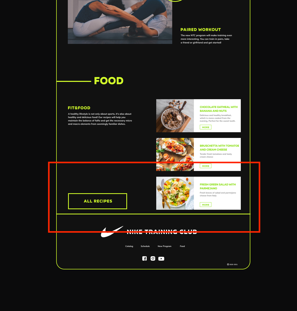
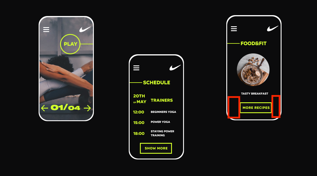
https://www.behance.net/gallery/97209083/Nike-Training-Club-website-redesign

Comment from frusia.pro:

The assignment was completed excellently! All the details were very well drawn. There is a small note: please pay attention to the alignment (centering) of the buttons.

Comment from frusia.pro design error Serhio

Also, please pay attention to the margins; in the example from Behance, they are different.

Comment from frusia.pro design error Serhio-2

Can you tell me if you completed the other assignments as well?

Serhii11 February 2021 19:47  
Good evening!
1) https://www.figma.com/file/JZ9TdtlmYpDehy8KzN1D7d/YouTube?node-id=0%3A1
2) https://www.figma.com/file/JZ9TdtlmYpDehy8KzN1D7d/YouTube?node-id=73%3A6
3) https://www.figma.com/file/JZ9TdtlmYpDehy8KzN1D7d/YouTube?node-id=81%3A0

Comment from frusia.pro:

Hello. I opened the links you attached and saw that the assignment is partially completed for this (5th lesson) and partially for the 4th lesson.

Assignment 2 for lesson 5 (color matching in illustrations). Everything is great! You highlighted the key colors of the illustration excellently.

Assignment 1 for lesson 4 (choose a website and redraw it as closely as possible). You drew it excellently, well done!

Assignment 2 for lesson 4 (draw icons based on the example). You drew the icons very carefully and correctly.

Note. To avoid confusion in the future, please send links to homework assignments only for the relevant lesson . I am waiting for the rest of the homework!

Mila25 November 2020 23:16  
Hello!
1. https://www.figma.com/file/Tg3AHQQsdMW51VPyYzlRqF/Mila-Kovalchuk-Design-Agency?node-id=47%3A4
2. https://www.figma.com/file/Tg3AHQQsdMW51VPyYzlRqF/Mila-Kovalchuk-Design-Agency?node-id=82%3A0
3. https://www.figma.com/file/Tg3AHQQsdMW51VPyYzlRqF/Mila-Kovalchuk-Design-Agency?node-id=87%3A10
I am really looking forward to your feedback!) Thank you!

Comment from frusia.pro:

Task 1. The icons are drawn well, there are some minor flaws, but considering that you are a beginner – it's all good. One of the points of this task was to give meaningful names to the icons. Unfortunately, you didn't manage to do this, apparently you misunderstood a bit (see the screenshot) https://prnt.sc/vtw6vc. Meaningfulness means giving a name that corresponds to the content of the icon. For example: "check", "flower", "calendar".

Task 2. You repeated a small mistake of previous students and also partially took not illustrations, but photos. But the colors reflect the palette excellently, so well done!

Task 3. You did a great job, awesome! Unfortunately, you didn't provide a link to the original site or the website concept, but I didn't see any obvious design errors, so everything is excellent! Be sure to keep it up!

Aidana24 November 2020 08:52  
2 task - https://www.figma.com/file/c758Ow2nxeTK8FVDeroxmX/Untitled?node-id=0%3A1
3 task - https://www.figma.com/file/qONBMdHjh2UOoqiOY7qneF/Untitled?node-id=0%3A1
https://www.figma.com/file/ABmNPxNV3bTIEvc0DjG7aJ/Untitled?node-id=0%3A1
4 task - https://www.figma.com/file/MBB8SdDgI6Gm0WnbORmLts/jjj

Comment from frusia.pro:

Task 2. You used a photo, but you were supposed to find illustrations. You probably misunderstood the task, as the colors are chosen incorrectly. You need to select the key colors of the illustration (that is, those that dominate it); there doesn't necessarily have to be 4. And the most important thing when filling the circle is to use the eyedropper, pointing it at the illustration and selecting the desired color. Try to redo the task.

Task 3. Unfortunately, you did not attach examples of the websites that you redrew for this task. For the first link (Chobani), everything is done quite well. For the second link (planner), I have a question: did you redraw this design from some example? Or did you draw it yourself?

Task 4. In this lesson, task 4 sounds completely different. Apparently, you mixed something up and sent the icons from the previous lesson here.

Anastasiia23 November 2020 22:39  
Assignment for the fifth lesson
1.1 https://www.figma.com/file/n12dKY4eXUDv3877xT1RFk/lesson-5-tasl-1.1?node-id=0%3A1
1.2 https://www.figma.com/file/7DJySPSju0QGzOw26gLQ0x/lesson-5-task-1.2?node-id=0%3A1
2 https://www.figma.com/file/E4dIuEQkxaruugoClEwCn0/lesson-5-task-2?node-id=0%3A1
3 https://www.figma.com/file/aXwW4c6Ywva1Yk7mD5mvxD/lesson-5-task-3?node-id=2%3A0

Comment from frusia.pro:

Task 1. All layers have meaningful names, excellent.

Task 2. For some reason, you used photos instead of illustrations in 4 out of 5 artboards. But the colors were chosen well.

Task 3. You did a great job drawing a long webpage. Overall, everything is done very well. Unfortunately, you didn't provide an example from which you redrew the site, so I will point out the visual errors present in this assignment. For example: lack of contrast: dark background / dark icons (see screenshot) http://prntscr.com/vt4od6

Mariya23 June 2020 15:39  
First part of the assignments
https://www.figma.com/file/LUgwagNiuNT8D0rIUioRM3/001?node-id=0%3A1
https://www.figma.com/file/29a4Yu6sLzI9pAJjZrcrVT/Untitled?node-id=0%3A1

Comment from frusia.pro:

Assignment 1 from the fourth lesson. You have drawn the main page of Google. Good job, the logo and other elements are drawn in great detail.

Assignment 2 from the fourth lesson. The icons are also good.

Assignment 1 from the fifth lesson (this one). Grouped well.

Assignment 2 from the fifth lesson. The key colors are chosen correctly. It’s unclear why you used photographs, but that’s not so important. It counts.

Assignment 3 from the fifth lesson. Drawn, images replaced. It counts.

Overall excellent, move on to the next lessons.