I hope you have already familiarized yourself with the tasks that UX designers face, and for many of you, they may have been a revelation. If you haven't done so yet, I recommend going back to the third lesson. Now we will move on to the tasks of UI designers. I am sure that in your imagination, this will be something more obvious and understandable. These tasks usually have a clear physical result – ready layouts in graphic editors.
UI design is about the constant search for balance between creativity and functionality. It is an industry where every year new trends emerge and gain popularity, which need to be considered in your work.
- Who is a UI designer?
- Typography
- Color in design
- Composition and spacing
- Design principles
- Grids
- Working with icons and images
- Where to get ideas?
- Creating final page designs
- Creating adaptive and responsive design
- UI Kits and design systems
- A typical day of a UI designer
- Animation of elements. The work of a motion designer
- Tasks of a graphic designer
- Homework
- Conclusions
UI Designer – is a creative specialist who transforms ideas, research, and functional requirements into visual solutions in the form of website layouts, applications, or any other interface. He is also referred to as a visual designer.
The main task of the UI designer is to make the interaction between the user and the product as intuitive and pleasant as possible. He carefully selects colors, fonts, icons, and the layout of elements, considering both aesthetics and usability. As a result, every pixel of the interface plays its important role in creating a harmonious and functional product.
An important factor for the effective work of a visual designer is the development of one's own taste, exposure, knowledge of the rules and principles of design theory. It is to these topics that we will turn below.
Typography — is the rules, principles, and methods of formatting text. Typography is one of the sections of graphic design. It allows text to be presented in the most understandable way for the reader's perception. The UI designer is responsible for selecting the font, determining sizes, spacing between lines and characters. It defines the styles of headings, paragraphs, lists, and other text elements of the page. Let's get acquainted with key terms.
Font — is a set of characters designed in a single style that forms a unified system.
Typeface — is a set of fonts grouped into one family.
Point size — is the height of a letter in the font.
Leading – is the line spacing or distance between lines.
Evaluate the complexity of this discipline by looking at the picture below.

The font has the ability to create mood and overall style no worse than photographs and colors. That’s why it’s important to learn how to choose fonts for each project. Every UI designer faces numerous obstacles on this path.
The first obstacle is learning to distinguish good, high-quality, and stylish fonts among all the others. The second is that a large number of good fonts are paid and require additional financial resources. The third obstacle will be relevant for designers working with Cyrillic, as the number of good fonts for this market decreases dramatically. There are also other minor obstacles.
If you are interested in learning more about typography, you can purchase my guide dedicated to this topic.
Pay attention to the example below (website design for a coffee shop). An experienced designer would hardly choose such fonts for the site as in the upper example. They look somewhat crooked, and their readability sharply decreases with smaller letter sizes. However, for the sake of fairness, I suspect that to someone without a design education or adequate exposure, such fonts may seem quite decent. In reality, adding handwritten fonts to modern web design should be done with great caution. For interfaces, it’s generally a taboo.
On the other hand, the combination of fonts from the lower example is more familiar and appropriate for a modern approach to website typography.
Color in Design
Color in UI Design – is much more than just choosing pleasant shades. It is a powerful means of communication that can convey emotions, influence the user's mood, and shape their interaction with the product.
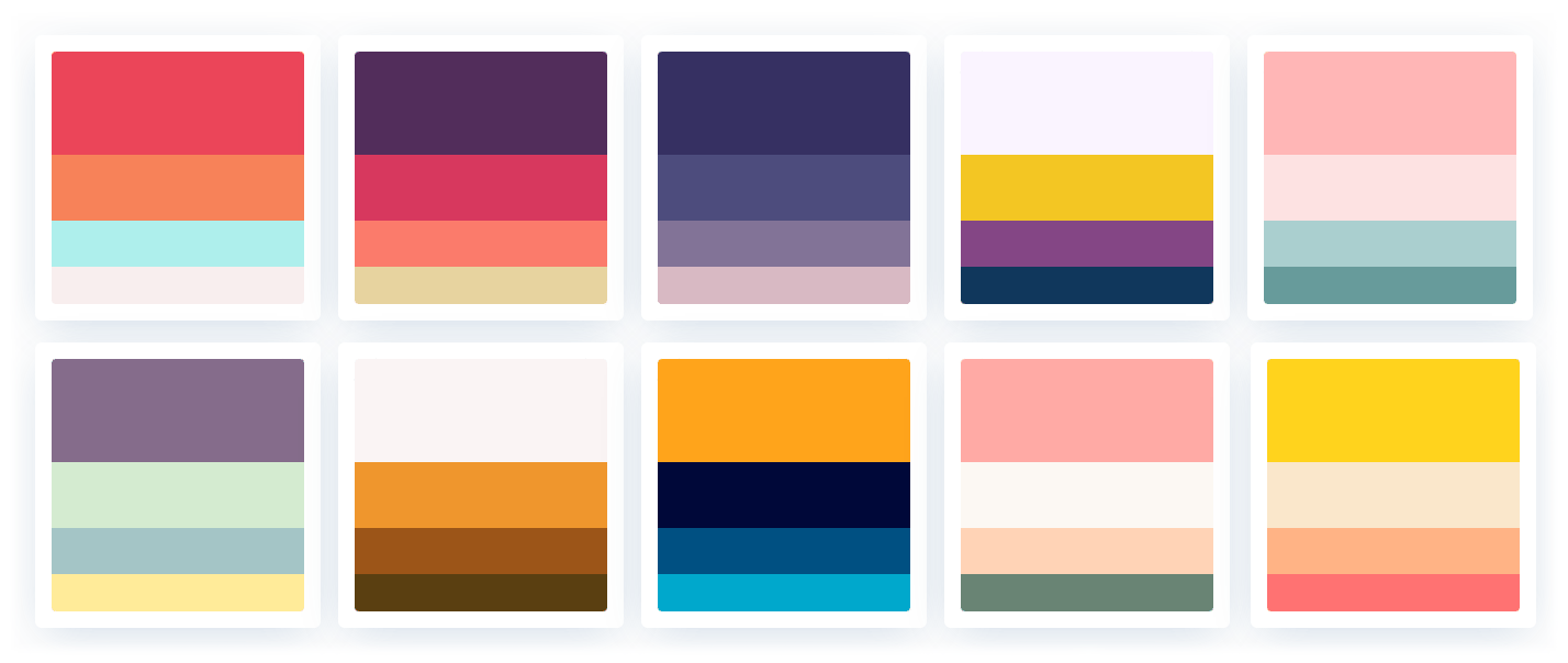
Palette or color scheme — is a set of basic colors used as the foundation for identifying your interface. It helps create cohesive pages, simplifies and significantly speeds up the work, because the selection needs to be done only once.
Usually, a ready-made palette is used, which is based on the brand style or promotional materials. If there are none, you can use the logo to get a few basic colors, and choose the rest yourself. If the client has nothing, then you create the entire color scheme yourself. It's better to work on creating the color palette after creating the wireframes to understand which interface elements and corresponding colors you will need.
When selecting a palette yourself, pay attention to the colors of competitors and related fields. It would also be good to familiarize yourself with color psychology. Find as many existing examples as possible and create a mood board.
If you want to delve deeper into the topic of color in UI design, I recommend purchasing my guide on color.
There are many services for creating color schemes (Adobe Color, Coolors, Colormind, Colorhunt, Palettr), which generate a new set based on just one base color or an uploaded image.
Composition and Spacing
Composition is the way of arranging all interface elements so that the user immediately understands where to go and what to do next. A well-thought-out composition establishes a visual hierarchy: primary elements are highlighted by size, color, or placement, while secondary ones are organically integrated into the overall scheme.
Among the main approaches to composition, we can highlight symmetrical, asymmetrical, grid, diagonal, and radial. Each of these options has its own characteristics and allows achieving a certain emotional and functional effect, depending on the project's goals.
Symmetrical balance involves the reflection of elements relative to a central axis. This approach creates a sense of harmony, stability, and order, which is especially useful for projects where it is important to convey reliability and confidence. Users find it easier to navigate a symmetrical interface, as all elements are arranged in an organized and predictable manner.
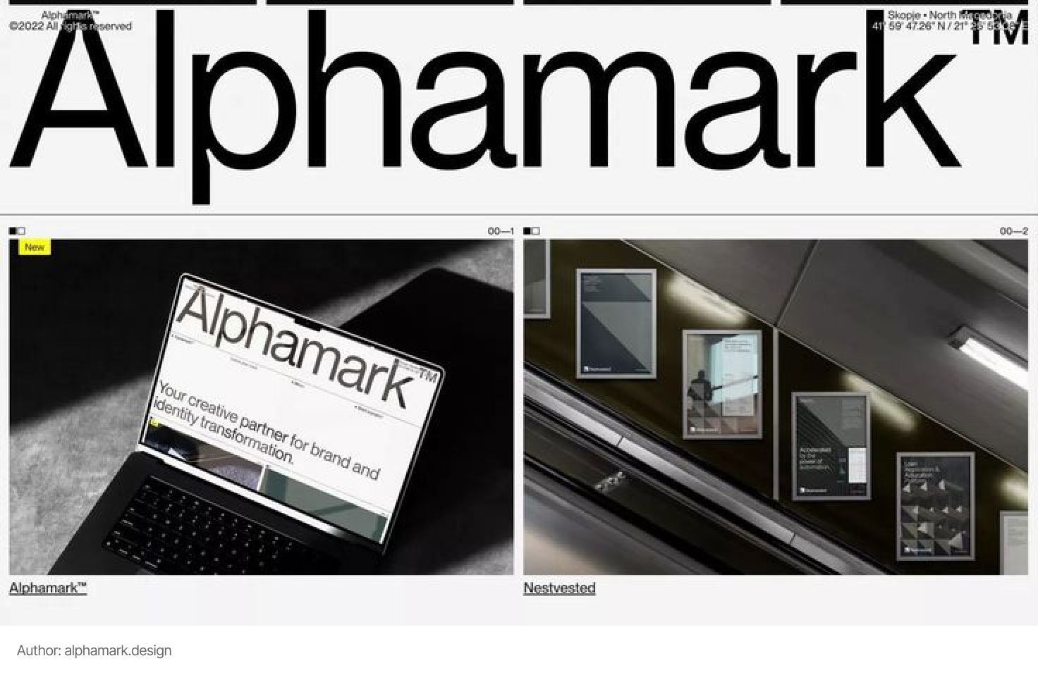
Asymmetrical balance is based on the uneven arrangement of elements, where balance is achieved through variations in size, weight, color, or shape of components. This approach allows for the creation of a dynamic, modern look that attracts attention through interesting visual accents. However, asymmetry requires careful selection of elements to maintain the overall harmony of the composition.
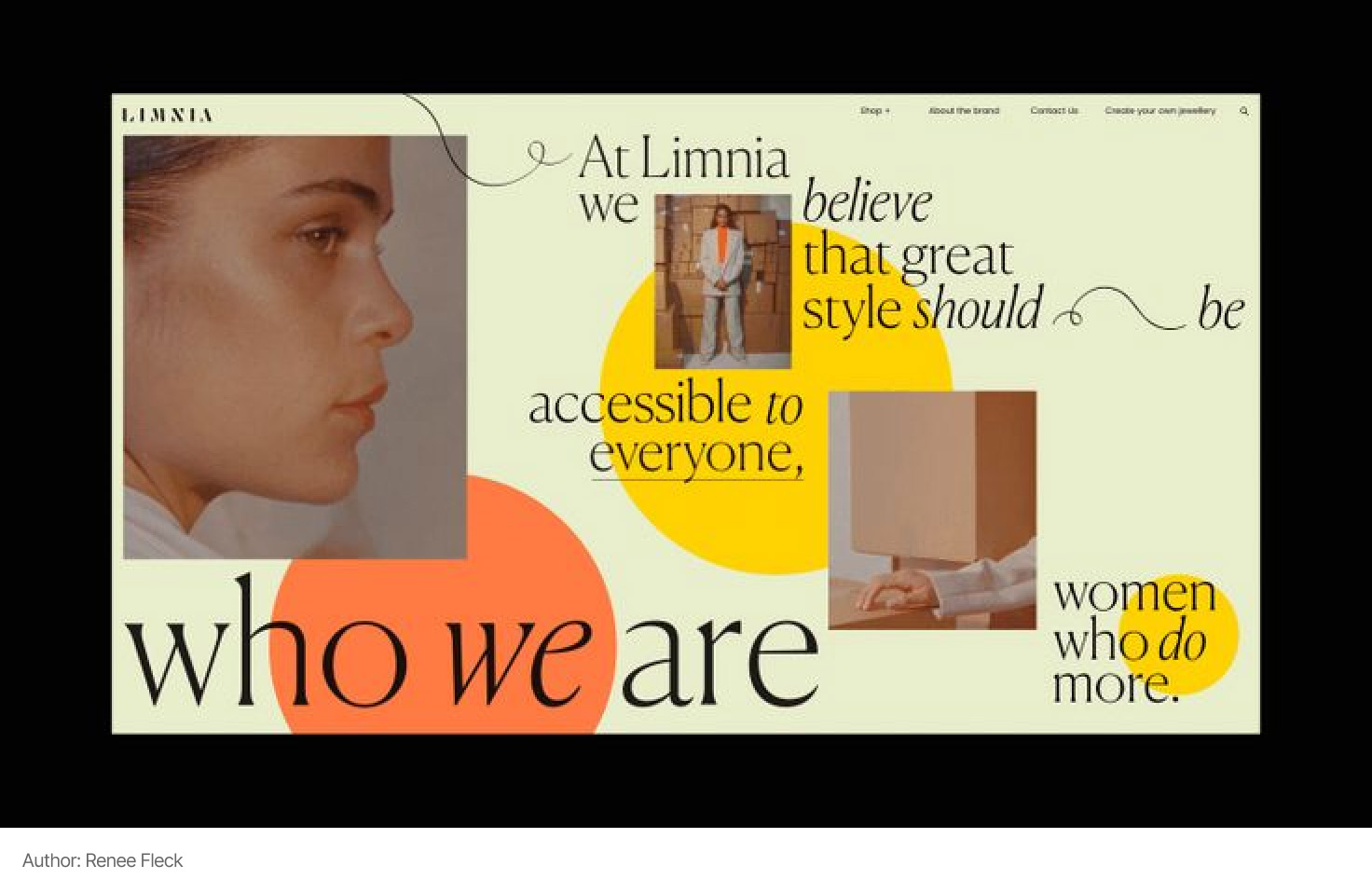
UI designers actively use grid structures to organize space, as well as diagonal compositions that add a sense of movement and dynamics.
Margins – this is the space between individual elements, which helps avoid interface overload and contributes to better readability. Clearly defined margins separate content into logical blocks, emphasize the connection between elements, and create a visual "breathing" zone. This allows the user to quickly orient themselves, highlight important parts of the page, and focus on key actions.
From whether the designer adheres to the correct hierarchy and approach to creating margins, one can say a lot about their experience in creating visuals.
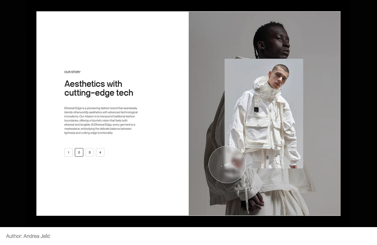
Design principles – are the foundation on which every effective interface is built. They help create a clear visual language that fosters intuitive information perception by the user.
The main design principles include:
- Balance: an even distribution of visual weight creates a harmonious and stable interface, making it easier to perceive information.
- Contrast: the use of different colors, sizes, and shapes allows key elements to stand out, providing a clear visual hierarchy.
- Hierarchy: variations in sizes, colors, and placement of elements help the user quickly determine the priority of information and the logic of interface structuring.
- Consistency: uniformity in the use of styles, fonts, and other visual elements creates a cohesive, recognizable look for the product.
- White Space: using empty space around elements makes the design cleaner and easier to perceive, allowing important components to "breathe".
Additionally, separate gestalt principles can be highlighted, which can be applied in design. They describe how our brain organizes visual information, automatically grouping individual elements into unified whole forms. These principles help to understand why we perceive a set of separate objects as a connected block, even if they are located separately or have minor differences.
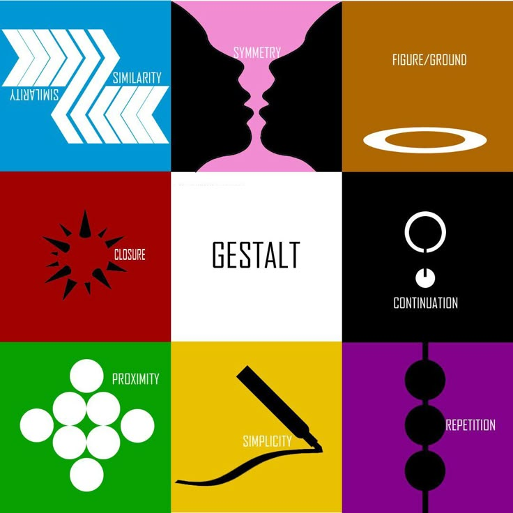
Applying gestalt principles in UI design allows for the creation of interfaces that users perceive logically and naturally. Mastering the topic of design principles requires separate material that will provide detailed examples.
Grids in UI Design – are tools that help to structurally organize space on the screen by dividing it into logical blocks. They provide consistency in the placement of elements, simplify responsive layout, and promote visual coherence of the product.
Column grids are one of the most common options and are based on dividing space into vertical columns with fixed or flexible gutters. This approach allows for easy management of the width of blocks, creating a clear and balanced layout that automatically adjusts to different screen sizes. The use of column grids significantly simplifies working with responsive designs, ensuring the preservation of proportions and clarity of structure when display sizes change.
An example of using a column grid in real design:
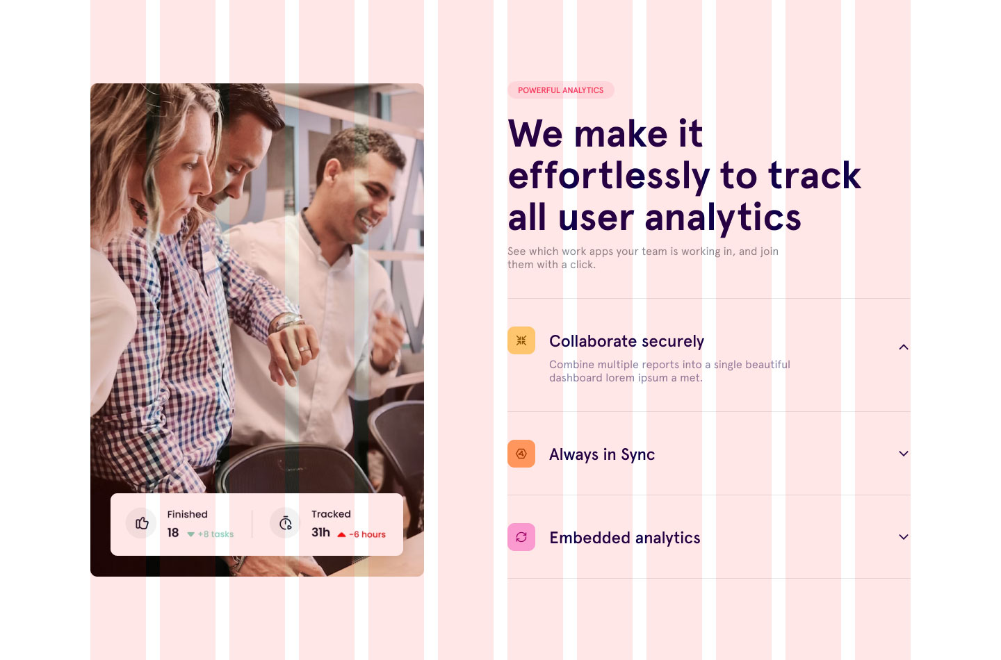
Basic grids are used to organize elements both horizontally and vertically. They allow for the establishment of a unified system of rows and columns, which creates a clear hierarchy of information and determines the order of content placement. Such a grid often includes a baseline grid, which ensures consistency in spacing and alignment of text elements.
Modular grids represent an extension of regular grids, combining both columns and rows to form a grid made up of numerous modules. Each module can be used as a separate unit for placing content or combined to create larger blocks, making the layout more flexible and adaptive.
The application of grids in UI design helps reduce chaos in the placement of elements and provides a technical foundation for building user-friendly, adaptive, and consistent interfaces. By using different types of grids, a designer can achieve an optimal balance between creative freedom and structure, which is critically important for modern digital products.
Icons – are simple and clear images (pictures) to speed up the understanding and perception of information.
The main rule that a designer should remember when working with them is that the icon must convey the meaning of the text it is tied to or that it replaces. If the image is not recognizable, it is better to remove the icon or replace it with another one.
Another important aspect is the style. Icons should blend well with each other and, of course, with the interface to which they are added. Ready-made solutions can help with this.
UI designers often use ready-made icon sets, of which there are many (Fontawesome, Lineicons). Sometimes icons need to be edited or recolored. A UI designer should ensure that all icons are maintained in a consistent style.
Images are used to enhance the presentation and complement the text. Photographs and illustrations are cropped, resized, and color corrected.
There are free and paid websites for selecting illustrations and photographs (Freepik, Unsplash, Shutterstock). UI designers do not often draw icons and illustrations themselves. This is more the job of a graphic designer.
Where to find ideas?
Inspiration in the field of UI design can be found almost everywhere – the main thing is to pay attention to details and analyze what makes a product successful. Ideas often arise in the process of observing the work of other designers, so it is important to constantly update your knowledge and familiarize yourself with new trends.
It is important not just to browse everything randomly, but to learn how to form targeted queries and look for the references you specifically need. Also, create folders to save various ideas, so that in moments of acute need or a crisis of ideas, you can quickly return to what you've saved.
Before starting the work on a specific project, the UI designer also creates a mood board, that is, a board of mood. We will return to the discussion of the mood board in the upcoming lessons. There is even an option for collaboration with the client when you first agree on the mood board. This is the idea stage. Then, based on it, you develop the design.
Imagine that you are a UI designer and today you are tasked with creating an interface for a new mobile application. First, you meet with the client and/or team to discuss the goals of the project, the needs of the target audience, and the key features of the product. This initial stage helps you clearly understand the task and form a general concept of the future interface.
Before diving into work in the graphic editor, you start gathering references for inspiration. You browse through competitors' works, look for modern and trendy solutions, and analyze successful cases from various fields. This stage helps you define the visual direction that will harmoniously align with the project's goals.
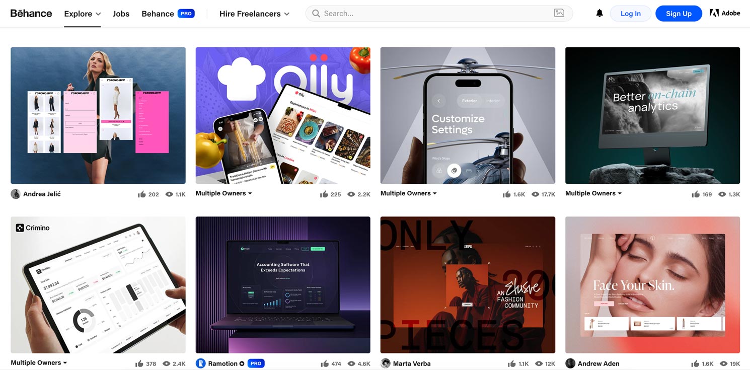
A bit about the process itself. I dispel a common myth. UI designers rarely come up with everything from scratch. Most often, they look for examples of work on sites like Behance and Dribbble, where the best colleagues from around the world share their work. This does not mean that everything is simply copied, no. But the designer can peek at some detail, a successful combination of colors, fonts, grid, and layout of elements.
Thus, the new design is gradually synthesized from the worldview and your experience, as well as from already existing successful solutions. With the development of projects, you will gradually form your own unique style with distinctive features. But remember, it takes a lot of time and effort.
You may already have wireframes ready from a UX designer who has worked on the logical structure of the interface. Or you are that designer, as you perform both roles, UX and UI simultaneously. The wireframes contain the main blocks and layout of elements, allowing you to focus on the visual design without spending time developing the structure from scratch. They become your foundation for further work on details and styling.
In some cases, wireframes are ignored, and the design is jumped straight into. However, if we are talking about a mobile application, this approach is not the best solution. It may be quite reasonable if you are developing, for example, a small creative website.
In the next step, you begin creating the visual concept. Using the collected references, you choose the color palette, typography, icons, and other graphic elements that will help make the interface not only attractive but also intuitive. You work carefully on proportions, spacing, and composition so that each element aligns with the overall concept of the product.
At the final stage, you organize a test session, showcasing your design to colleagues and potential users. The feedback received allows for adjustments, improving the visual hierarchy and enhancing the usability of the interface. Thus, through a systematic approach – from gathering references to the final presentation to clients – you transform ideas into a real, modern interface that meets high standards of UI design.
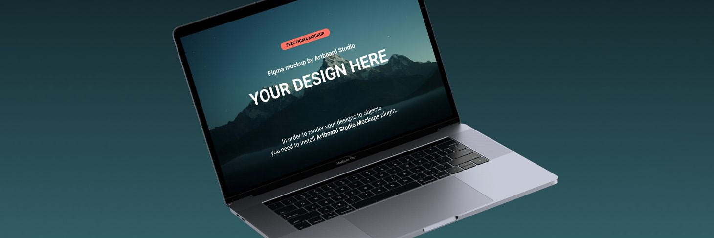
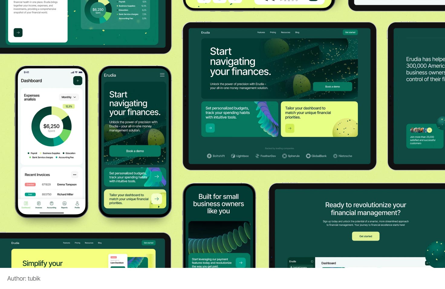
Mockup (pronounced mockup) is a design of a drawn page. A mockup also refers to the design of a page or screen that is embedded in a photograph or illustration with the device on which it is intended to be used. When you see a photo with a laptop and a running website, know that this is also a mockup.
Now let's take another example, namely creating a website. Usually, the process starts with sketching layouts for the desktop version (that is, the version for monitors and laptops). However, for the development team to effectively implement your design, just these layouts will not be enough.
Statistics from recent years indicate that an increasing number of users visit websites from mobile devices. This is facilitated by a significant improvement in mobile internet speed. Web pages on a phone load just as quickly as on a PC or laptop. Therefore, the designer must think ahead about how the site will look and function on a smartphone.
Let's figure out what the difference is between adaptive and responsive design.
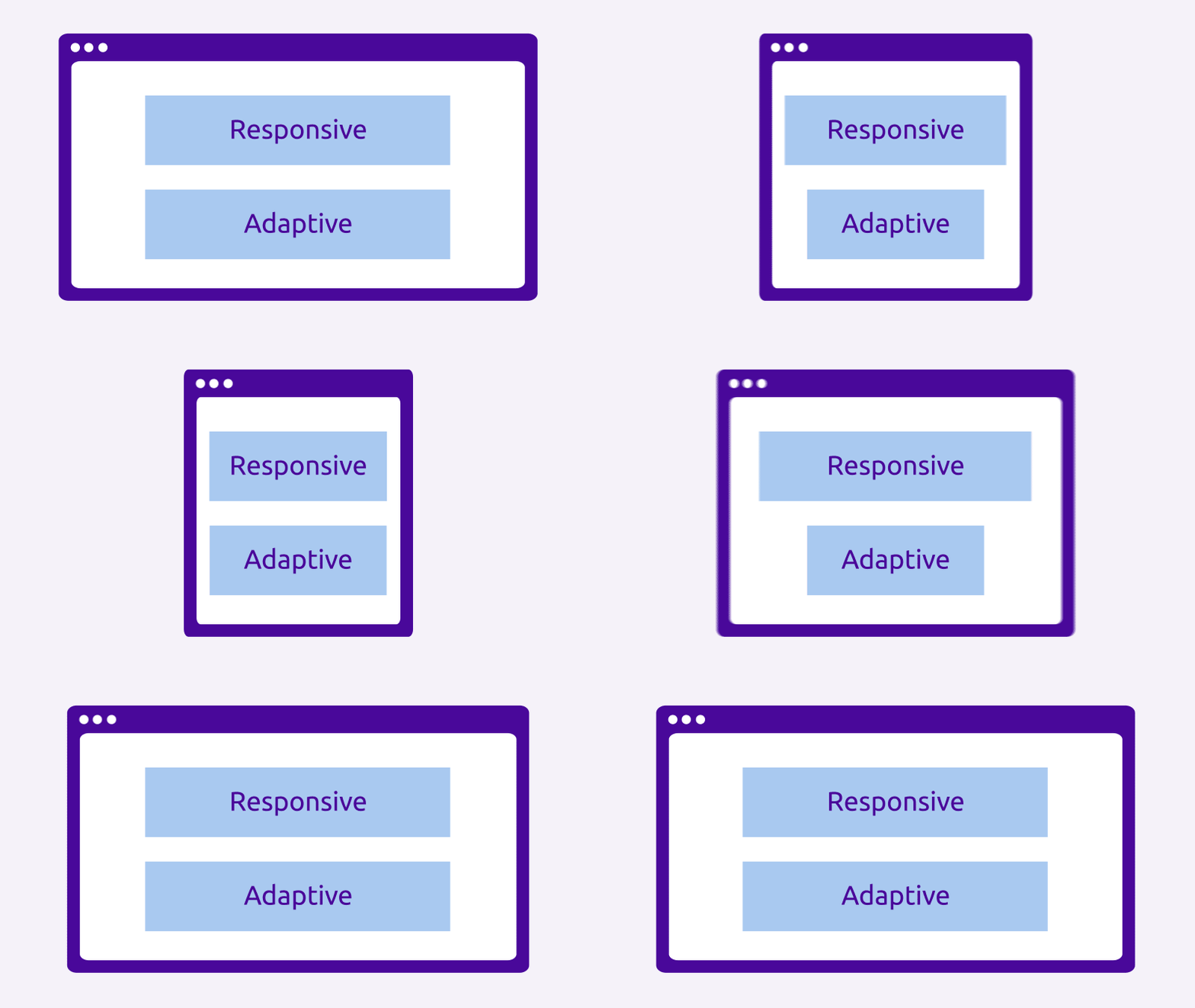
The approach of adaptive design involves creating separate, predetermined layouts for different screen sizes. You create fixed versions of the interface for smartphones, tablets, and desktops, each optimized for a specific category of devices. This allows for clear control over how your design will look at each breakpoint, but requires more resources to maintain multiple layout variants.
When developing this type of design, key display variants are highlighted, between which there is a sharp transition. These points are also called breakpoints. When resizing the browser window, the site will adapt in "jumps" when switching from one display to another. Each display can have a unique layout.
For example, the display for desktop computers (where large monitors are typically used), the design may include a right column with additional information. In the display for smartphones of the same site, this sidebar will be hidden, as the screen is narrow.
Responsive design, on the other hand, is based on flexible grids and relative units of measurement, allowing the interface to smoothly adapt to any screen size. You set rules for elements that scale depending on the space, thus providing a continuous transformation of the layout, regardless of specific breakpoints. This approach provides greater versatility but may require careful testing to achieve perfect usability across all devices.
When resizing the browser window, the design adjusts as if it were made of rubber. That is, the layout structure is static and the side columns do not disappear.
From my experience, responsive design works well with simple layouts where there are many similar elements: sliders, cards, simple texts. However, if we want to achieve greater creativity or demonstrate approaches different from the desktop version to users, it is better to work with adaptive design.
Creating layouts for separate versions of the site requires the following skills from the designer:
- Audience and Device Analysis: determining the main screen sizes and breakpoints used by your users.
- Flexible Grid: using responsive grids for logical content distribution on the page.
- Content Optimization: scaling images and icons, using modern formats for fast loading.
- Responsive Typography: ensuring usability of buttons, menus, and forms on various devices, including touch screens.
- Interactive Elements and Device Features: ensuring usability of buttons, menus, and forms on various devices, including touch screens. Remember common gestures (taps, swipes, etc.).
- Accessibility: using high contrast and clear navigation to ensure comfortable usage for all user groups.
UI Kits and Design Systems
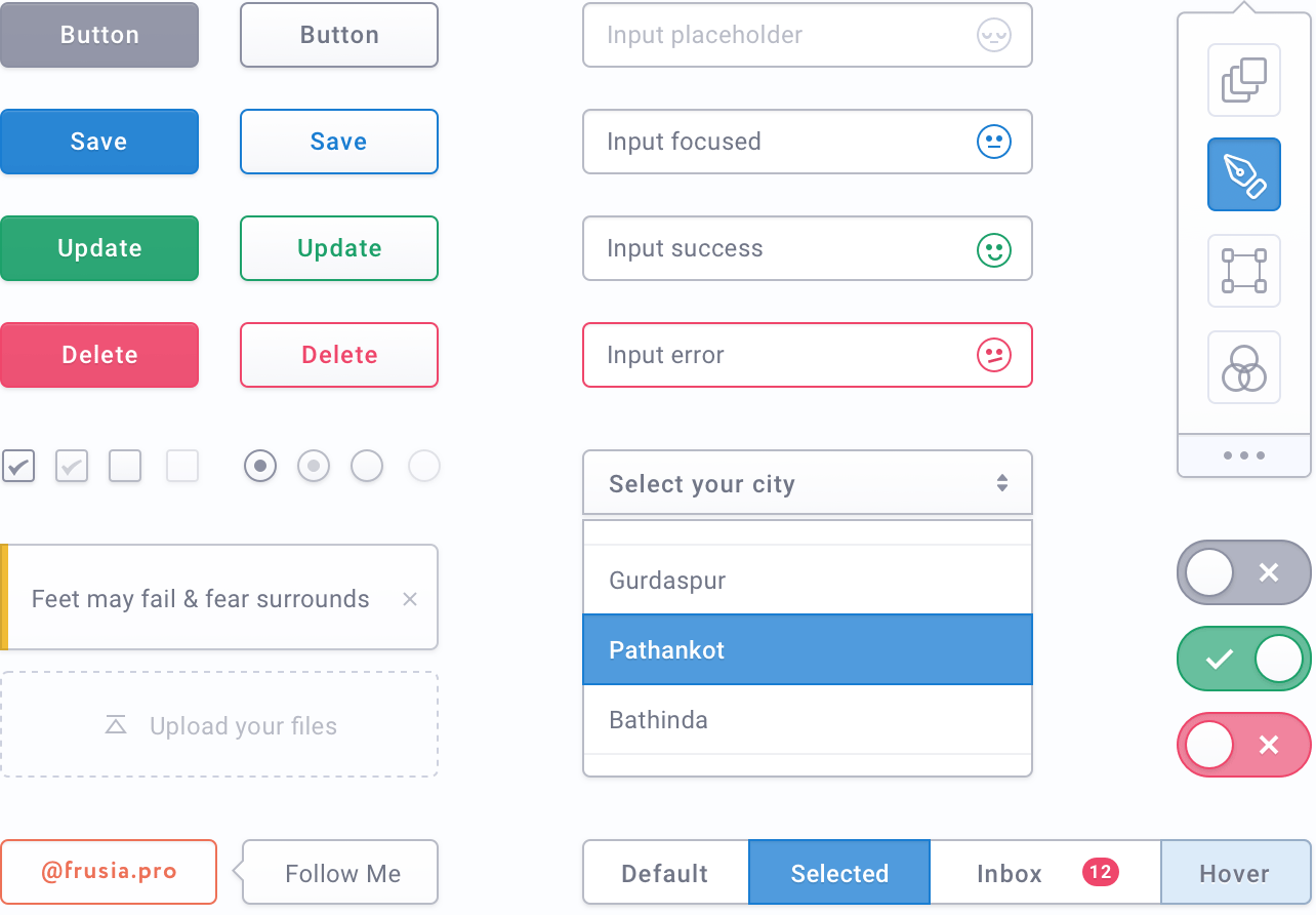
UI-kit (read as yoo-eye-kit) or User Interface Kit — is a set of interface elements for further designing web pages. The set will differ for a startup, a blog, and a social network. The most common elements include: buttons, navigation elements, input fields, lists, switches, forms, and so on.
The UI kit in modern graphic editors is based on components. This significantly speeds up the process of making changes. Imagine a situation. You have 20 illustrated screens. Suddenly, the client wants to change the rounding of the buttons despite all the designers' persuasion. By using a component-based UI kit, you will only need to make changes in one place, and the adjustments will be made automatically and instantly on all pages. Is that not magic? Without components (for instance, if you are using Photoshop), you would have to go through all the pages and redo each button manually.
Design System is a more comprehensive tool that includes not only visual components but also a set of rules, principles, documented templates, as well as recommendations for the use of colors, fonts, spacing, and even code. The design system is created to provide a single standard for the entire team, including both designers and developers, and to ensure consistency across all company products.
The difference between UI Kits and design systems lies in the scale and depth of information. UI Kits are usually static collections of graphic elements that are used for quickly generating prototypes or as a base for visual design. A design system, on the other hand, is much broader: it includes both visual elements and principles that govern their use, allowing for the creation of not only beautiful but also functional interfaces that are easy to maintain and scale.
The former helps quickly generate ideas and create prototypes, while the latter supports long-term unity, efficiency, and scalability of the product.
Remember that both the design system and the UI Kit aim to assist not only the design team but also significantly ease and speed up the development of the interface.
A Typical Day of a UI Designer
Like a UX designer, the morning starts with checking emails, planning tasks, or having joint calls with the team or clients. Next comes direct work with search engines, stock resources, technical specifications, conducted research, and of course, graphic editors.
A significant portion of a UI designer's time is dedicated to searching. We look for ideas and specific references for mood boards and layouts. We search for good, often free, fonts. We look for colors and compositional techniques. Sometimes we also look for content. This can include temporary photos, videos, icons, as well as those that will be used in the final product.
Since searching can take quite a bit of time, it's important to optimize the speed of work with graphic editors. This allows for quickly implementing ideas, sketching several options, etc. Working with components, variants, and auto-layouts will help you.
UI designers create interface screens from scratch or visualize existing wireframes.
As you can see, a UI designer communicates less with people and spends more time drawing. However, communication skills are necessary in any case. After all, there is a presentation stage when the designer must defend their ideas. And when we talk about visuals, an irrational factor of tastes and preferences can come into play from others. That is why a designer needs the ability to explain and defend their decisions.
Animation of Elements. The Work of a Motion Designer
In UI design, animations are used to direct attention, explain state changes, create smooth transitions, and provide a wow effect. The main goal of animation is to ensure intuitive interaction: it helps the user understand what is happening and creates a sense of continuity in the product usage process.
Microanimations are short, subtle effects that confirm user actions, signal active elements, or ease the perception of the interface. They can be displayed when buttons are pressed, content is loaded, or element states change, making interaction more understandable and enjoyable. Such animations are easy to create using Figma. For complex animations, Adobe After Effects or Adobe Animate is usually used.


In reality, a UI designer should not focus all their attention on working with animations. Because this is a separate field with a dedicated specialist – a motion designer. Main tasks of a motion designer:
- Development of concepts and ideas for animations.
- Creation of storyboards and movement prototypes.
- Integration of animations into the final product. For example, using Lottie technology.
- Testing and optimization of animations for different devices.
- Collaboration with UI/UX designers and developers to align movements with the overall design.
It is also worth noting that a large part of the animations implemented in modern web products is created by developers using specialized ready-made css and js libraries. Working in a team with front-end developers, one can try to implement animations without the help of a motion designer.
Graphic Designer Tasks
This includes a wide range of tasks, but I highlighted only the main ones that intersect with UX/UI design:
- Creating logos and corporate identity;
- Drawing illustrations and icons;
- Creating banners, marketing materials, packaging.
Unlike a UX/UI designer, a graphic designer sometimes uses additional equipment, such as a graphic tablet. Furthermore, an artistic education and the ability to draw can greatly assist in the profession.
Homework
From now on, this course is designed for independent study and completion of homework assignments. I understand that some tasks may be challenging for you.
For additional support, use the Telegram chat. Here you can ask questions related to the lessons or view examples of correct completion from other students.
The chat is not available for citizens of Russia.
Task 1. Visit the website Behance and save portfolio examples from three different designers: a UX/UI designer, a graphic designer, and a motion designer. Another condition is that you should like the portfolios. You can share the links in the Telegram chat.
Task 2. Imagine a situation: you are working in a team and have agreed with the client on the wireframes for their future application. However, they have no idea what the application should look like visually. Now your task is to find 2-3 references for the client that differ in style. Since this is a fictional task, choose the application theme yourself from the list below.
- Mobile application for fitness. Tracking workouts, meal planning, motivational reminders.
- Ready meal delivery service. Various diets, subscriptions, personalized recommendations.
- Budget (finance) planning application. Expenses, savings, expense diaries, payment reminders.
- Foreign language learning application. Daily lessons, gamification, social interactions between users.
- Online platform for finding tutors or courses. Teacher ratings, class schedules, reviews, specialization searches.
- Application for mental health care. Meditations, stress relief tips, mood diary.
Look for references on the same Behance and save them as links.
Conclusions
Hello! This was another extensive lesson of this free course. I hope it has become clearer to you what knowledge is required for a UI designer and what tasks they face daily. To become a skilled specialist in this field, you need to delve into each of the sections separately. Good luck!
Complete your homework. Only practice will truly bring you closer to your dream profession.
графічний - https://www.behance.net/NegativoPeru
ux ui - https://www.behance.net/vlad_g
Додаток про психологічне здоров’я. Медитації
Референси : [https://www.behance.net/gallery/221897061/Soulspace-Mobile-app-UX-UI?tracking_source=search_projects|meditation&l=0]
[https://www.behance.net/gallery/231356027/Calm-meditation-and-yoga-app?tracking_source=search_projects|meditation&l=4]
[https://www.behance.net/gallery/230684935/Yoga-And-Meditation-Mobile-App?tracking_source=search_projects|meditation&l=10]
Коментар frusia.pro:
Добрий день, Марго! Бачу правильно підібрані портфоліо моушн-дизайнера, граф дизайнера та ux/ui-дизайнера. Референси для додатку психологічне здоров'я також відповідні та мають класний стиль.
У вас добре виходить, переходьте до наступного уроку!