In this introductory lesson, visual examples will show what design is in general and what key concepts it includes. You will master the basic terms that everyone has heard of, but which no one fully understands.
Design is the result of designing an object with the aim of solving the set tasks, particularly artistic (aesthetic).
In a broad sense, design focuses not only on artistic construction but also on solving a number of other problems: technical, social, consumer, etc.
Design should solve the problem as effectively as possible.
Depending on the context and the task at hand, design solves problems in different ways. Let's take a look at Coca–Cola's advertising materials from 1949:

From the perspective of graphic design this poster should attract attention, identify the brand, prompt action — all of this is the task of design in this context. Composition, color theory, and typography help us with this — tools and principles of design. A key role here is also played by copywriting or how the text is written, but that is already an adjacent discipline.
Now let's focus on the red vending machine with drinks (which is allegorically depicted steaming in the sky).
Look at the size of the doors, the placement of the handle and coin acceptor. Pay attention to the hinges and cooling grid. Every detail is crafted and has a reason for which it is made this way.
This is the result of industrial design – a separate complex discipline that takes into account entirely different aspects: functional requirements for the product, technical constraints, the structure, and arrangement of parts. To create such a design, engineering assistance or consultations with relevant specialists will already be required.
From the above, it should be clear that design can be different, but each of its directions has boundaries and areas of application. We are going to study a very specific type of design — UX/UI дизайн for екранних графічних інтерфейсів.
Interface — is a set of tools for interaction between two systems. In English, interface means "between faces." In the case of design, one of the systems is always a human.
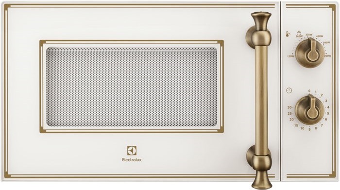
Let's analyze the UI (User Interface) user interface of the microwave.

The front panel includes several elements that we can customize according to our needs:
- Door with window and opening handle — provides access to the food container and serves as an indicator. When heating is in progress, we see the light;
- Power knob — determines the strength of the heating;
- Timer knob — sets how long to heat. Additionally, as soon as we set the time, the cooking process begins immediately. That is, this knob also acts as a switch.
All of the above are user interface elements.
Based on our retro microwave, we will consider what UI and UX design are.
UI–design (User Interface Design) or user interface design – defines how the user interface looks, namely:
- Materials and Colors — metal and glass, cream and bronze colors;
- Style of Mechanical Elements — retro;
- Style of Icons and Texts — flat, sans-serif font.
UX Design (User Experience) or interaction experience – defines how the user interacts with the interface, namely:
- Which interface elements to choose — instead of mechanical knobs, the UX designer could have placed a display with touch controls and status indicators. He could also have installed an additional switch to turn the oven on/off or a button to open the door;
- Size and placement of interface elements — on which side to place the knob, what size window to install in the door, how large the dials should be.
In the responsibilities of a UX–designer, the search for product usage scenarios based on user roles is also included. For example, in our case, several scenarios can be identified:
- Student heats frozen pizza before breakfast — it seems heating will be frequent, perhaps we should consider a single button that automatically sets the power to 240 watts and a timer for 3 minutes?
- Mom cooks fish in a baking bag — this can take a whole hour, we should think about a loud signal at the end of cooking, at that moment mom may be in another room.
The interface of a microwave oven can be described as physical and even mechanical. But UX/UI designers work with graphical user interfaces. That is, all interface elements are located on the screen of a monitor or mobile device (smartphone, tablet).
It is very important to understand that the monitor screen of a desktop computer and the screen of a smartphone have significant differences. Specifically, how we interact with them:
- On desktop computers, a keyboard and mouse are used;
- On smartphones, tablets, and smartwatches, only fingers are used instead of a mouse and keyboard. This imposes certain limitations. For example, a button on a mobile device cannot be made too small, as it would be impossible to tap with a finger.
So, UX/UI designers create graphical screen interfaces, specifically design for:
- Websites — that we will study intensively;
- Mobile applications — we will only touch on superficially;
- Desktop applications.

Design for websites and mobile applications – this is what UX/UI designers work on 99% of the time. In this course, we will focus on design for sites, which is called web design.
For a better understanding, here are a few types of unusual interfaces. We will not work with them, but they exist:
- Command Line Interface — one of the first computer interfaces still used by professionals today. It requires a high level of technical training but provides flexible and efficient control of the computer in return. It exclusively uses the keyboard for operation;
- Gesture Interface — control through hand gestures and a touchscreen. Touchless recognition is also possible. For example, the multimedia system in the latest models of BMW cars allows control of music volume with an intuitive finger-twirling gesture;
- Voice Interface — one of the most understandable ways to interact with computer systems using human language. It is especially relevant when the device lacks a keyboard or when its use distracts from the primary task (e.g., a driver on the road).
New interfaces continue to be developed today. Elon Musk's company Neuralink is working on creating a neural interface that will enable direct interaction between the human brain and a computer. Just imagine how much the quality of the user experience will change when you can control the cursor with your thoughts and input text without saying a word.
This course is now designed for independent study and completion of homework assignments. I understand that some tasks may be challenging for you.
For additional support, please use the chat in Telegram. Here you can ask questions related to the lessons or view examples of correct execution from other students.
The chat is not available for citizens of Russia.
Task 1. Analyze the interface of two specific objects that you interact with yourself. For example, a hair dryer, a washing machine, a remote control, and so on. Something you use frequently. Specifically, explain what UI (appearance: color, style, fonts, etc.) is present in the chosen device, and what UX is (why the object has that particular shape, why the elements are arranged in that way and not differently). Try to get to the essence. For example, the handle has that shape so that it is comfortable to hold in your hand.
If you are unable to complete this task, re-read the section What is UX, UI design and what is the difference? of this lesson.
Task 2 (advanced difficulty, optional). Analyze an object that has no buttons or electronics, such as a spoon. Where are the UX and UI design parts? Why does it have that particular shape?
Task 3. Name one new type of interface that is not described in the lesson. They definitely exist, you can invent your own.
Today you have become acquainted with the basic design terms. Please make sure you are well familiar with them. Complete the homework in full before moving on to the next lesson. Review the lesson again after some time.
uх
- маленький розмір повербанку дозволяє брати з собою на роботу шо дуже зручно
-ручка для носіння повербанку дозволяє завжди його брати із собою
- вбудовані розєми для різних моделей зарядних пристроїв дозволяє не переживати за наушники, які можуть в любий момент розрядитися
-тримає заряд до 5 годин
-вистачає на 3 повних заряда телефону
ui
-має чорний колір
-гладенький на дотик
-коли заряджається має червоний колір , що дозволяє відслідковувати стан зарядки
2. кільцева лампа
ux
- має опору на 3 ніжки
- висота лампи 1 + метра що дозволяє себе знімати на повний ріст
- гарна фіксація ніжок які дозволяють утримувати вагу телефону та рвновагу
- різні розміри кільцевої лампи
-шнур з різними опціями для керуванням потужності ламп
-може працювати від світла і від повербанка
ui
- має чорний колір
-лампа має 4 кольори та різні освіщення (жовтий, білий, рожений і т.д,
Коментар frusia.pro:
Повер банк. Все правильно, тільки замість гладенька на дотик краще писати, що має блискучу поверхню.
Кільцева лампа. Все супер. Розібрано правильно, молодець!
Чудовий початок, переходьте до наступного уроку!