No matter how strong the craving for the term "overexposure" might be, it still remains an important component for the personal development of a UI designer. Overexposure allows one to distinguish good visual solutions from bad ones. This applies to everything around: clothing, interior design, architecture, and, of course, web design, which interests us the most.
How to form amazement? In this material, I will share with you personal ways. In my opinion, the main rule that you should apply almost every day is to notice the details. This is what allows you to develop taste and a certain opinion about various things.
There are many web communities where people publish works on the topic of UX/UI and graphic design. On these sites, both beginners and pros, or even leaders in the field, showcase their work.
Behance – the largest design community, where works are published not only on web and graphic design but also on photography, architecture, interior and industrial design. Behance has one cool advantage – most case studies are published in the form of large, detailed presentations, where you can see the work on individual details that can inspire you and be noted for future projects.
Dribbble – a community where designers publish short posts and shots, showcasing the best parts of their projects. I use Dribbble to search for specific solutions when I need to see how other designers have solved a particular task.
By the way, anyone can browse others' works on dribbble. However, to publish your portfolio, you need to receive an invitation from those who are already registered on dribbble.
Awwwards – another community where the top works in the digital world are collected. Awwwards differs from the first two communities in that it features sections with ready-made websites. That is, those that are actually implemented and functional. This changes the experience of viewing, as the sites are «live», allowing interaction and the ability to see what solutions have been implemented by programmers.
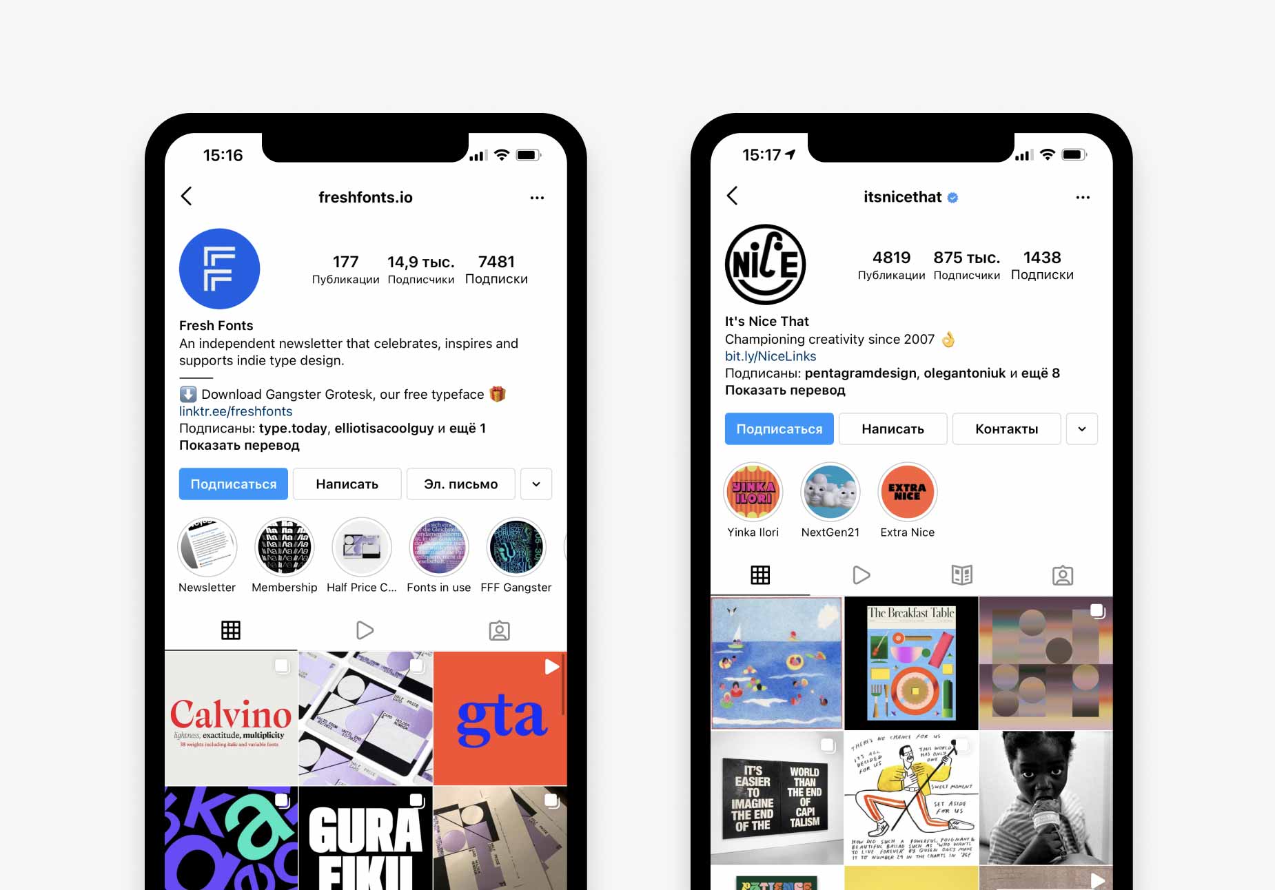
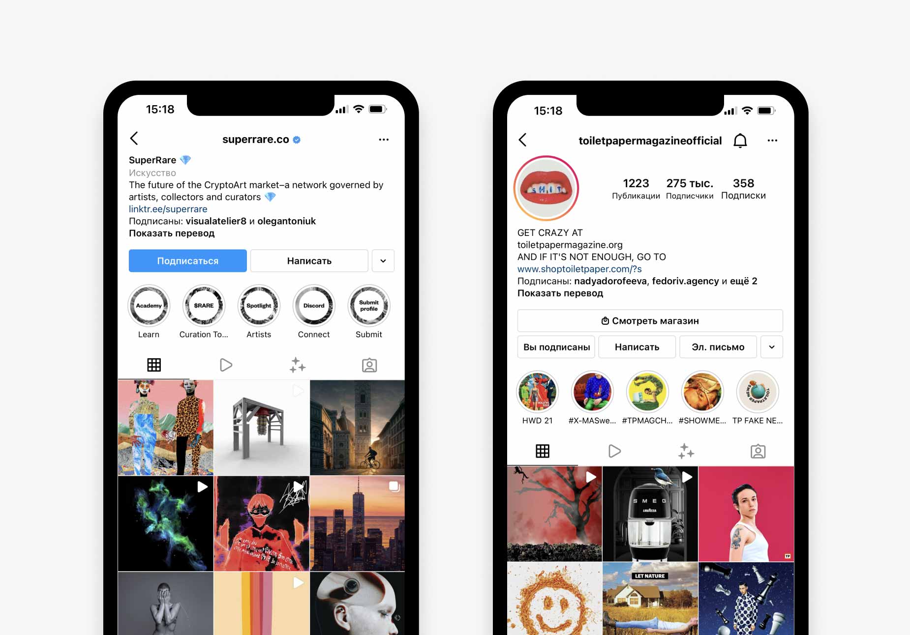
If you are seriously interested in training your sense of wonder, then it is worth reviewing the content that makes up your feed on Facebook, Instagram, etc. Add more aesthetics to it. Let's focus on Instagram, I will show you four cool design profiles. If you are not registered on Instagram, you can try searching for something similar in a design context on the social networks you prefer.
Freshfonts.io – to visually determine good typography :)
Itsnicethat – a selection of super-creative works.
Superrare.co – profile with creative works.
Toiletpapermagazineofficial – if you are looking for inspiring posts that may go a little beyond the limits. One title is worth it :)
Visual of these profiles.
It is not only about the essence of the books. In the training of wonder, we are interested in the design. Pay attention to the color and density of the paper, the choice of fonts, the cover, and the illustrations.
As an example, I want to show you three books from my library that I consider excellent examples of how to train amazement. I hope that there will be people who will want to have the same books in their library. And it will not only be about graphic design. It seems to me that industrial design can be no less inspiring.
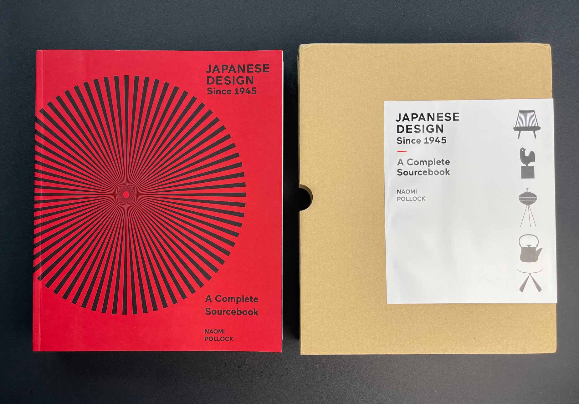
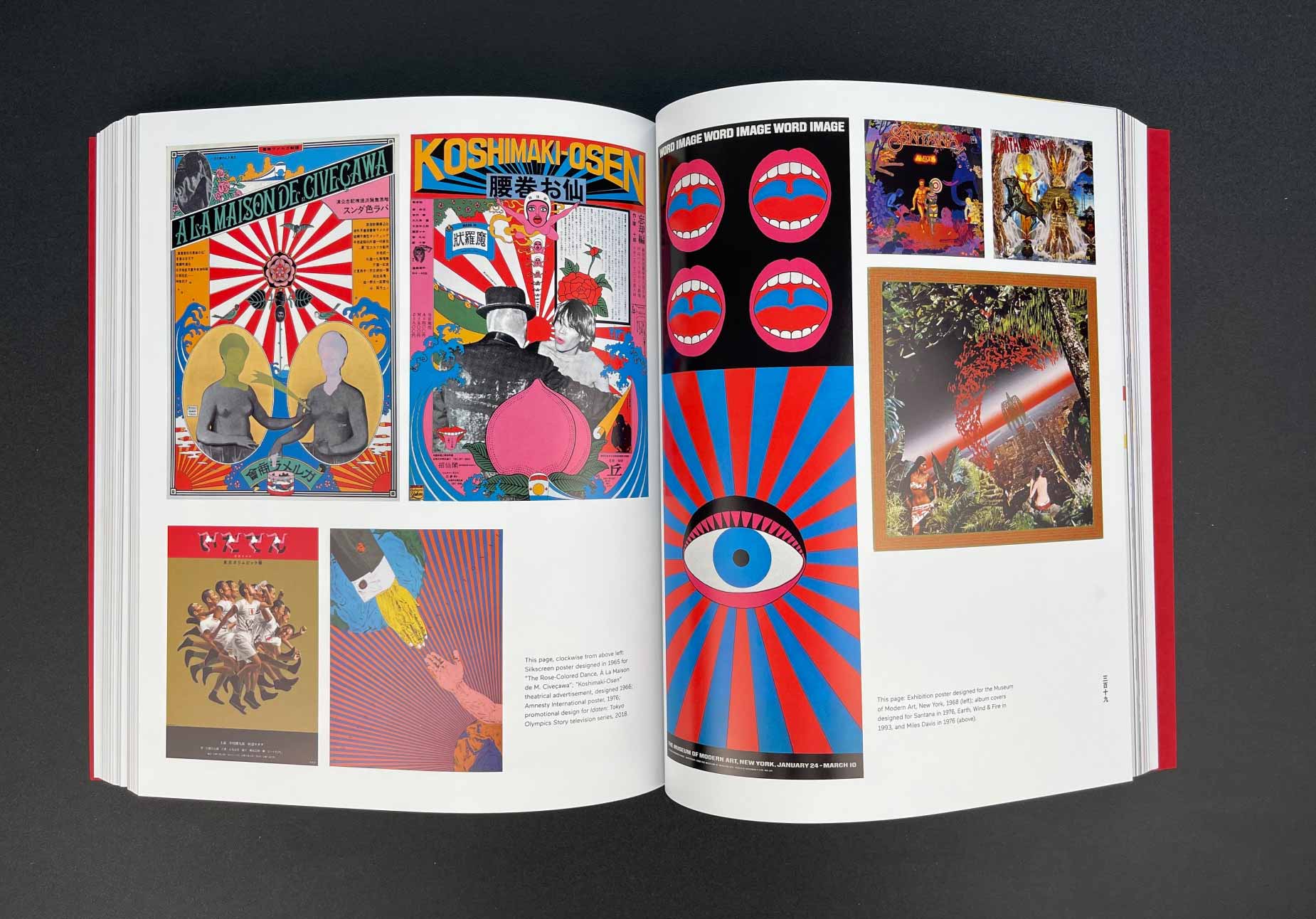
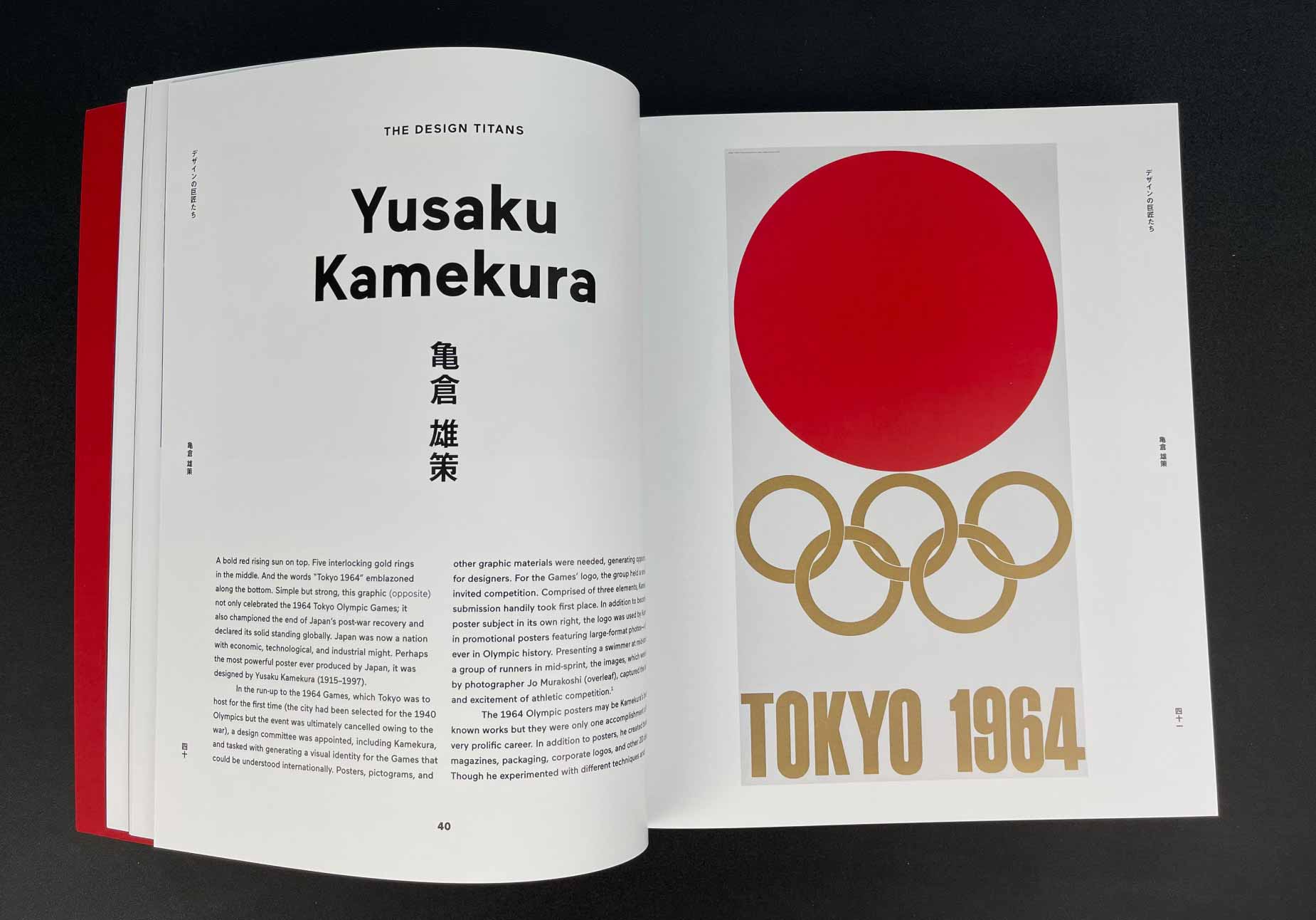
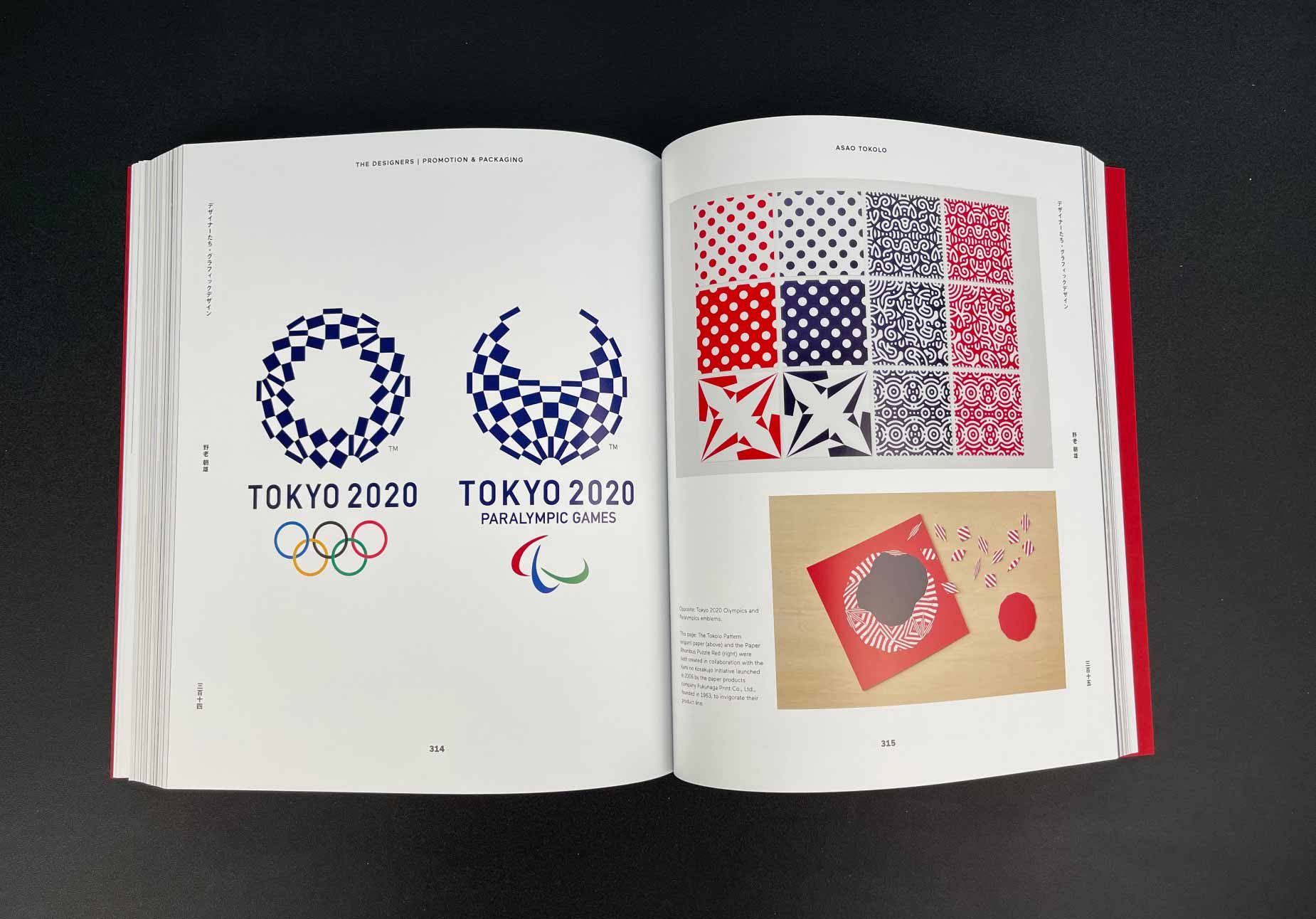
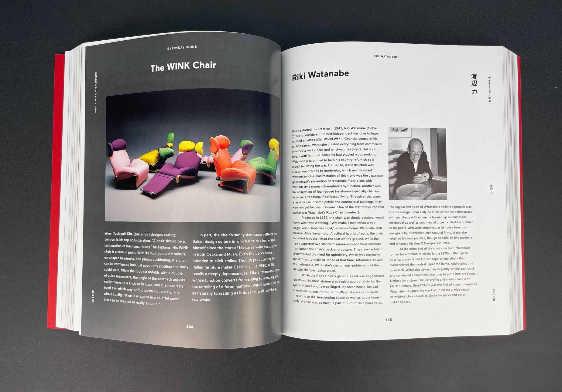
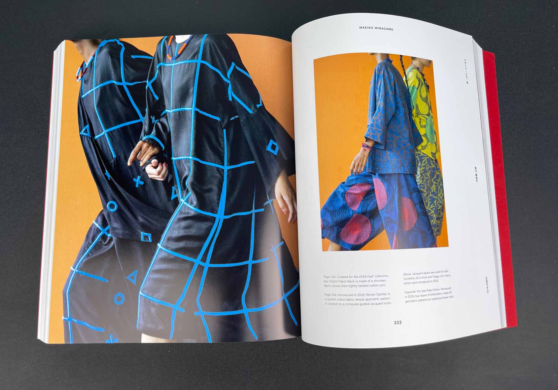
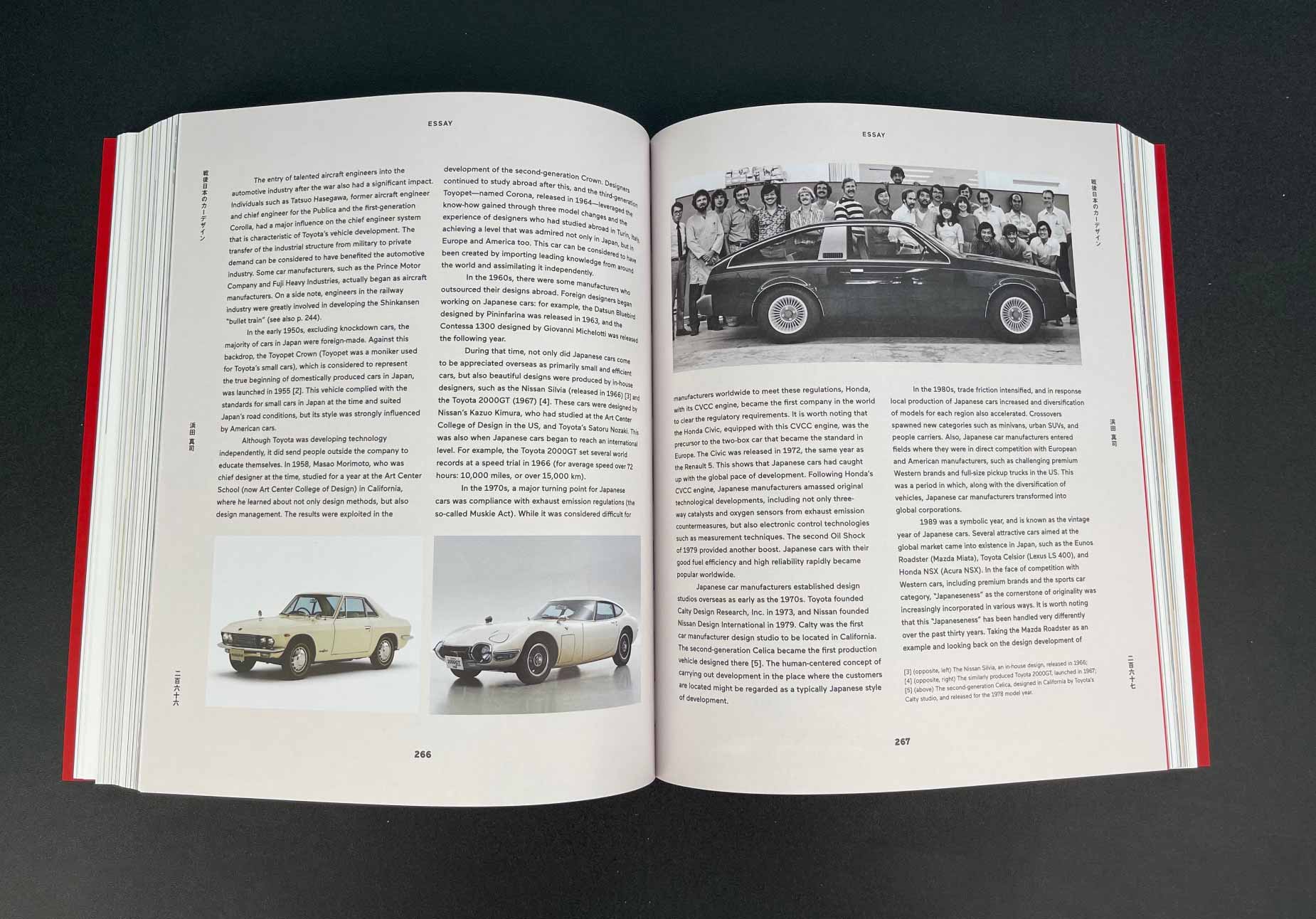
Japanese Design Since 1945: A Complete Sourcebook. Naomi Pollock
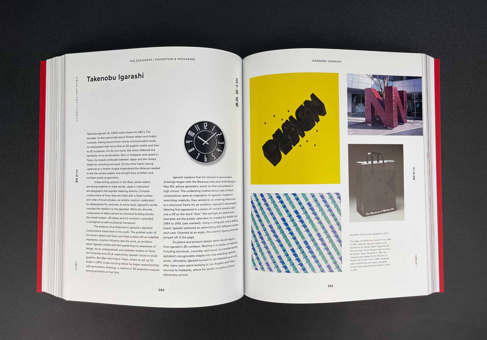
I admit, this is my favorite book when it comes to aesthetic pleasure. It contains a multitude of solutions from Japanese designers, starting from the post-war period to the present day. The book is packaged in a cool kraft box, and the paper inside resembles thick magazine pages.
Those who have been at least a little interested in Japan know that for the last 100 years, this country has often been ahead of its time, and its cultural isolation from the outside world has allowed the Japanese to demonstrate a slightly different perspective on ordinary things: technology, clothing, furniture, cars, and, of course, art.
Photographs of the book from my library
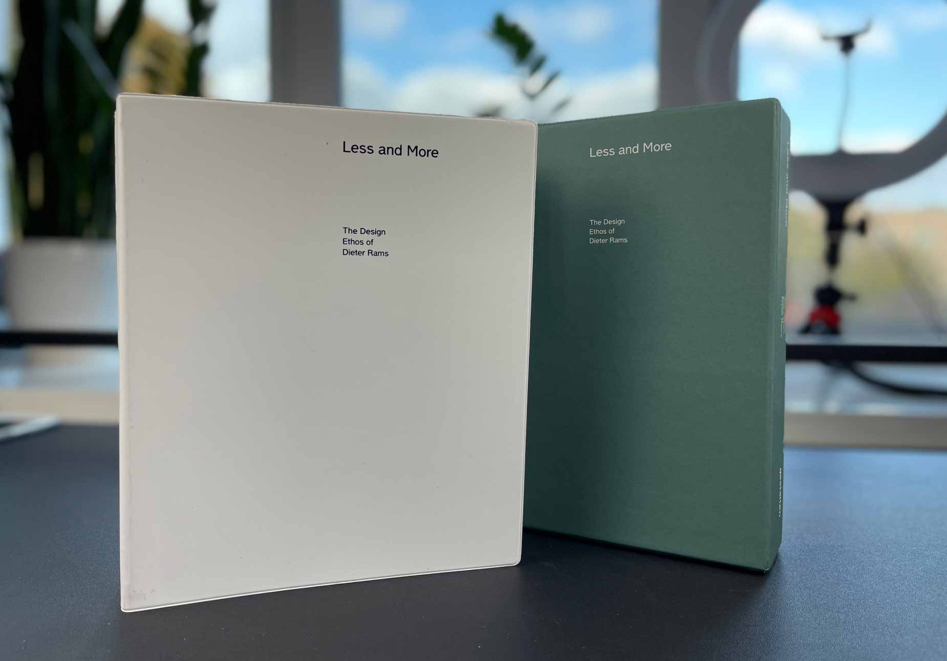
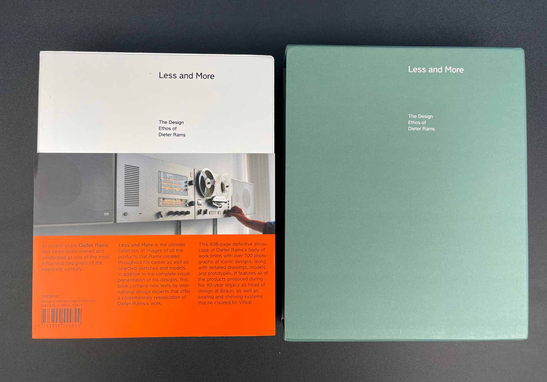
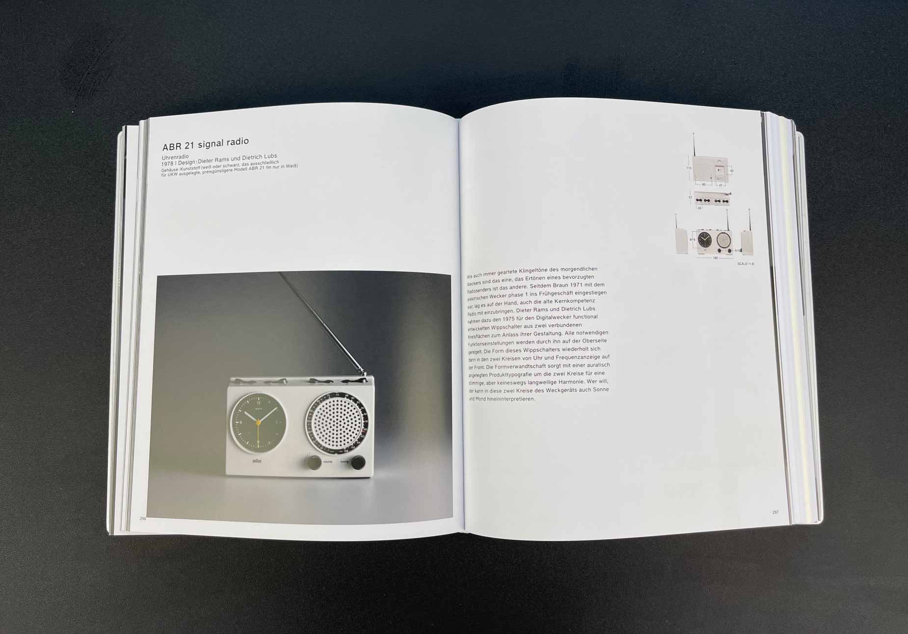
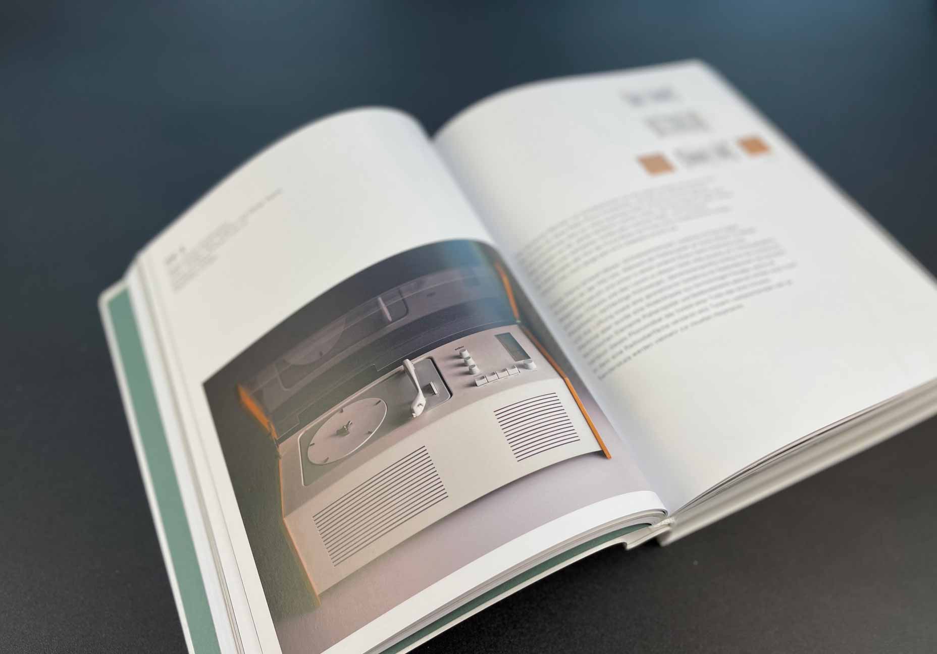
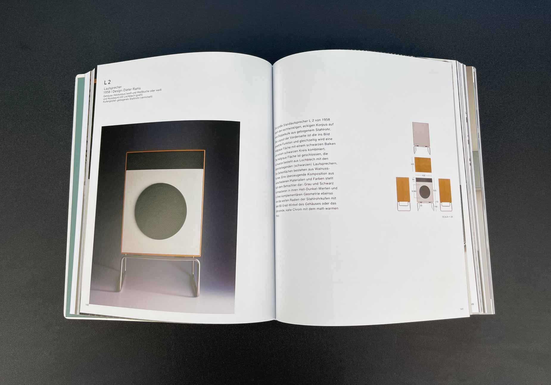
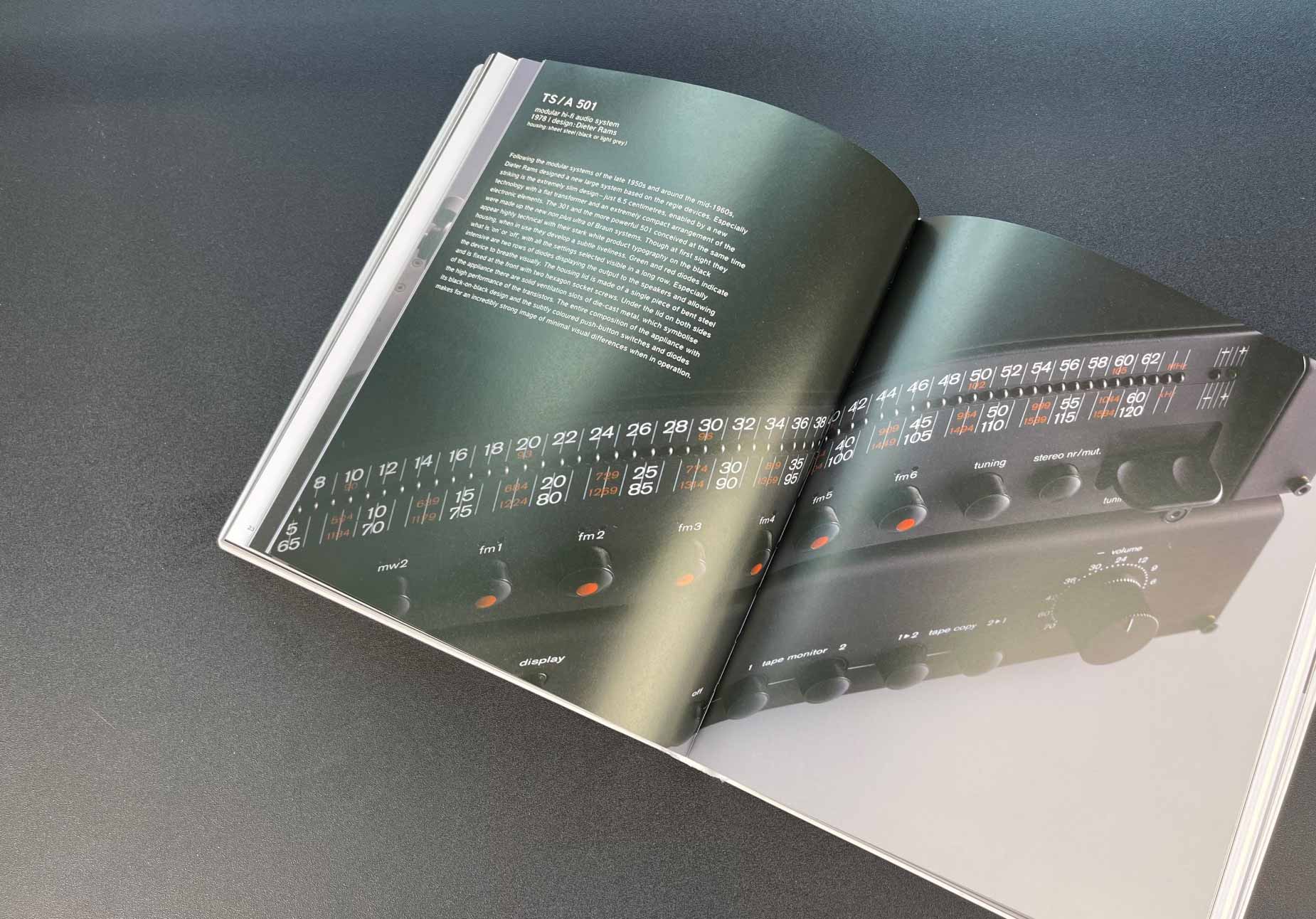
Less and More The Design Ethos of Dieter Rams
Dieter Rams – a legendary figure in 20th-century industrial design. He was the leading designer at Braun, so the book mainly showcases the technology of this brand with comments.
Previously, before design entered my life, when I had to choose household appliances for my home in the store, Braun products somehow subconsciously evoked more sympathy than others. Now I pay attention to how they are made. Usually, they combine a pleasant visual aesthetic with functionality. No unnecessary elements, no excess in the color scheme.
The aesthetics of the book, like the previous one, resemble a magazine. And just look at the packaging.
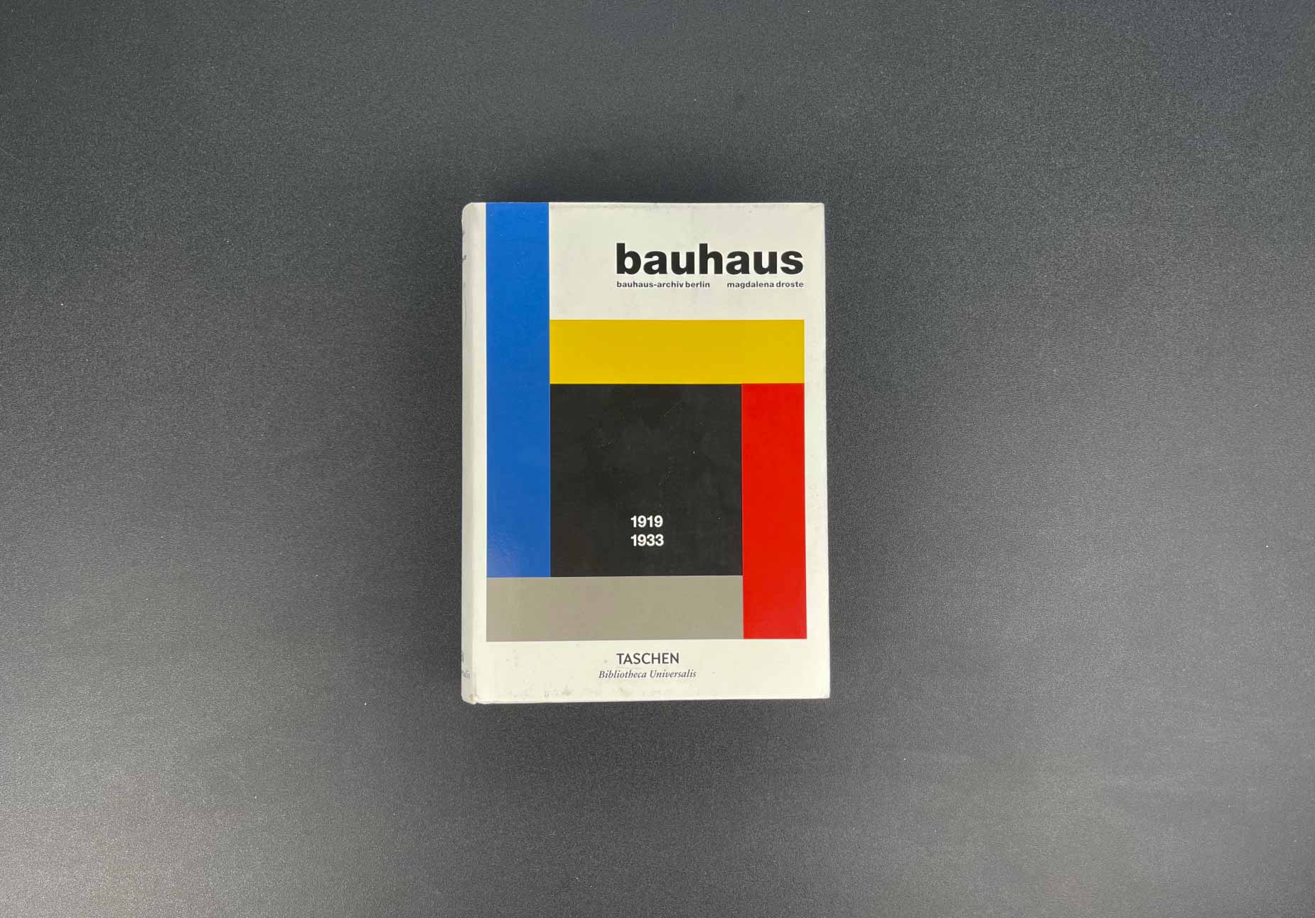
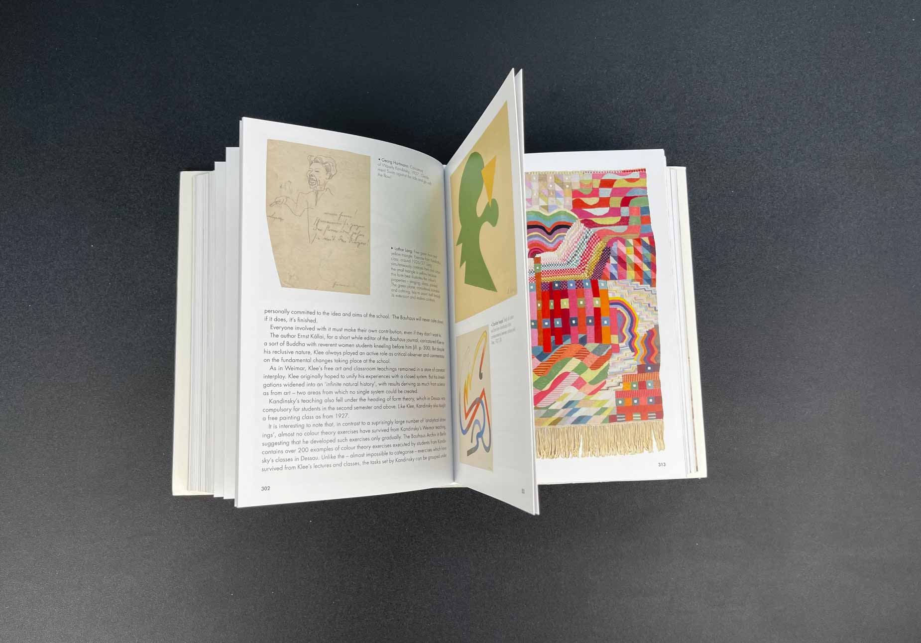
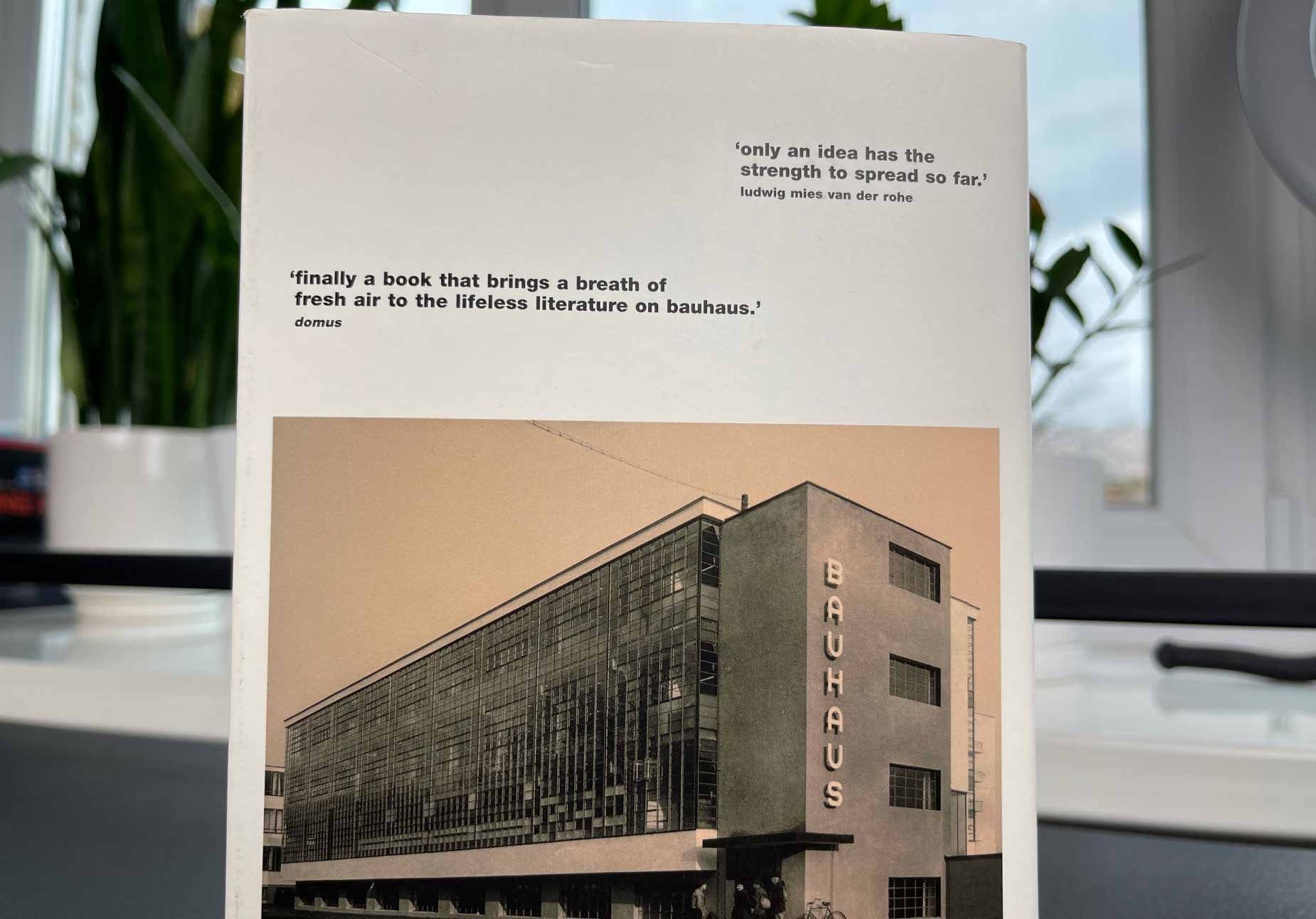
Bauhaus. Updated Edition (Bibliotheca Universalis). Magdalena Droste
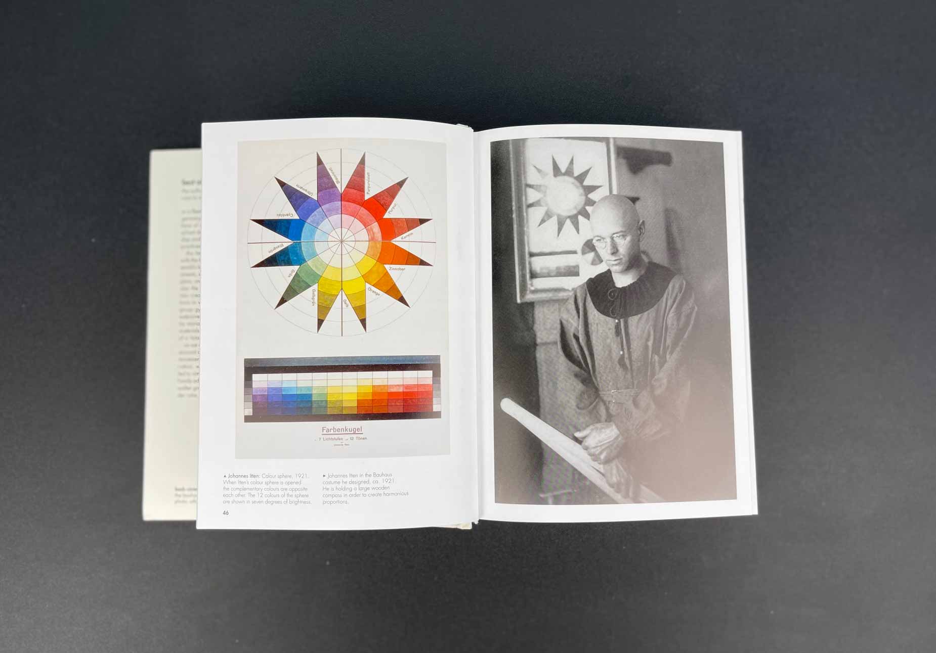
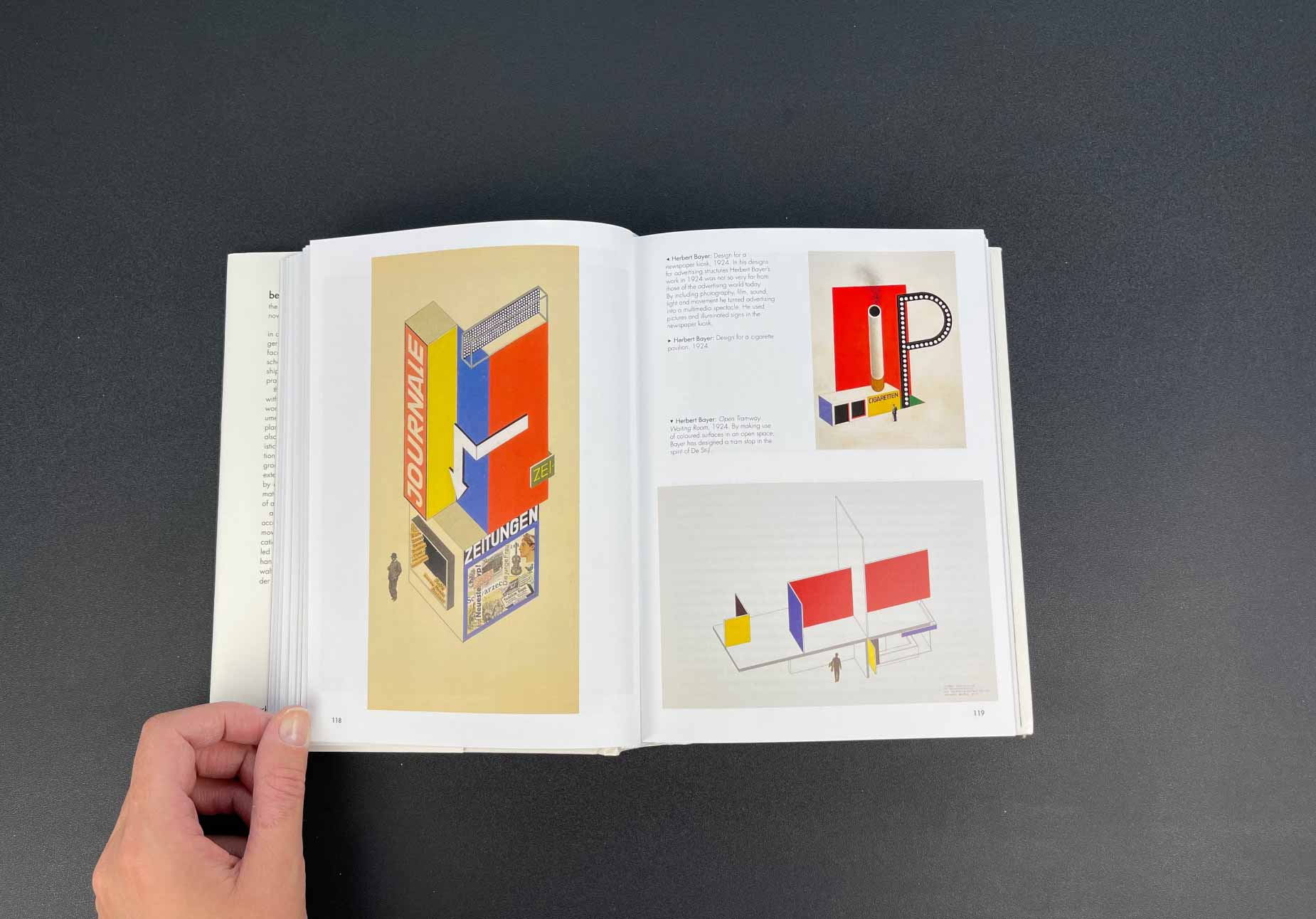
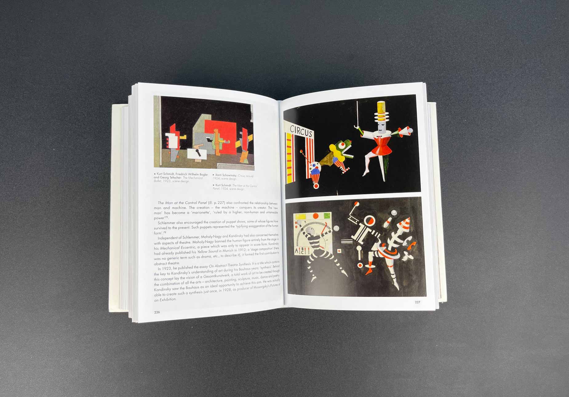
I have been fascinated by the works of the German school of art and design Bauhaus for many years. They have their own unique style, which consists of simplicity of forms and functionality. You have probably come across patterns made up of geometric shapes, using pure color – the hallmark of the school. I recommend the book as a source of inspiration not only for some specific details but also for the approach to creating design in general.
Photo of the book from my library
I don't want to pompously talk about how without travel you will have a narrow worldview and such things. With modern technology, each of us can learn about the cultural heritage of other countries without even leaving home.
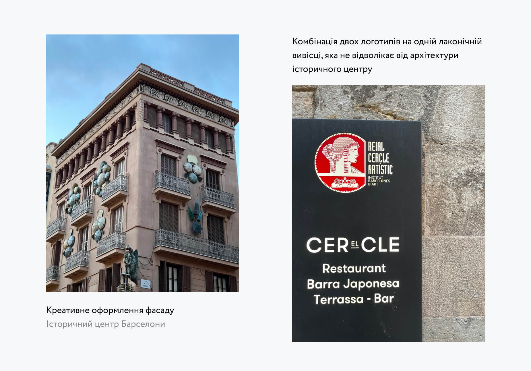
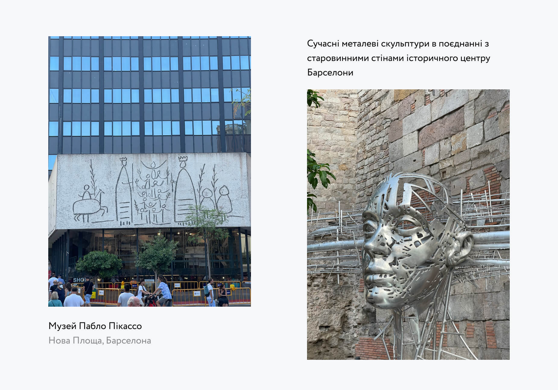
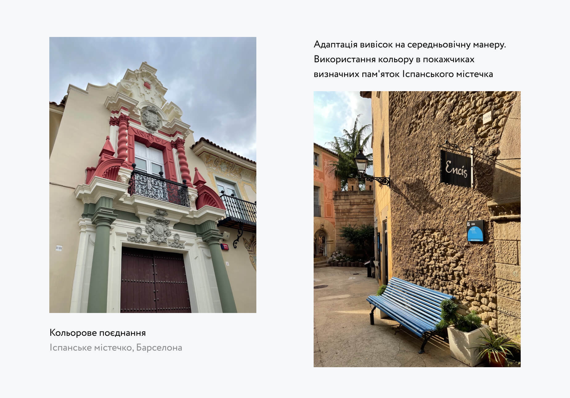
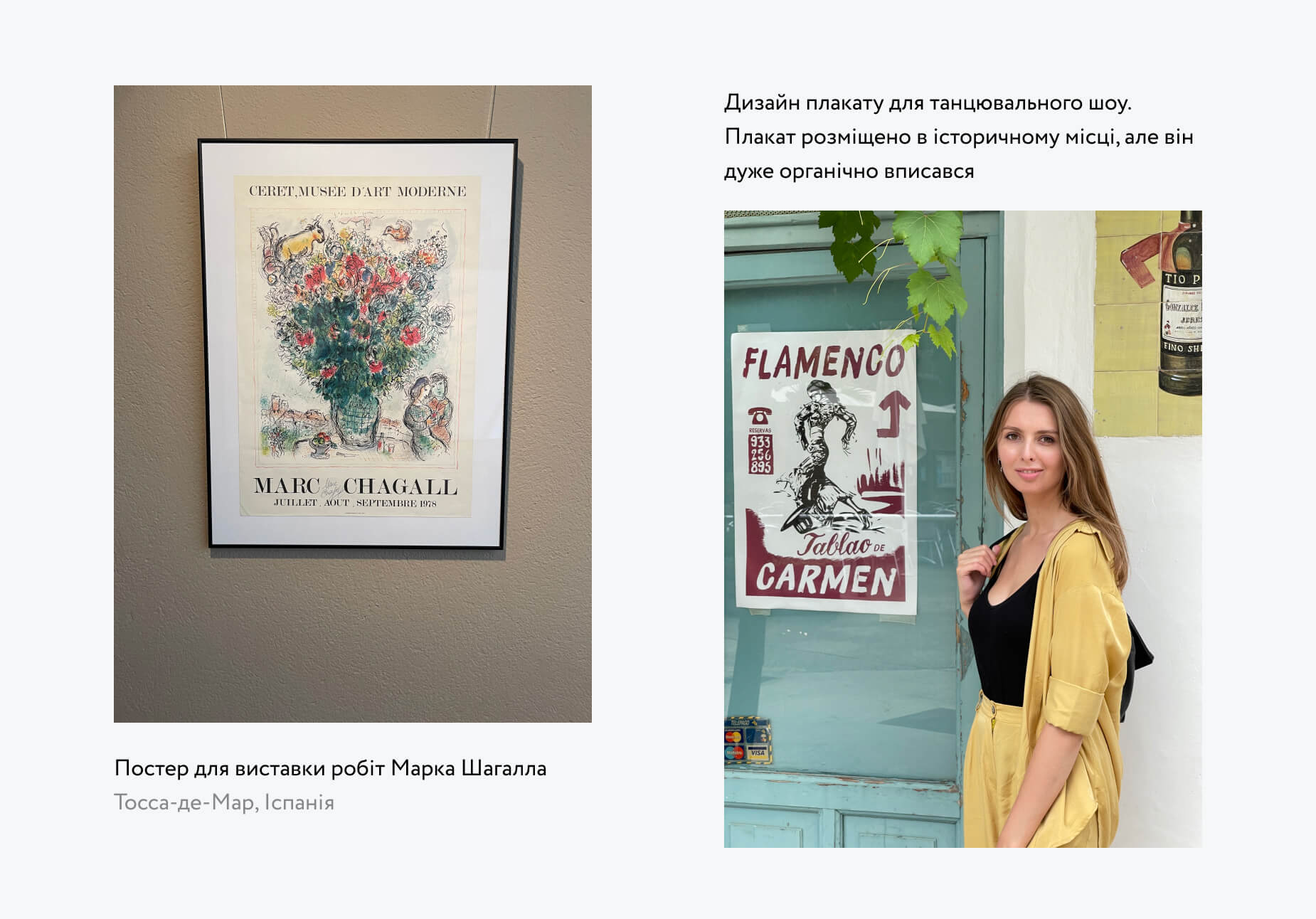
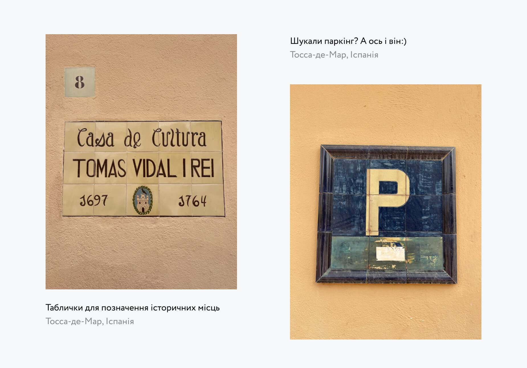
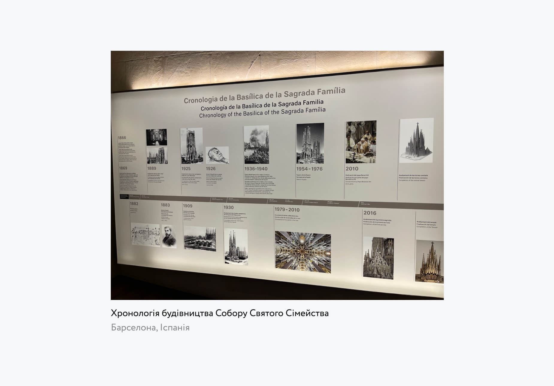
But still, seeing something for yourself is not at all the same as in a video. So, if you get the chance to travel somewhere in the near future, try to pay more attention to how everything is arranged. Whether it's another city or another country. Notice everything: urban planning, landscapes, signs, window displays, goods, people on the streets. How life is organized, what people are interested in, what they do. Take photos, shoot videos.
Here are a few examples of what I filmed while traveling in Spain.
You might say: «And how will this help me in a web environment?»
And I can still provide a few arguments. The first – most startup ideas are borrowed from abroad. Just like a large number of business names (cafes, restaurants, boutiques...). Why shouldn't we, as designers, borrow at least a quality approach or visual solutions? The second – the development of taste cannot occur separately from everything else. Rarely does a person manage to create stylish designs for websites while having no taste for interior design or clothing.
I hope you have noticed at least one of the ways to train your awareness. Finally, I will give you one more piece of advice – try to catch the thrill from watching all of this. It is in these moments that the desire arises not only to watch how others do it, but also to realize something on your own.
Share your ways of practicing mindfulness in the comments.
